
In today’s competitive marketplace, packaging design has evolved far beyond its utilitarian purpose of merely containing and protecting products. Modern packaging serves as a powerful marketing tool, a brand ambassador, and often the first physical interaction consumers have with a product. As we navigate through 2025, several distinctive packaging design styles have emerged, each reflecting broader cultural movements, technological advancements, and shifting consumer values.
This comprehensive exploration delves into the most influential contemporary packaging design styles, examining their characteristics, applications, and the psychology behind their appeal. From bold minimalism to interactive augmented experiences, these styles represent the cutting edge of packaging design and offer valuable insights for brands seeking to make a lasting impression in an increasingly crowded marketplace.
1. Bold Minimalism: The Power of Restraint
Bold minimalism has established itself as a dominant force in contemporary packaging design, particularly in industries like beauty, skincare, and natural foods. This industrial style is characterized by clean, simple lines and shapes, with high-contrast colors that create immediate visual impact despite the limited design elements.
The Aesthetic Foundation
At its core, bold minimalism combines two seemingly contradictory concepts: simplicity and visual impact. The style is defined by several key characteristics:
- High-contrast color combinations that create immediate visual distinction
- Clean, industrial fonts that convey clarity and purpose
- Strategic use of negative space to highlight essential elements
- Reduced number of design components to focus attention on the brand message
Unlike traditional minimalism, which might use subtle tones and understated typography, bold minimalism embraces stark contrasts and commanding visual elements. This approach ensures that despite the “less is more” philosophy, the packaging still captures attention in competitive retail environments.
The Strategic Advantage
Bold minimalism isn’t merely an aesthetic choice—it’s a strategic communication approach. By stripping away decorative elements, brands can ensure their core message reaches consumers without distraction. This style is particularly effective for products that want to emphasize purity, functionality, or ethical credentials.
The intentional arrangement of every design element becomes crucial in bold minimalist packaging. Since there are fewer components to draw the consumer’s attention, each element must be precisely positioned and proportioned. This requires a deep understanding of design principles, color theory, and consumer psychology to create packaging that communicates effectively despite its simplicity.
Consumer Appeal
The appeal of bold minimalism reflects broader cultural trends toward authenticity and transparency. Modern consumers, particularly in premium markets, often associate visual clutter with unnecessary additives or marketing hyperbole. Bold minimalist packaging signals honesty and confidence—a brand that doesn’t need embellishment to make its case.
This style also photographs exceptionally well for social media, where clean lines and high contrasts stand out in crowded feeds. The Instagram-friendly nature of bold minimalist packaging has contributed significantly to its popularity among digitally-savvy brands targeting younger demographics.
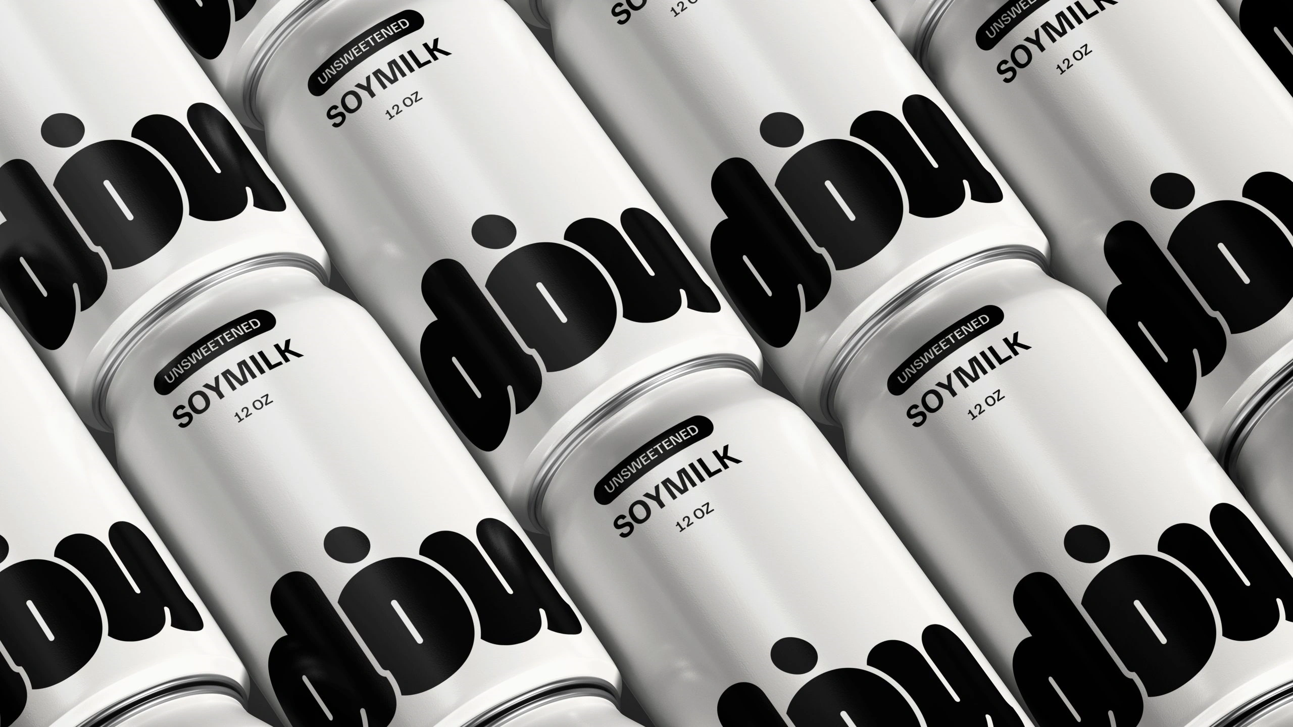
Case Study: Dou Soymilk
Dou Soymilk perfectly exemplifies the bold minimalism packaging trend. Designer Siyu Shen created a striking identity that relies almost entirely on typography as the central design element. The packaging features clean aluminum cans in white and warm yellow, with a custom rounded logo for “dou” that feels approachable and friendly, paired with a modern sans-serif font for supporting text. This minimalist approach directly reflects the product’s simple, pure ingredients: just water and organic soybeans. The design clearly communicates this transparency through straightforward statements like “UNSWEETENED SOYMILK” and “MADE ONLY WITH WATER & ORGANIC SOYBEANS,” building consumer trust through directness rather than marketing embellishment.
2. Maximalism: Embracing Visual Abundance
Standing in direct contrast to minimalism, maximalist packaging embraces the philosophy that “more is more.” This exuberant style features bold color combinations, contrasting patterns, minimal white space, and an abundance of design elements that create a sense of visual richness and complexity.
The Aesthetic Foundation
Maximalist packaging is characterized by:
- Vibrant, often clashing color palettes that demand attention
- Multiple patterns and textures that create visual depth
- Typography that often becomes a decorative element itself
- Illustrations or imagery that covers most available space
- Layered design elements that reward closer inspection
Unlike the restrained approach of minimalism, maximalism celebrates abundance and visual stimulation. These designs often tell complex stories through their imagery, creating packages that function almost as miniature art pieces.
The Strategic Advantage
Maximalist packaging excels at creating memorable brand experiences. The rich visual language allows brands to communicate complex stories, cultural references, or product origins in ways that more restrained designs cannot. This approach is particularly effective for products like coffee, alcohol, and specialty foods, where storytelling and provenance add significant value.
The playful nature of maximalist design also creates opportunities for discovery—consumers might notice new details each time they interact with the packaging, creating an ongoing relationship with the product. This extended engagement can strengthen brand loyalty and encourage social sharing.
Consumer Appeal
Maximalist packaging appeals to consumers seeking authentic experiences and connections. The detailed, often handcrafted appearance suggests care and attention to detail that extends to the product itself. For brands targeting experience-seeking consumers, maximalism offers an opportunity to stand out in categories where bold minimalism has become commonplace.
The style also performs well on social media platforms where visual distinctiveness drives engagement. Unboxing videos and product photography benefit from the rich details and vibrant colors typical of maximalist designs.
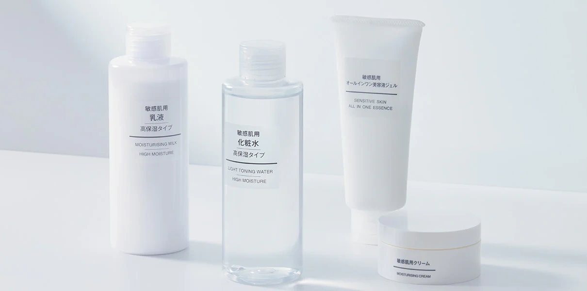
Case Study: MUJI’ Packaging
MUJI’s minimalist design style embodies Japanese Zen principles through clean lines, neutral colors, and natural materials while eliminating unnecessary elements. Their approach focuses on quality raw materials, streamlined manufacturing processes, and simplified packaging that highlights essential functionality rather than decoration. This “no-brand” philosophy creates a distinctive visual identity characterized by geometric shapes, absence of visible branding, and strategic use of negative space, representing a deliberate simplicity achieved through thoughtful design rather than mere reduction.
3. Neo-Retro: Reimagining the Past
The neo-retro style has gained significant traction in contemporary packaging design, particularly among brands targeting the hipster subculture and consumers who value authenticity and craftsmanship. This approach doesn’t simply replicate historical designs but reinterprets them with modern sensibilities, creating packages that feel simultaneously familiar and fresh.
The Aesthetic Foundation
Neo-retro packaging often contains:
- Ornaments and patterns that evoke historic graphic styles like Art Nouveau or Art Deco
- Textured elements that suggest traditional production methods
- Variation in typefaces, often mixing vintage-inspired fonts with contemporary ones
- Color palettes that reference specific historical periods but with updated combinations
- Illustrations that blend traditional techniques with modern subject matter
Research has shown that these design elements are strongly associated with values such as authenticity and craftsmanship. The style creates a bridge between historical aesthetics and contemporary sensibilities, allowing brands to leverage nostalgia while remaining relevant to modern consumers.
The Strategic Advantage
Neo-retro packaging allows brands to tap into positive associations with the past without seeming outdated. By referencing historical styles that consumers may associate with quality, craftsmanship, and tradition, brands can borrow credibility and emotional resonance.
This style is particularly effective for products seeking to emphasize heritage, traditional production methods, or timeless quality. It creates a visual shorthand that communicates these values instantly, even to consumers unfamiliar with the specific historical references being made.
Consumer Appeal
The appeal of neo-retro packaging extends beyond simple nostalgia. For younger consumers like Gen Z, who show surprising affinity for eras they never experienced firsthand, neo-retro designs offer a connection to an idealized past while remaining firmly in the present.
This style creates a unique aesthetic that feels both familiar and fresh, offering consumers a way to express appreciation for craftsmanship and tradition while still embracing contemporary values. The hipster subculture’s embrace of neo-retro aesthetics has helped mainstream this approach, making it accessible to broader audiences.
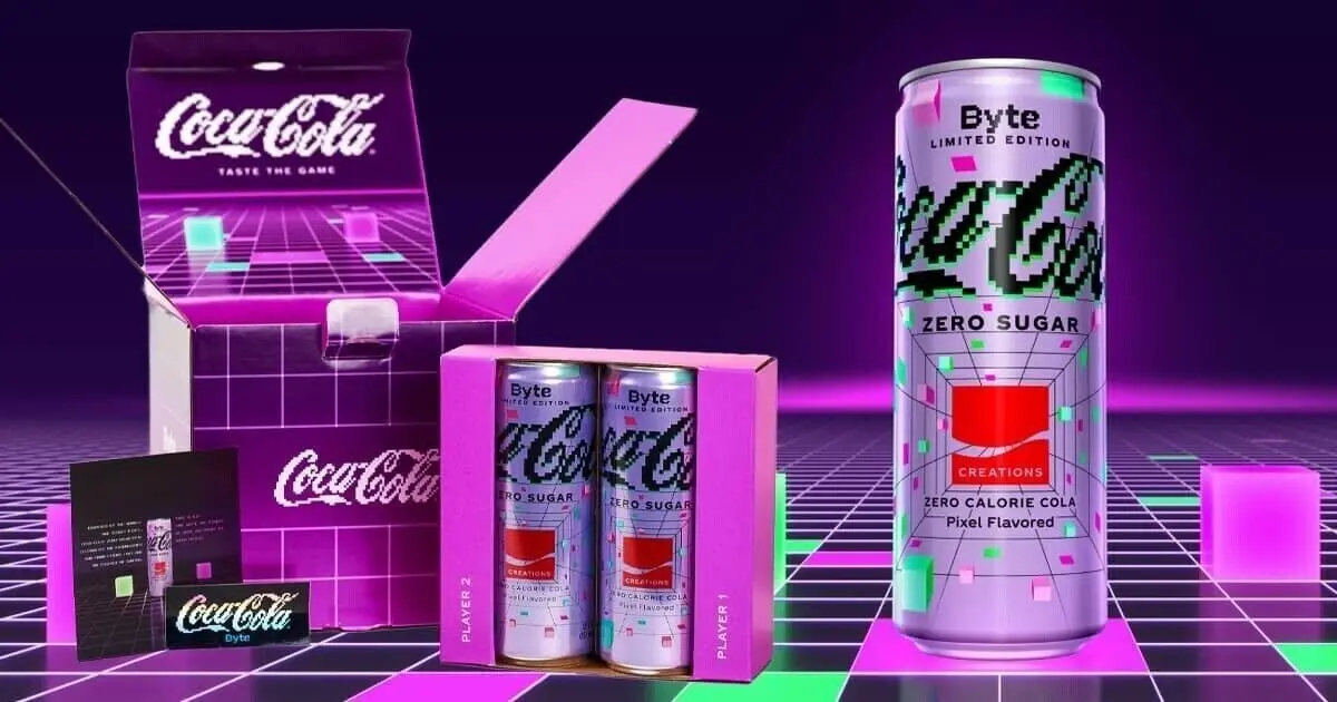
Case Study: Coca-Cola Zero Sugar Byte
Coca-Cola’s limited edition “Zero Sugar Byte” is a bold and imaginative creation that blends the world of refreshment with the excitement of digital innovation. Inspired by the idea of tasting pixels, this futuristic beverage is part of Coca-Cola’s Creations platform, which explores new flavors and immersive experiences designed to connect with the next generation of consumers. Zero Sugar Byte features the brand’s signature zero-sugar formula but with a unique, otherworldly twist meant to capture the flavor of the metaverse. The eye-catching packaging is designed in a vibrant pixel-art style, evoking nostalgia for early video games while simultaneously appealing to digital natives and tech enthusiasts.
4. Distorted: Breaking Visual Boundaries
The distorted packaging design style reflects a desire for subversion, freedom, and creativity. Characterized by unconventional shapes, fluid typography, and elements that seem to defy physical laws, this style invites consumers into a world where normal rules don’t apply.
The Aesthetic Foundation
Distorted packaging typically features:
- Text that is playfully distorted to fill shapes or create flowing effects
- Typography that becomes a central design element rather than just informational
- Unconventional shapes and forms that challenge traditional packaging structures
- Fluid, dynamic elements that suggest movement or transformation
- Surreal combinations of imagery that create unexpected visual relationships
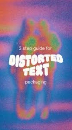
Creating distorted text effects typically involves a three-step process: adding text and vectorizing it, applying envelope distort techniques (such as “Make with Warp” in Adobe Illustrator), and expanding the design for finishing touches like color application.
The Strategic Advantage
Distorted packaging designs excel at capturing attention through their unconventional appearance. In retail environments where consumers are bombarded with visual information, these distinctive packages stand out by breaking expected patterns and forms.
This style allows brands to express personality and creativity in ways that more conventional approaches cannot. For products targeting younger demographics or creative industries, distorted packaging signals innovation and willingness to challenge conventions—qualities that may extend to the product itself.
Consumer Appeal
The distorted style resonates particularly with Gen Z consumers, who often feel at odds with conventional norms and appreciate brands that challenge the status quo. These designs transform everyday reality into something whimsical and exciting, if only momentarily.
This aesthetic also aligns with younger generations’ interest in augmented reality and other technologies that blur lines between physical and digital realms. The fluid, dynamic nature of distorted packaging creates a natural bridge to digital experiences, making it well-suited for brands with strong online presences.
Case Study: PackMojo’s Distorted Text Design
PackMojo demonstrates the distorted packaging design style with their playful text manipulations that create flowing, whimsical effects. Their approach involves a three-step process: first adding text and vectorizing it, then applying envelope distort techniques (such as “Make with Warp” in Adobe Illustrator), and finally expanding the design for finishing touches like color application. The result is typography that becomes a central design element rather than just informational text. Their example features retro-inspired colors with text that appears to flow and bend across the packaging surface, creating visual interest through unconventional shapes and forms that challenge traditional packaging structures.
5. Indie: Celebrating the Handcrafted
The indie packaging style captures a DIY spirit and appreciation for authenticity and individuality. This approach often looks intentionally handcrafted or small-batch, featuring a mix of patterns, seemingly random graphical elements, and a playful approach to design that feels spontaneous and personal.
The Aesthetic Foundation
Indie packaging designs typically include:
- Elements that appear handcrafted or hand-drawn
- Collage-like compositions that combine diverse visual elements
- Imperfect or irregular components that emphasize the human touch
- Sticker-like graphics that suggest personalization or customization
- Typography that often mimics handwriting or manual letterpress
While these designs may appear somewhat chaotic at first glance, they express a youthful energy and authenticity that resonates deeply with consumers seeking genuine connections.
The Strategic Advantage
Indie packaging allows brands to communicate authenticity and personality in an increasingly homogenized marketplace. By embracing imperfection and individuality, these designs signal that the products they contain are unique and created with care rather than mass-produced.
This approach is particularly effective for brands that want to emphasize their independent status, artisanal production methods, or community connections. The handcrafted aesthetic suggests attention to detail and quality that extends to the product itself.
Consumer Appeal
Indie packaging appeals to consumers who value uniqueness and personal expression. The style allows for a sense of discovery and connection—each package feels like it was created specifically for the individual consumer rather than produced in vast quantities.
This style also photographs well for social media, offering a wealth of details and textures that create visual interest. For brands targeting younger demographics who share their purchases and experiences online, indie packaging provides rich material for user-generated content.
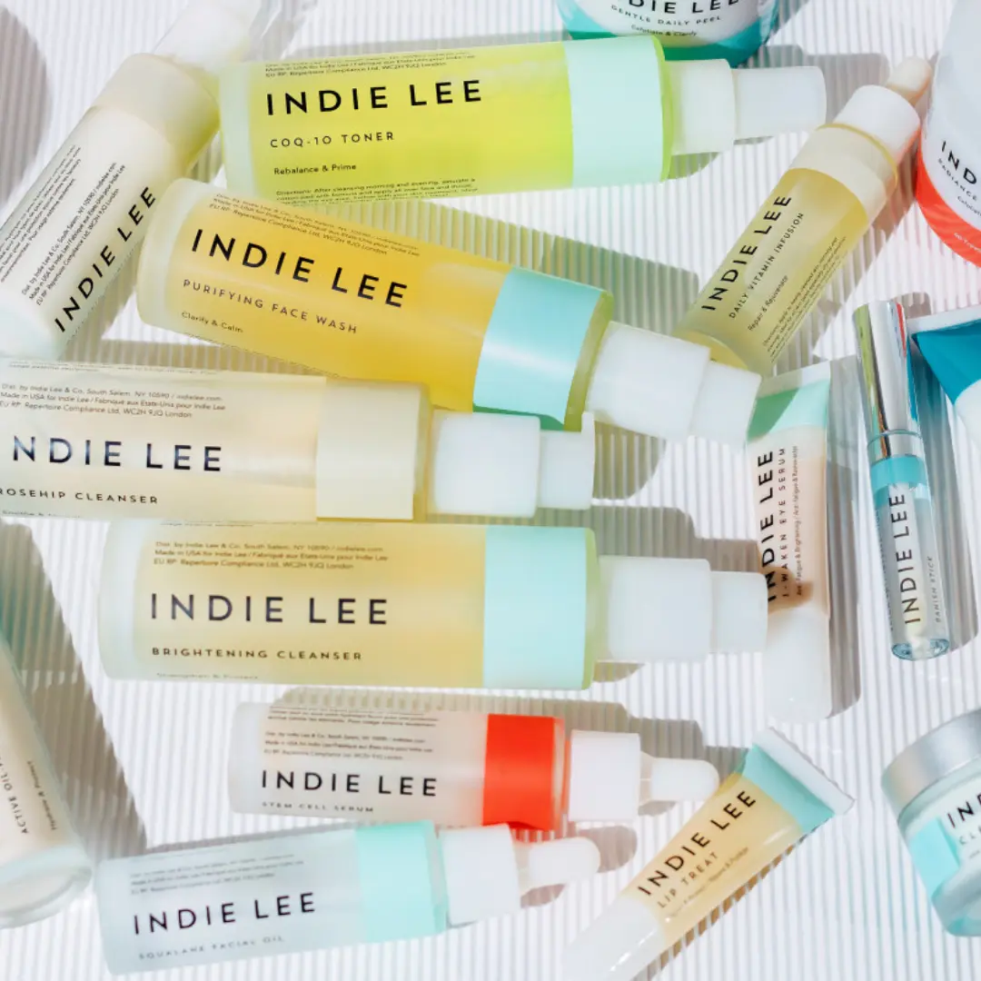
Case Study: Indie Lee & Co
Indie Lee & Co, a rapidly growing line of eco-chic natural beauty products, exemplifies the indie packaging style with its intentionally handcrafted aesthetic. Founder Indie Lee, who began her mission after recovering from a brain tumor she believes was linked to chemical exposure, worked with her chief design officer to create packaging that would stand out from conventional beauty products. They selected Neenah® Folding Board in Felt finish specifically for its tactile quality and natural appearance. The packaging features a clean, bright white surface as a consistent backdrop for the brand’s signature color band identity. This approach creates a chic yet natural look that avoids the glossy or soft-touch finishes common in the beauty industry, instead emphasizing authenticity and craftsmanship through texture and simplicity.
6. Interactive and Smart Packaging: Beyond the Visual
As technology advances, packaging is evolving beyond static visual design to incorporate interactive elements that engage consumers on multiple levels. From augmented reality experiences to embedded sensors, smart packaging is creating new possibilities for brand engagement and product functionality.
The Technological Foundation
Interactive packaging encompasses various technologies:
- QR codes, NFC chips, or RFID tags that connect physical packaging to digital content
- Augmented reality features that transform packaging through smartphone apps
- Time-temperature indicators and freshness monitors that communicate product condition
- Sensors that track usage patterns or supply chain conditions
- Interactive elements that change appearance based on environmental factors or user interaction
These technologies extend packaging functionality beyond containing and protecting products to creating ongoing relationships with consumers.
The Strategic Advantage
Smart packaging offers unprecedented opportunities for brands to gather data, extend engagement, and provide additional value. By connecting physical products to digital experiences, brands can offer tutorials, provenance information, reordering capabilities, or entertainment content that enhances the overall product experience.
This approach also allows for personalization at scale—packages can be produced identically but deliver customized digital experiences based on user preferences or behavior. For brands seeking to build direct relationships with consumers, this creates valuable touchpoints beyond the initial purchase.
Consumer Appeal
Interactive packaging appeals to tech-savvy consumers who expect seamless integration between physical and digital experiences. The novelty factor of augmented reality features or other interactive elements creates shareable moments that extend brand reach through social media.
These technologies also address growing consumer demand for transparency and information. By providing easy access to detailed product information, usage instructions, or sustainability credentials, smart packaging helps build trust and confidence in brand claims.
Case Study: Herbal Tea Products from Doi Mae Salong
A case study from Doi Mae Salong Subdistrict in Thailand demonstrates the potential of interactive packaging through augmented reality technology. Researchers designed herbal tea packaging specifically for elderly consumers using universal design principles combined with AR technology. The packaging allows users to access product information and experience the aesthetics of drinking herbal tea through all five senses: form, taste, smell, sound, and touch. This approach not only makes the packaging more accessible for older users but also adds value by telling the story of the production source through interactive digital content. The design creates an ongoing relationship with consumers beyond the initial purchase by connecting the physical package to engaging digital experiences.
7. Sustainable Packaging: Design with Purpose
As environmental concerns become increasingly urgent, sustainable packaging design has evolved from a niche consideration to a mainstream priority. Contemporary sustainable packaging balances ecological responsibility with aesthetic appeal and functional performance.
The Material Foundation
Sustainable packaging approaches include:
- Biodegradable or compostable materials derived from plant sources
- Recycled materials that divert waste from landfills
- Designs that minimize material usage without compromising protection
- Mono-material constructions that simplify recycling
- Reusable containers that extend packaging lifespan
Advances in material science have dramatically expanded the options available to designers, allowing sustainable packaging to compete aesthetically with conventional alternatives.
The Strategic Advantage
Beyond environmental benefits, sustainable packaging offers brands an opportunity to demonstrate their values in tangible form. As consumers increasingly consider environmental impact in purchasing decisions, packaging becomes a visible statement of corporate responsibility.
Innovative sustainable packaging can also generate positive media coverage and social sharing, extending brand reach through earned media. For brands targeting environmentally conscious demographics, sustainable packaging is increasingly an expectation rather than a differentiator.
Consumer Appeal
Sustainable packaging resonates with growing consumer concern about environmental issues. Research indicates that consumers—particularly younger demographics—are willing to pay premiums for products with environmentally responsible packaging.
The tactile nature of sustainable materials often creates positive sensory experiences that enhance product perception. Natural textures, earth tones, and visible recycled content can communicate authenticity and care that extends to the product itself.
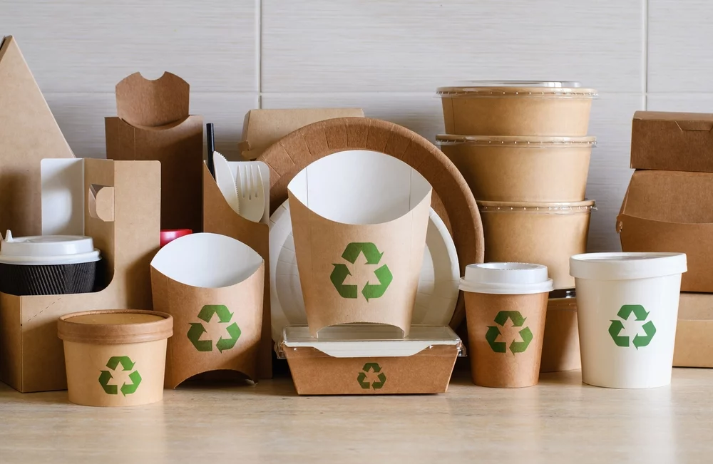
Case Study: Bio-based Food Packaging
A comprehensive study on bio-based materials for food packaging demonstrates how sustainable packaging can balance ecological responsibility with aesthetic appeal. Researchers investigated the relationship between bio-based material characteristics and user perception, developing guidelines for designers to integrate affective values into conceptual design. The study examined materials like sugar cane, starch-based materials, wood, paper, and palm leaf, finding that each material evoked specific emotional responses. For example, sugar cane and starch-based materials were perceived as eco-friendly, while wood, paper, and palm leaf materials conveyed authenticity and craftsmanship. This research provides valuable insights for brands seeking to create sustainable packaging that resonates emotionally with environmentally conscious consumers.
8. Hyper-Contrast: Creating Visual Drama
The hyper-contrast packaging trend brings dramatic visual impact through angular shapes and loud clashing colors designed to make a powerful first impression. This style has gained significant traction in categories targeting younger demographics who respond to bold visual statements.
The Aesthetic Foundation
Hyper-contrast packaging typically features:
- Extremely high contrast between foreground and background elements
- Angular shapes and sharp geometric patterns
- Vibrant, sometimes clashing color combinations
- Bold typography that commands attention
- Dramatic use of light and shadow to create depth
This style intentionally creates visual tension through unexpected combinations and extreme contrasts, resulting in packages that are impossible to ignore.
The Strategic Advantage
In crowded retail environments where products have seconds to capture attention, hyper-contrast packaging cuts through visual clutter with unmistakable presence. This approach is particularly effective for brands targeting younger consumers or entering categories dominated by conservative design approaches.
The style also translates exceptionally well to digital environments, where strong contrasts and bold graphics perform well on small screens and in social media feeds. For digitally-native brands, this alignment between physical packaging and digital presence creates consistent brand experiences across touchpoints.
Consumer Appeal
Hyper-contrast packaging appeals to consumers seeking products that make bold statements. The dramatic visual approach signals confidence and distinctiveness—qualities that may extend to the product experience itself.
For younger consumers accustomed to the visual intensity of digital media, hyper-contrast packaging creates familiar energy in physical form. The style’s photogenic nature also encourages social sharing, extending brand reach through user-generated content.
Case Study: 99designs by Vista Examples
The hyper-contrast packaging trend is exemplified by designs from 99designs by Vista, which feature stark juxtapositions of angular shapes, mismatched patterns, and bright, highly saturated color palettes. These designs intentionally create visual tension through unexpected combinations and extreme contrasts. One example showcased by 99designs features packaging with bold geometric patterns in vibrant colors against contrasting backgrounds, creating a visual experience that’s impossible to ignore. This style is particularly effective for brands with playful personalities targeting younger demographics who respond to bold visual statements and are accustomed to the visual intensity of digital media.
9. Brutalist Type: Typography as Architecture
Brutalist typography in packaging design draws inspiration from architectural brutalism, emphasizing raw, unadorned letterforms and structural typography that becomes the central design element. This approach has gained popularity for its distinctive character and ability to communicate strength and authenticity.
The Aesthetic Foundation
Brutalist typography in packaging typically features:
- Heavy, structural letterforms that dominate the design
- Minimal decoration or embellishment
- Raw, sometimes imperfect execution that emphasizes authenticity
- Limited color palettes that focus attention on typographic forms
- Unexpected spacing, scaling, or positioning that creates visual tension
This style treats typography as architecture—building the entire design around the structural qualities of letterforms rather than treating text as merely informational.
The Strategic Advantage
Brutalist typography creates instant visual distinction in categories dominated by more conventional approaches. The raw, unfiltered aesthetic signals authenticity and confidence—a brand that doesn’t need decorative elements to make its statement.
This approach is particularly effective for products targeting design-conscious consumers or categories where authenticity is a key selling point. The distinctive character of brutalist typography creates strong brand recognition even from a distance or in peripheral vision.
Consumer Appeal
Brutalist typography appeals to consumers who appreciate design that challenges conventions. The raw, unfiltered aesthetic signals honesty and directness—qualities increasingly valued in an era of marketing saturation.
For design-literate consumers, brutalist typography demonstrates brand confidence and sophistication. The style’s distinctive character creates memorable visual impressions that strengthen brand recall and recognition.
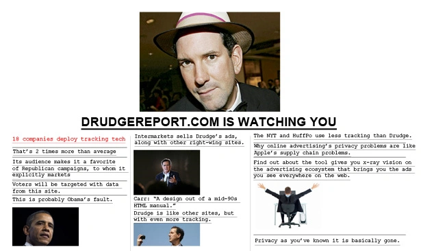
Case Study: Kimp Design Examples
Kimp Design showcases brutalist typography in packaging that draws inspiration from architectural brutalism. Their examples feature heavy, structural letterforms that dominate the design with minimal decoration or embellishment. The approach treats typography as architecture—building the entire design around the structural qualities of letterforms rather than treating text as merely informational. One example features a website design for The Drudge Report that uses simple color palette and solid white background with typography as the central design element. This raw, unfiltered aesthetic signals authenticity and confidence—a brand that doesn’t need decorative elements to make its statement.
10. Translucent Play: Revealing What’s Within
The translucent play trend in packaging design leverages transparency, translucency, and light interaction to create visually engaging experiences that reveal product characteristics while maintaining an element of mystery.
The Aesthetic Foundation
Translucent packaging typically features:
- Transparent or semi-transparent materials that reveal product contents
- Strategic opacity that guides visual focus to specific elements
- Light-reactive elements that change appearance under different conditions
- Layered transparency that creates depth and visual complexity
- Color filters that transform the appearance of contents
This approach treats light as an active design element, creating packages that change and evolve depending on viewing conditions and angles.
The Strategic Advantage
Translucent packaging allows brands to showcase product qualities directly while maintaining control over the presentation. For products where color, texture, or form are selling points, this transparency creates immediate proof of quality while still allowing for brand expression.
This style also creates opportunities for surprise and discovery as consumers interact with the packaging from different angles or under different lighting conditions. These changing appearances encourage extended engagement and exploration.
Consumer Appeal
Translucent packaging appeals to consumers seeking authenticity and transparency—both literally and figuratively. The ability to see the product before purchase builds confidence and reduces purchase anxiety, particularly for new or unfamiliar products.
The interactive quality of translucent packaging—the way it transforms with light and movement—creates engaging experiences that extend beyond the moment of purchase. This ongoing relationship with packaging design can strengthen brand connections and encourage repeat purchases.
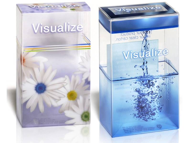
Case Study: Wellness Brand Packaging by gianni88
A wellness brand packaging design by gianni88 via 99designs by Vista demonstrates the Translucent Play trend by leveraging transparency and light interaction. The design features semi-transparent materials that partially reveal product contents while maintaining strategic opacity that guides visual focus to specific elements. This approach treats light as an active design element, creating packaging that changes and evolves depending on viewing conditions and angles. The translucent quality allows the brand to showcase product qualities directly while maintaining control over the presentation, creating opportunities for surprise and discovery as consumers interact with the packaging from different angles or under different lighting conditions.
11. Curated Frames: Gallery-Worthy Packaging
The Curated Frames trend brings an elevated, gallery-worthy approach to packaging design by incorporating intricate artwork within defined frames or borders. This style creates a refined, high-end feel that places artistic elements center-stage while maintaining overall design simplicity.
The Aesthetic Foundation
Curated Frames packaging typically features:
- Artwork or photography enclosed in defined frames rather than full-bleed designs
- Intricate illustrations or detailed imagery that rewards closer inspection
- Minimalist text that allows the framed artwork to dominate
- Fine details and lines that elevate the overall aesthetic
- Composition that mimics gallery presentation or museum curation
Advancements in printing technology have made this approach more accessible, allowing brands to incorporate detailed artwork that creates a premium, curated impression.
The Strategic Advantage
The Curated Frames approach instantly elevates product perception by associating packaging with fine art traditions. This connection to cultural institutions and artistic heritage creates powerful quality associations that extend to the product itself.
This style is particularly effective for premium products where perceived value and sophistication are key selling points. The gallery-like presentation suggests that the product within deserves the same careful consideration and appreciation as fine art.
Consumer Appeal
Curated Frames packaging appeals to consumers with sophisticated aesthetic sensibilities who appreciate cultural references and artistic quality. The style creates an impression of exclusivity and discernment—qualities that many premium consumers seek to express through their purchasing choices.
The distinctive presentation also makes these packages suitable for display rather than immediate disposal, extending brand presence in consumers’ environments and creating ongoing reminders of the brand experience.
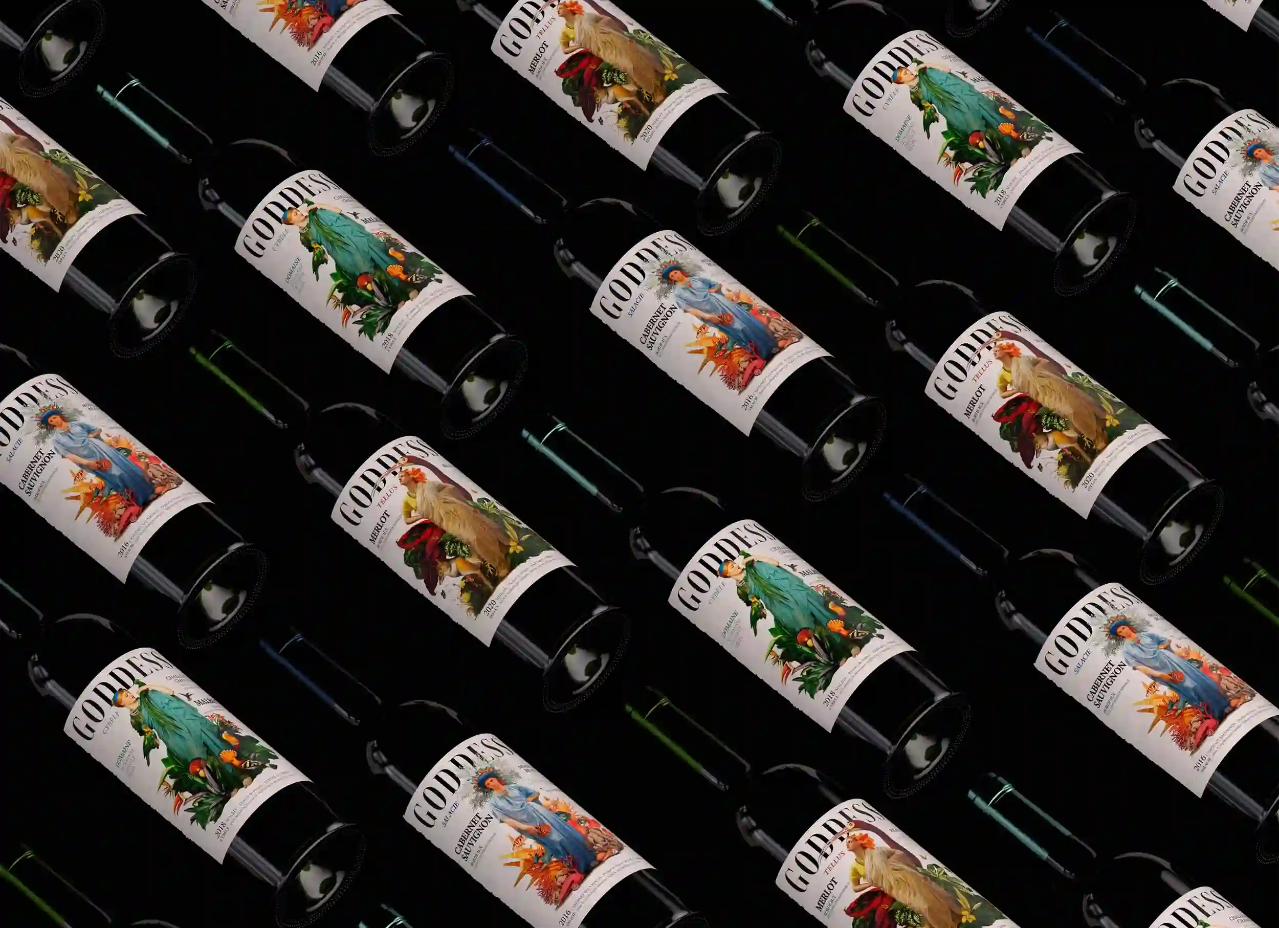
Case Study:Wine Label Design by Ossobüko Studio
Ossobüko Studio’s wine label design perfectly exemplifies the Curated Frames packaging trend. Their work features carefully framed artwork enclosed in defined borders rather than full-bleed designs. The label incorporates intricate illustrations with fine details and lines that elevate the overall aesthetic, while minimalist text allows the framed artwork to dominate the design. This gallery-worthy approach creates a refined, high-end feel that places artistic elements center-stage while maintaining overall design simplicity. The composition mimics gallery presentation or museum curation, instantly elevating product perception by associating the packaging with fine art traditions. This connection to cultural institutions and artistic heritage creates powerful quality associations that extend to the product itself.
12. Conclusion: The Future of Packaging Design
Contemporary packaging design continues to evolve at the intersection of artistic expression, technological innovation, and consumer psychology. The styles explored in this article represent current directions, but the field remains dynamic and responsive to cultural shifts and technological advancements.
Several factors will likely influence future packaging design trends:
- Sustainability imperatives will continue to drive material innovation and design approaches that minimize environmental impact while maximizing brand expression.
- Technological integration will expand, with augmented reality, embedded sensors, and other smart features becoming more accessible and expected.
- Cultural movements and generational preferences will shape aesthetic directions, with Gen Z’s influence growing as their purchasing power increases.
Cross-disciplinary influences from architecture, fashion, digital design, and fine art will continue to inspire new packaging approaches.
For brands navigating this complex landscape, successful packaging design will balance distinctive visual expression with functional performance and alignment with brand values. The most effective packaging will not merely contain products but create meaningful experiences that extend beyond the moment of purchase to build lasting brand relationships.
As packaging design continues to evolve, one principle remains constant: effective packaging must speak authentically to its target audience while fulfilling its practical functions. The styles explored here offer diverse approaches to that challenge, each with unique strengths and applications across product categories and consumer segments.