
1. Strategic context and client ambition
In 2020, this Polish medical aesthetics brand was already an established player in Poland’s medical aesthetics market, running a network of offline beauty salons and building trust primarily through professional in-clinic treatments. At the same time, customer behaviour was clearly shifting: more patients were seeking clinic-level skincare solutions for everyday use at home, and premium skincare in key markets such as Italy and Germany was increasingly framed around scientific efficacy and dermatological credibility.
Against this backdrop, the brand’s leadership began to re-evaluate the limits of a purely service-based model. Remaining focused only on in-clinic procedures risked leaving the daily at-home skincare space to competitors with less medical depth but stronger product ecosystems. Developing its own branded product lines was therefore seen as a logical extension of the existing expertise, allowing the brand to accompany consumers beyond the treatment room and into their everyday routines.
The strategic intent that emerged can be summarised in three directions:
Gradually evolve from a service-only model to a combined in-clinic and product-driven model, increasing recurring revenue and extending the brand relationship between visits.
Position the brand in the mid-to high-end segment of the beauty market, using its medical background to support a distinctly high-end image rather than competing on price.
Treat packaging as a core strategic tool, using form, material and finish to consistently express clinical credibility and modern aesthetics across skincare, colour cosmetics, personal care and future categories such as fragrance.
With this shift, the criteria for selecting a partner also changed. The brand no longer needed a simple catalogue supplier, but a long-term collaborator able to translate brand positioning into concrete packaging solutions—covering structural design, decoration engineering and coordinated supply‑chain planning from initial trials to large-scale production.
2. 2020: From exploratory samples to strategic fit
First contact and sample strategy
The partnership began in October 2020, when the client initiated broad inquiries into plastic and glass skincare packaging suitable for premium European positioning. The objective was not merely to obtain containers, but to map out a spectrum of possibilities: silhouettes, materials, capacities, and finishing options that could anchor a future brand architecture.
In November 2020, the client placed an initial sample order worth several hundred US dollars, covering multiple styles with minimums of 5,000 pieces per design. This phase served as a controlled experiment to test:
Material and functional performance under real product conditions (e.g., active formulations, viscosity, compatibility).
Sensory cues such as weight in hand, closure sound, and surface tactility—critical for high-end positioning.
Alignment between the supplier’s design language and the client’s vision for a modern, premium, medically inspired aesthetic.
Following internal evaluation and informal market feedback, the client was impressed by both execution quality and the freshness of the design proposals relative to prevailing offerings at the time, paving the way for a formal launch project.
Early signal: a partner, not a vendor
This modest order was strategically significant for two reasons. First, it validated that the supplier could meet the technical baseline required for premium European skincare packaging. Second, it surfaced the supplier’s willingness to engage consultatively—clarifying trade-offs, proposing alternatives, and thinking beyond transaction value. This set the tone for a relationship built on co-creation rather than one-off procurement.
3. 2021: First formal launch, process breakthrough, and signature cap
January 2021: High-stakes first rollout
In January 2021, the client committed to its first full-scale project: a 210,000 RMB order using the supplier’s standard bottle molds but with a proprietary graphic and branding design. While the primary structures were “standard,” the requested finishing was anything but:
Complex hot stamping with stringent visual and durability requirements.
Multi-color screen printing with precise registration and legibility on contoured surfaces.
For the supplier, this combination pushed the limits of its then-existing post-processing capability and introduced an early, high-stakes test of technical agility.
Execution required close collaboration between commercial, production, and partner teams:
New technical routes were explored with decoration partners to optimize foil selection, temperature, pressure, and dwell time for hot stamping.
Screen printing parameters—ink systems, mesh, curing profiles—were tuned to ensure crisp lines and long-term adhesion without compromising the stamped metallic layers.
Multiple trial runs were conducted, using feedback loops between the client’s brand team and factory technicians to converge on a consistent, production-ready result.
Ultimately, the team delivered exactly the visual and tactile effect the client had envisioned: sharp metallic accents, clean typography, and a finish robust enough for EU logistics and retail handling. For the client, this first success proved that its packaging partner could translate elevated creative ambitions into reliable industrial output; for the supplier, it validated investment in more advanced decoration capabilities.
April 2021: Designing a signature cap and long-term bestseller
Buoyed by the successful launch, the client quickly elevated its expectations for the next collection, scheduled for April 2021. This time, the brief was not just about decoration; it called for a signature brand gesture: a distinctive cap and logo treatment that could become instantly recognizable and serve as a long-term asset across markets.
Two key requirements defined the project:
A new cap form that would require a dedicated mold, rather than adaptation of an existing component.
A logo integration that felt “engineered into” the object, not simply printed on its surface.
The client’s standards for aesthetics, ergonomics, and consistency were exacting, especially given the expectations of discerning mid-to-high-end consumers in markets like Germany and Italy.
To build confidence, the supplier took a methodical approach:
It presented prior case studies of structurally and decoratively complex caps, demonstrating mastery over tooling, tolerances, and finishing.
It provided renderings and, where relevant, early prototypes to allow the client to judge proportions, hand-feel, and the opening “click” before freezing the design.
It openly discussed material and process trade-offs—such as different resin choices, wall thickness strategies, and finish options—so the client could calibrate between cost, durability, and premium perception.
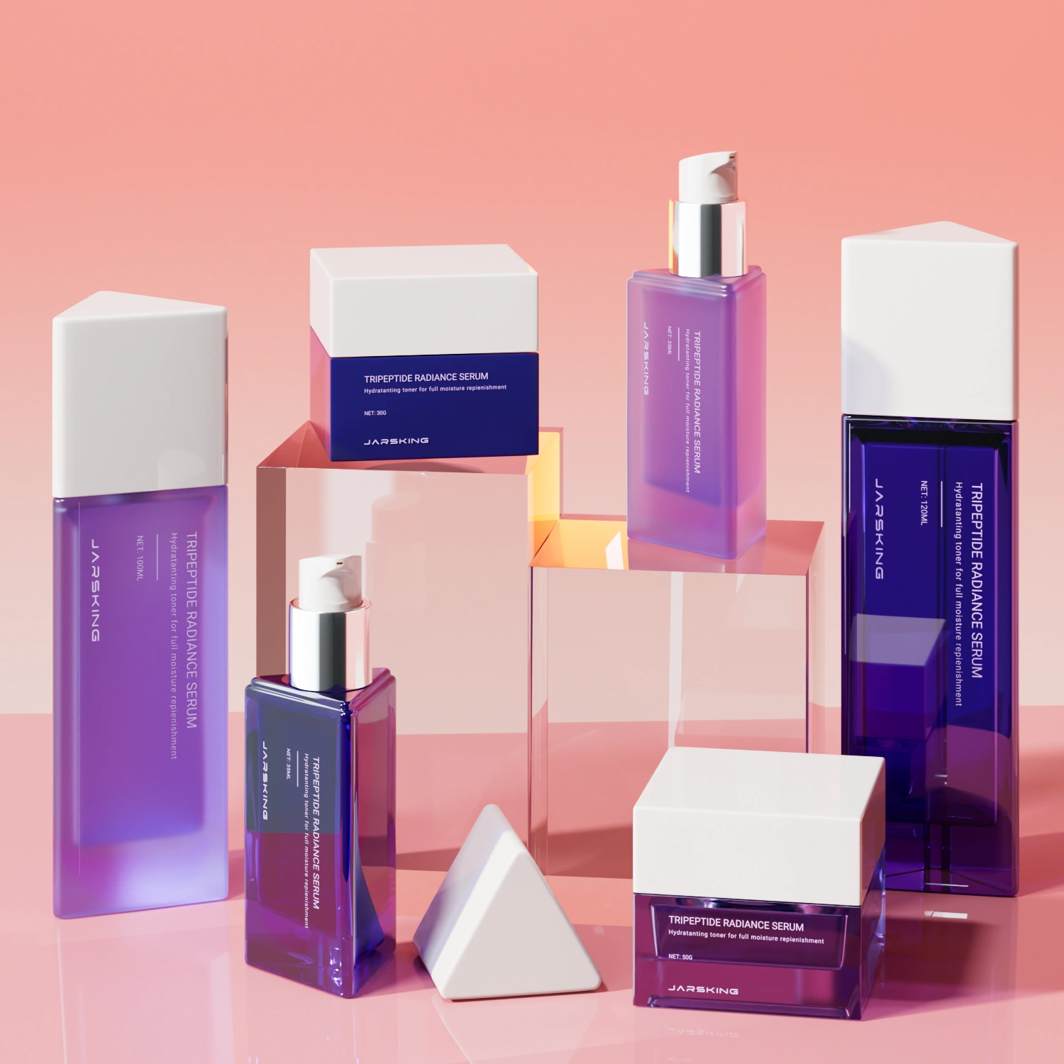
Through multiple rounds of adjustment, the cap’s internal locking system, external geometry, and decoration zones were refined until they harmonized visually with the bottle while meeting all functional and quality constraints. The result was a cap and logo execution that not only met, but elevated, the client’s brand aspirations. The associated series quickly became a long-term bestseller and a cornerstone of the brand’s aesthetic identity, with the order value for this phase rising to 600,000 RMB.
4. 2022–2024: Scaling, diversification, and technical frontiers
From single line to brand platform
From 2022 onward, the partnership shifted from project mode to platform mode. As the brand expanded across categories and geographies, annual cooperation value climbed past 1 million RMB, then to 3 million, and then 4 million. Over this period, the scope of collaboration broadened in several dimensions:
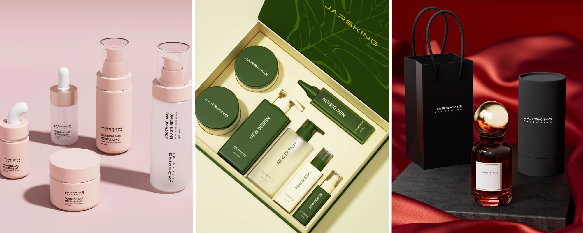
Category expansion: From core skincare into color cosmetics and personal care, with packaging designed to maintain a cohesive visual language while respecting category-specific use patterns.
Format diversification: Introduction of new volumes, dispensing systems, and structures tailored to distinct formulations and consumer routines.
Secondary packaging integration: Development of paper boxes across lines, aligning protective, regulatory, and brand storytelling needs while supporting an increasingly unified shelf presence.
By 2024, the supplier had jointly developed approximately 60 private molds for the client, effectively building a proprietary packaging ecosystem spanning all major lines under the brand umbrella.
2023: Square bottle, square cap—form as a brand statement
In 2023, the client introduced one of the most structurally challenging briefs to date: a series built around a square bottle paired with a square cap. The intent was clear—create an instantly identifiable form factor that could stand out in a sea of cylindrical packaging and serve as a visual shorthand for the brand.
From an engineering standpoint, square packages present complex constraints:
Risk of warpage and uneven wall thickness, particularly at corners and panel centers.
Higher visibility of even minor misalignments between bottle and cap faces.
Increased scrutiny of surface flatness and edge definition, since any distortion is immediately noticeable.
The engineering team engaged deeply with tooling and process partners:
Structural design was iterated to balance aesthetics with manufacturability, optimized gate locations and cooling strategies helping control shrinkage and stress.
The interface between cap and bottle was refined to maintain clean, face-to-face alignment and a precise, repeatable closing action.
Samples underwent mechanical and handling evaluations to ensure robustness in filling, transport, and consumer use.
After several months of development, the team achieved stable mass production: the square bottle and cap combination delivered both the desired visual impact and the necessary structural integrity at scale. This series effectively established a new icon within the brand’s portfolio.
2024: Synchronizing embossing and hot stamping
In 2024, the client advanced the aesthetic brief further with a highly specific requirement: a logo that would be both embossed and hot-stamped, with perfect spatial synchronization between the raised relief and the metallic foil. This was not a minor decorative tweak; it was a manufacturing challenge at the intersection of tooling precision and process control.
Key technical issues included:
Die design: Embossing and stamping tools had to be coordinated so that relief depth and foil coverage matched exactly, without halos, misregistration, or distortions.
Process sequencing: The team needed to determine the optimal order and conditions for embossing and stamping to prevent deformation, foil cracking, or loss of definition.
Repeatability: The solution had to be robust enough for high-volume runs, not just achievable in small pilot batches.
The backend technical team undertook multiple experimental cycles, adjusting embossing parameters, refining stamping conditions, and fine-tuning registration methods until alignment between tactile and visual elements was consistently precise. The resulting logo execution, combining three-dimensional relief with a crisp metallic finish, became a hallmark of the brand’s renewed premium expression—and a concrete demonstration of the supplier’s ability to solve “first-time” problems rather than only replicate established routines.
5. Mold development for custom glass packaging
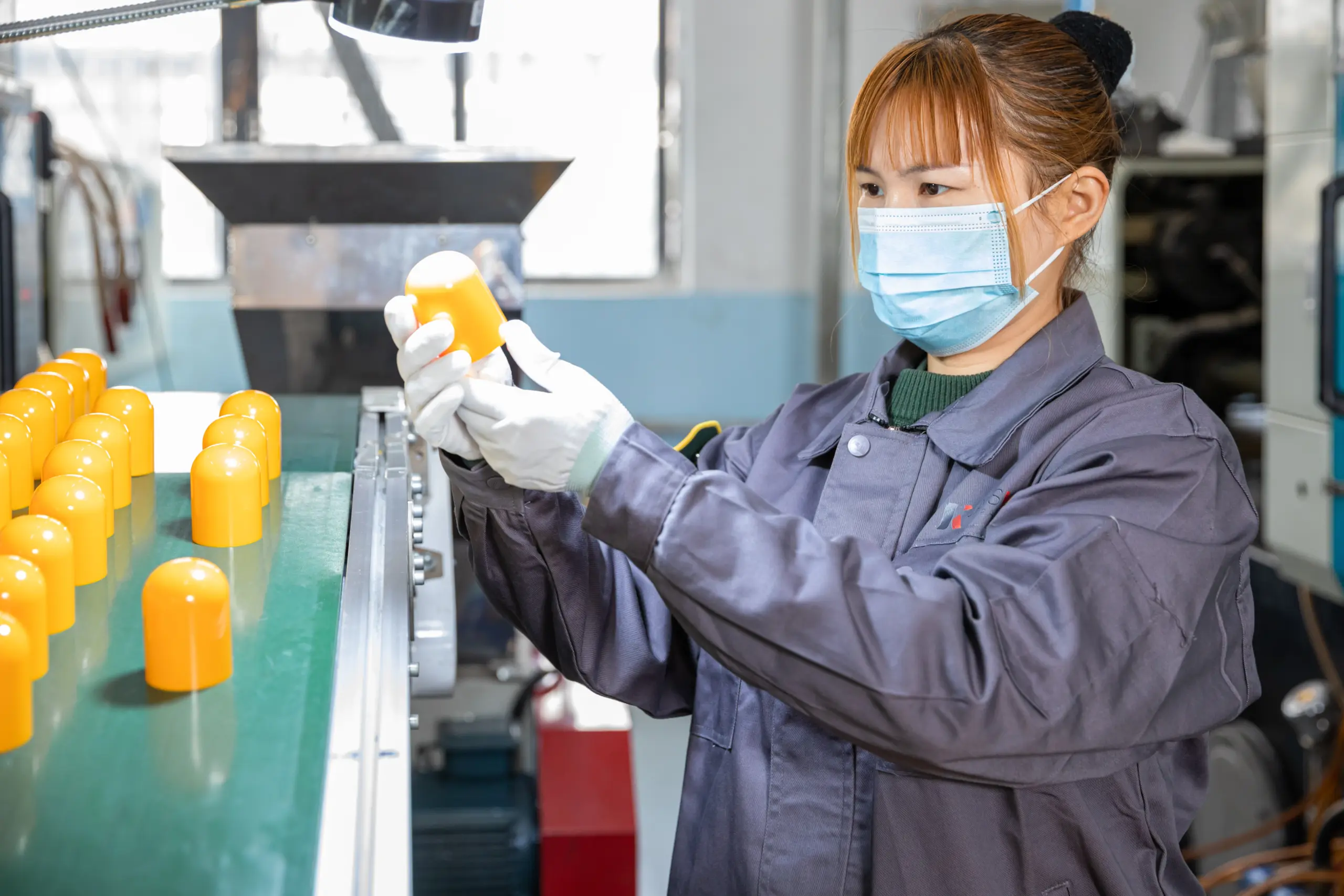
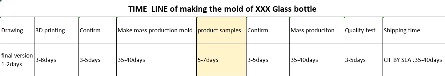
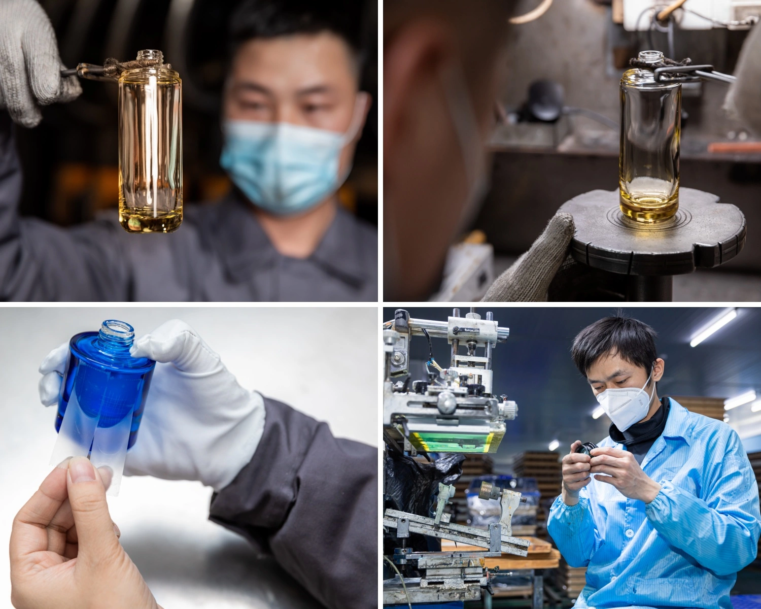
As our collaboration with this Polish brand evolved from using standard components to creating more than 60 private molds, mold development became one of the most critical pillars of the project. We quickly realised that every new glass bottle or jar had to be engineered as carefully as it was designed: before any steel was cut, our industrial designers and engineers aligned on target capacity, glass weight, wall-thickness distribution and centre of gravity, so the chosen silhouette could run stably on high-speed glass lines while still meeting impact and temperature-resistance requirements for international transport. At the same time, we focused on the “invisible” functional interfaces—the neck finish, thread profile or crimp ring—designing these to recognised industry standards to ensure that pumps, droppers and caps from different suppliers would assemble reliably without leakage or stress fractures.
Once the overall geometry was defined, we moved into the details that most consumers never notice but that determine whether a design can succeed in production. We refined draft angles, corner radii and engraving depths to balance the brand’s aesthetic expectations with the realities of glass forming: edges were softened just enough to avoid chipping, and logo or pattern depths were calibrated so they would read cleanly without trapping glass or creating weak points. In parallel, our process engineers planned the mold-cooling strategy and target gob (glass drop) weight, because these parameters directly influence how glass fills the cavity, how evenly it distributes in the shoulder and base, and how consistent weight and critical dimensions will be over large runs.
Before we committed to full multi-cavity production molds, we typically ran short tests using pilot cavities. These pilot runs allowed us to observe real glass behaviour on the line—identifying potential issues such as bubbles, stones, flow lines, uneven thickness or surface waviness—and to verify how the surface responded to the planned decoration processes, including frosting, spraying, screen printing and hot stamping. Based on what we learned, we fine-tuned cavity geometry, venting and cooling-channel layout before manufacturing the hardened steel molds that would run in mass production, ensuring a stable process window with controlled weight variation, consistent critical dimensions and a cosmetic quality level that matched the brand’s premium medical-aesthetics positioning.
6. 2025: One-stop ecosystem and entry into fragrance
Tens of millions in annual cooperation
By 2025, the relationship had matured into a high-value strategic partnership, with annual cooperation reaching the scale of tens of millions of RMB. Multiple product families across the brand now relied on the supplier’s packaging, including:
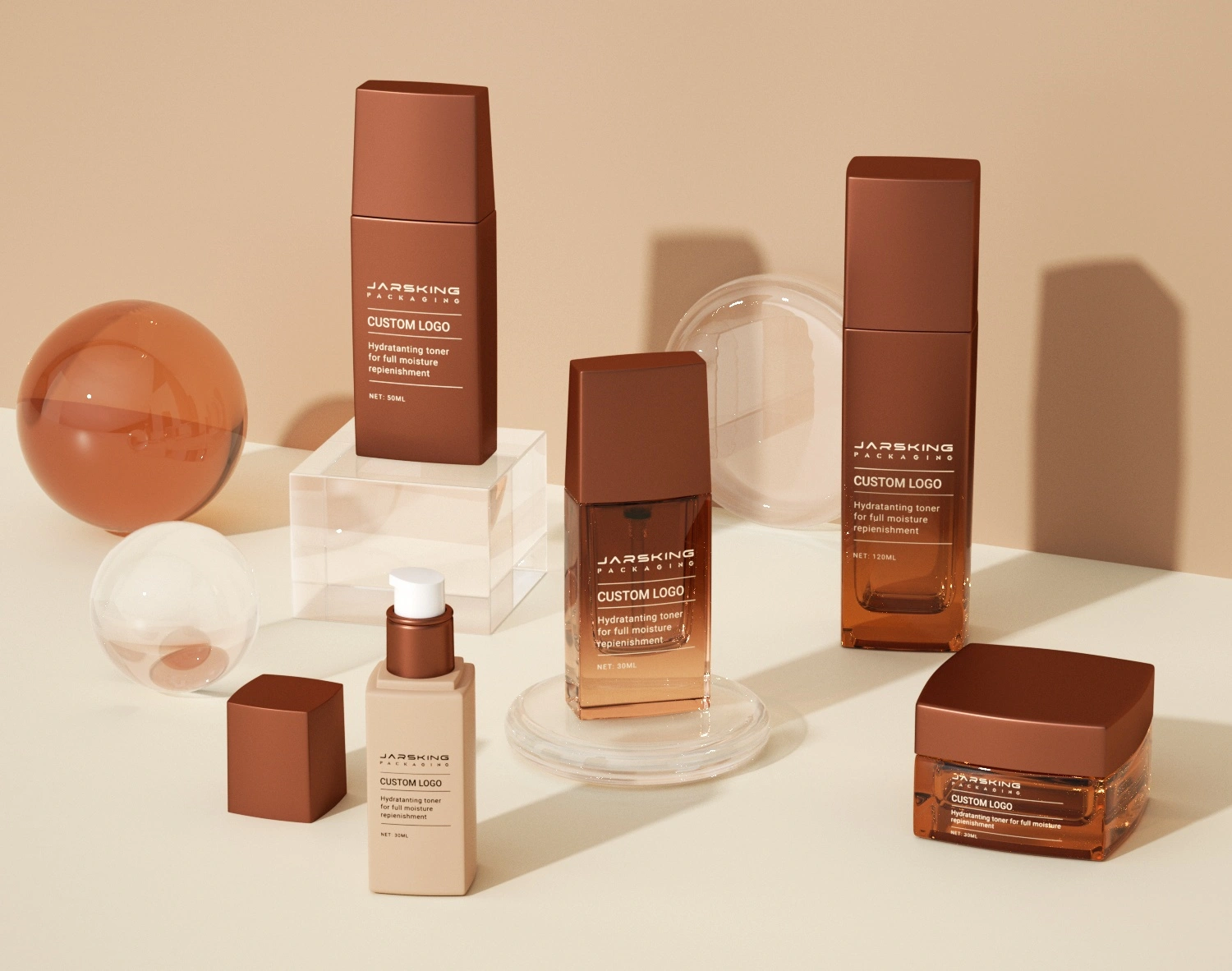
Core skincare (serums, creams, lotions, toners, cleansers) across glass and advanced plastics.
Personal care lines that extended the brand from the face to the full body, yet remained visually aligned with the original skincare codes.
The supplier’s remit covered not only primary packaging but also a wide range of secondary cartons, allowing the brand to execute fully integrated launches without juggling multiple vendors.
Beginning exploration of perfume packaging
In 2025, the partnership progressed into yet another category: perfume packaging. Fragrance typically sits at the pinnacle of brand storytelling and requires:
Distinctive bottle silhouettes with high-precision glass forming.
Complex caps that may integrate metal, resin, or decorative elements.
Often more elaborate secondary packaging, including rigid boxes or special inserts.
By bringing perfume into the portfolio, the brand signaled:
A full lifestyle positioning, extending from clinic-grade skincare to sensorial, aspirational products.
Confidence in its packaging partner’s ability to manage even more demanding technical and aesthetic challenges.
7. Consultative service model and supply chain management
From vendor to strategic partner
Over the years, the supplier’s role evolved from a product provider to a strategic partner deeply integrated into the client’s brand operations. Key aspects of this evolution included:
Consultative sales: The front-end sales team did not simply take orders but actively advised on pack selection, MOQs, lead times, and configuration based on market plans and seasonal peaks.
Demand planning support: The team helped the client plan inventory and replenishment cycles ahead of major peak seasons (e.g., holiday, Black Friday, special campaigns), ensuring product availability while controlling stock risk.
Risk mitigation: Early warning on material constraints, decoration capacity limits, and logistics disruptions allowed joint contingency planning.
This model aligned well with broader industry shifts in Europe, where premium brands increasingly seek packaging partners who can contribute to commercial strategy and operational resilience, not just supply components.
Backend technical backbone
The backend technical team played an equally critical role:
Rapid troubleshooting of production issues, such as minor color variances, adhesion tests, or tooling adjustments.
Continuous process improvement, leveraging learnings from one series to enhance future ones (e.g., optimizing stamping dies or improving square bottle cooling patterns).
Close collaboration with raw material suppliers to adopt new coatings, foils, or resins that support both aesthetic and environmental objectives.
This strong front-end/back-end synergy allowed the partnership to maintain high reliability even as complexity increased across SKUs and markets.
8. Strategic impact on the client’s brand
Brand elevation and European market fit
Through this partnership, the client was able to build a coherent, premium design language across all categories—skincare, cosmetics, personal care, and emerging perfume—critical for success in mature, competitive markets like Germany and Italy. The combination of:
Heavy, clear glass or high-quality plastics.
Clean, mostly minimalist forms with distinctive structural details.
Advanced decorations such as synchronized embossing and hot stamping.
positioned the brand credibly against established international players, at a premium but accessible price point consistent with mid-to-high-end positioning in Europe.
Speed to market and innovation cadence
Because the supplier could manage both structural innovation (new bottle and cap shapes, private molds) and decoration innovation (new effects, embossing-plus-stamping, special finishes), the brand was able to:
Maintain a steady cadence of new product launches and refreshed series.
Quickly respond to evolving consumer preferences for minimalism, tactile luxury, and perceived sustainability.
Create “hero” SKUs such as the best-selling cap and logo series that anchored their brand image and became recognizable icons.
This innovation rhythm is especially important in the beauty sector, where trends move quickly and first-mover advantage in design can translate into significant incremental sales.
9. Relationship dimension: Trust and “co-creation”
Beyond numbers and technical achievements, the partnership created significant relational value:
Regular communication at both operational and management levels strengthened understanding of each side’s constraints and priorities.
Success in difficult projects, such as the 2023 square bottle and the 2024 embossed-plus-stamped logo, built a shared sense of achievement.
The supplier began to be treated not just as a vendor but as a co-creator of the brand’s physical identity and long-term strategy.
In turn, this trust made it easier for both parties to:
Commit to new mold investments with confidence in the expected payback.
Share market intelligence and insights about trends in European cosmetic packaging and medical aesthetics.
Jointly explore higher-risk innovations, like the new perfume line, knowing that both sides were aligned for the long term.

10. Strategic takeaways
For brands
- Treat packaging as a strategic asset early
For medical aesthetics and clinic-origin brands, packaging is often the first point where professional credibility and consumer-facing luxury meet. It needs to signal both “this works” and “this feels worth paying for” through material choice, form, weight, colour, and finishing. When these decisions are made at the same level of importance as formulation and marketing, packaging becomes a growth lever: it supports premium pricing, improves shelf and screen recognition, and creates a clear visual link between in-clinic services and at-home products. - Choose partners, not just suppliers
As soon as a brand moves beyond simple stock components, it depends on partners who can think with it, not just quote and produce. A partner that understands launch calendars, regulatory constraints, and the realities of multi-market distribution can help balance aesthetics, cost, and feasibility long before issues appear on the line. This kind of collaboration is especially valuable when planning for peak seasons, synchronising global launches, or phasing in design upgrades without writing off existing inventory; it turns the packaging supply chain into a structural advantage rather than a recurring bottleneck. - Build a coherent packaging ecosystem, not isolated SKUs
When a brand spans multiple lines, price tiers, and demographics, isolated one-off designs easily fragment the identity. Treating the portfolio as a packaging ecosystem—shared proportions, repeated structural cues, related cap philosophies, controlled colour systems—creates instant recognition across shelves and digital listings. In this case, the 60+ private molds did more than give variety; together they formed a visual language that made products look related even when they targeted different ages, concerns, or price points, reinforcing trust at every touchpoint from clinic to e-commerce and retail.
For packaging and solution providers
- Invest in both front-end and backend sophistication
Long-term, high-value collaborations emerge when consultative commercial work and deep technical capability move in step. On the front end, this means being able to interpret brand strategy, challenge unclear briefs, and advise on SKUs, MOQs, and timings. On the backend, it means having the engineering depth to handle new structures, complex decorations, and multi-component systems with consistent quality. When both sides are strong, packaging providers can participate in roadmap discussions rather than only reacting to finished artwork or last-minute RFQs. - Use challenging briefs as capability accelerators
Unusual requests—square bottles with tight face alignment, caps combining debossing and hot stamping, multi-category architecture under one brand—are demanding, but they also force teams to refine tooling design, process control, and quality systems. Each solved challenge becomes a reference case and a reusable methodology that can be offered to other clients. In this way, difficult projects contribute directly to the provider’s competitive differentiation and justify investment in more advanced technology and talent. - Aim for one-stop, cross-category support where appropriate
When brands expand from facial skincare into body care, hair care, colour cosmetics, fragrance, and gender-specific lines, coordinating multiple suppliers quickly becomes complex. Providers that can cover primary and secondary packaging across these categories, and manage components like pumps, droppers, sprayers, inserts, and gift-set structures, create systemic value: fewer interfaces, faster alignment, and more consistent execution of the design system. This level of integration also makes it easier to roll out new ranges or refresh existing ones without re-engineering the supply base each time, supporting sustainable, long-term growth on both sides.
11. Outlook
The partnership has reached a stage where the brand’s growth ambitions, our accumulated technical capabilities, and the wider market environment are closely aligned. As the Polish medical aesthetics brand extends from clinic-based origins into broader lifestyle territories and more channels, the focus of our collaboration will naturally shift from “building the system” to “optimising and differentiating within it.”
In the near term, one priority will be exploring more sustainable materials and structures—such as higher recycled content, more easily separable components, and lighter-weight designs—while preserving the sense of weight, precision, and finish that underpins the brand’s premium positioning. In parallel, there is considerable scope to use the existing structural platform as a base for limited editions, gift sets, and potential refill solutions, allowing faster launches and stronger storytelling without restarting engineering from zero each time. As distribution broadens across offline, online, and cross-border channels, further refinement of the brand’s signature design codes—proportions, cap language, surface treatments and colour systems—will help maintain a consistent, instantly recognisable identity in very different retail and digital contexts.
What began as a small sample order in late 2020 has therefore evolved into a long-term co-creation engine: a partnership where packaging is not a finishing step, but an ongoing strategic tool that supports the brand’s transition from a local medical aesthetics operator into a distinctive, credible, and scalable beauty player.
FAQs
What kinds of brands are a good fit for this type of packaging partnership?
Clinic-origin beauty brands, indie skincare labels, salon or spa chains, and established cosmetics or personal‑care companies that want long‑term, coherent packaging across lines are all a good fit. The model works best when a brand is building a portfolio and roadmap, not just a one‑off product.
Does it make sense to start this kind of collaboration when volumes are still small?
Yes. The featured Polish medical aesthetics brand began with small test orders and gradually scaled to tens of millions of RMB in annual cooperation. Starting early allows structural and visual systems to be set up correctly, avoiding costly redesigns as the business grows.
Beyond supplying bottles and jars, what support can a packaging partner provide?
Support can include line and tier architecture, structural input, custom mold development, decoration engineering, and matching of pumps, sprayers, droppers, and caps. Many partners also coordinate secondary packaging such as cartons and gift‑set boxes to keep everything visually aligned.
How is visual consistency maintained when expanding into new categories and demographics?
A design-system approach is used: stable rules for proportions, cap language, typography and key finishes apply across skincare, body care, hair care, fragrance and men’s grooming. Within that framework, colour, material and detail changes differentiate age groups, skin concerns and price tiers without fragmenting the brand.
Can technically complex briefs—like square glass, special caps or combined embossing and hot stamping—be handled in this model?
Yes. The case study includes square bottle‑and‑cap structures, precision hot stamping on curved surfaces, and caps with combined debossed/embossed logos and metallic finishes. Such projects are treated as capability‑building exercises, with learnings reused for future developments.
What does the collaboration process normally look like from first contact to mature cooperation?
It usually starts with understanding positioning, selecting or lightly customising initial packs, and running small validation batches. Over time, the work expands to private molds, more categories, integrated decoration development and coordinated production and logistics for multiple launches per year.