


Before a consumer experiences fragrance, texture, or flavor, there is a tactile moment of truth—the engagement with the bottle cap. This instant—turning, flipping, pressing, or spraying—forms the very first physical dialogue between user and product. The cap is not simply a closure; it is the primary human interface through which a brand communicates intention, value, and usability. In that one second of contact lies the potential to either delight or frustrate the user.
While marketing teams obsess over logo placement or bottle silhouette, the user experience (UX) of closures often escapes focused attention. Yet in ergonomic terms, few packaging elements carry such experiential weight. Each type of cap represents a behavioral interaction—requiring motor coordination, sensory feedback, and situational ergonomics. As neuroscience and consumer psychology research show, these first-contact experiences strongly anchor brand perception and user loyalty, particularly for daily-use products.
This blog reframes the plastic cap through the lens of UX design—borrowing concepts from human-centered design (HCD) and interaction ergonomics—to reveal how closure choices shape not just product functionality, but emotional satisfaction and accessibility.
1. The Philosophy of First Contact
At the core of user experience (UX) design in packaging lies empathy: the intention to deeply understand how the end user perceives, manipulates, and emotionally interprets a closure—whether it is a twist open/close screw cap, a one-hand flip top, a press-to-open disc top, or a secure child-resistant cap (CRC). Great closure UX makes the dispensing method—opening, dosing, and resealing—an effortless, almost subconscious extension of the human body’s capabilities rather than an obstacle or source of frustration.
Functionality: Cognitive Predictability and Product Fit
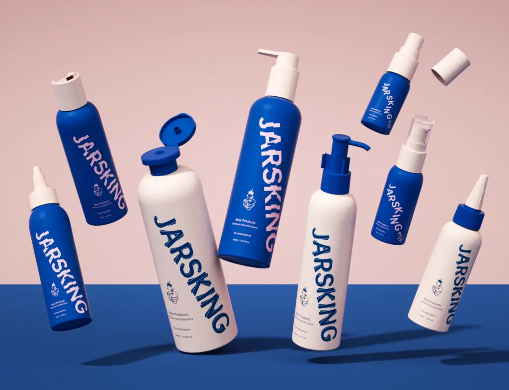
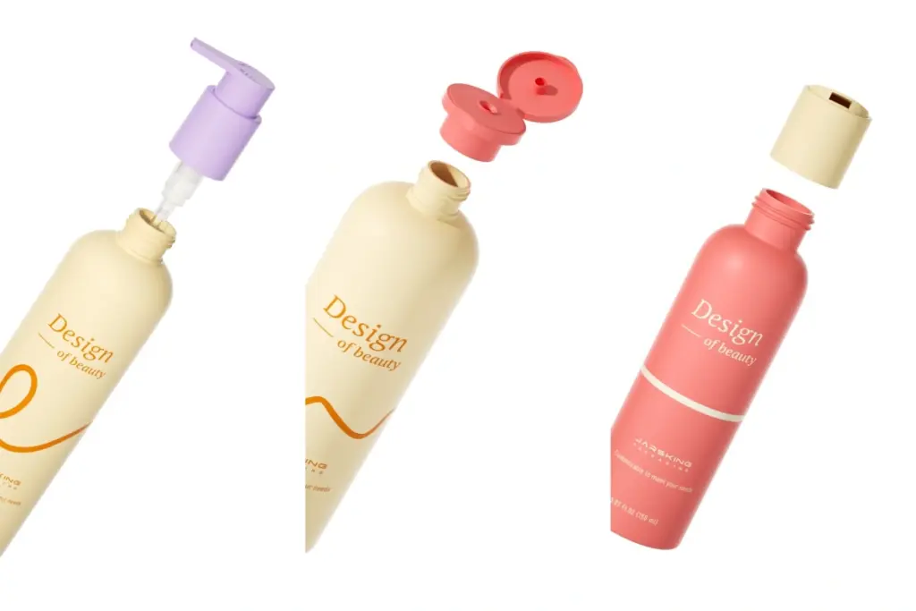
A closure’s functionality encompasses its ability to reliably open, close, and preserve the product. Users must instantly understand, for example, if the cap requires a twist, a one-handed flip, a press, a squeeze, or a push-and-turn motion. Recognizable patterns—like the rotational torque of a screw cap on oil or shampoo, or the thumb-activated hinge of a flip top cap on shower gel—help build cognitive predictability.
Products with high viscosity, such as lotion or hand wash, benefit from pump head dispensing, which delivers precise, single-handed dosage. Comparably, pump mechanisms in hospitality and personal care not only improve functionality but also hygiene, showing how a cap’s role is pivotal in matching product attributes with optimal dispensing method. For mist sprayers—used in personal care or fragrance—users intuitively expect a spray when pressing the actuator, with a satisfying spray pattern confirming correct operation.
Usability: Physical Comfort and Accessibility
Physical comfort in cap design pertains to the effort, grip, and dexterity required to operate the closure. A user should not struggle with a snap-on cap on a beverage or a tight child-resistant cap on medication. Flip tops and disc tops, employing either a lever or pressure motion, ease access compared to traditional screw caps and screw-threaded closures—especially in conditions where grip is compromised, such as in the “In-Shower Challenge”. For users with reduced hand strength, such as children or the elderly, press-to-open disc tops, ergonomic pump heads, or easy-press snap-ons dramatically improve usability and inclusivity.
Usability also means consistency: the force required to actuate a flip-top or secure a tamper-evident cap should be balanced—not too stiff to deter access, nor too loose to risk leakage.
Look-and-Feel: Emotional Resonance and Sensory Cues
Emotional resonance emerges from how a cap feels and sounds in the hand. The tactile “click” of a closing flip top or the clean snap of a press-on cap provides sensory confirmation akin to the feedback from digital interfaces. The look and surface finish—be it the high-gloss of a protective overcap for premium perfume, the matte texture of a safety-focused CRC, or the transparent tip of a dropper cap—support the perception of luxury, purity, safety, or simplicity.
Properly engineered trigger sprayers combine contour and tactile feedback, supporting long use in cleaning or horticulture without hand fatigue, while the audible “crack” of a tamper-evident cap signals integrity and safety to consumers in food, pharma, and beverage products.
Evaluation: Measuring and Iterating for the Best Cap Experience
The evaluation aspect of FULE means systematically testing closures for user experience excellence. This includes user studies—like observing how intuitively people open a twist spout/nozzle on hair dye, or how much torque is needed to pop open a press-on cap on beverages.
Brands conduct sensory mapping, A–B user preference trials, and ergonomic force measurements across all cap types and dispensing methods. Evaluation feedback guides improvements—reducing unnecessary opening force in CRCs, adjusting the hinge stiffness on flip tops, or optimizing the thread design in screw caps for faster, smoother engagement.
2. The “In-Shower Challenge”
Few environments highlight the strengths and weaknesses of cap design more than the shower—a true arena for user experience (UX) and ergonomic validation. Here, sensory conditions are compromised: hands are wet and slippery, vision is often reduced, and temperature fluctuates rapidly. Time and attention are limited, and users need fast, intuitive access to products such as shampoo, conditioner, or body wash.
Screw Caps:
Twist open/close screw caps are widely appreciated for their cost-effectiveness, simplicity, and compatibility with a wide variety of bottles—making them the default for many personal care, food, and household products. However, their limitations show in the shower. When water and soap reduce hand friction, smooth cap surfaces cause fingers to slip, and threaded mechanisms can misalign, resulting in leaks and user frustration. The repetitive, two-handed unscrewing motion adds cognitive load and breaks the flow of the routine, especially when multitasking. Such experiences illustrate why modern UX research advocates for low-effort interaction in packaging, emphasizing the need to minimize unnecessary wrist flexion and grip force.
Flip Top Caps:
By contrast, flip top caps are engineered for ergonomic excellence in wet conditions. With a one-handed flip and controlled flow, often performed by the thumb, consumers enjoy intuitive, seamless product access. The lever-hinge design guarantees just the right resistance: sturdy enough to avoid accidental opening during transport, yet light enough to operate with minimal grip in slippery circumstances. Industrial studies show that high-quality polypropylene hinges can endure more than 10,000 cycles without cracking—a durability standard that underpins premium user experience. Combined with effective sealing, flip tops provide good product protection and easy dispensing, driving repeat usage and brand loyalty in beauty, personal care, and food products.
Disc Top Caps:
Disc top caps further refine UX with their press-to-open, pressure-based activation. The cap delivers precise volumes, often enforced by built-in silicone valves, which keep flow consistent regardless of force—reducing spills and enabling neat, one-handed operation. This design supports controlled product dispensing for liquid soaps, shampoos, and conditioners in the beauty and hospitality sectors. Users benefit from effortless, non-drip performance, even when dexterity is compromised, making disc tops a key choice in both everyday and professional settings.
Technical and Emotional Impact:
These design subtleties—whether a simple twist, ergonomic flip, or tactile press—dramatically influence user satisfaction. Less product waste, reduced spill risk, and smoother routines mean the closure is not just functional but a silent participant in daily wellness. In business terms, these seemingly small differences build long-term loyalty and drive positive word-of-mouth; users return to solutions that respect their real-life challenges.
For everyday consumers, these seemingly small design differences translate into meaningful experiences: less waste, fewer spills, and smoother routines. From a business perspective, that translates into repeat purchase behavior—UX loyalty through ergonomic empathy.
3. Luxury vs. Convenience — The Emotional Dimension
Luxury packaging communicates ritual, while convenience packaging prioritizes utility. The closure is the medium through which that psychological promise is fulfilled.
High-End Droppers: A prestige facial serum, for instance, employs a dropper cap not merely to dispense fluid but to choreograph a care ritual. The consumer draws serum into the pipette, places precise droplets, and associates slowness with care. From a UX perspective, this deliberate pace nurtures emotional engagement, product trust, and mindfulness—traits aligned with luxury identity. The controlled tactile resistance of the rubber bulb enhances sensory satisfaction through compression feedback.
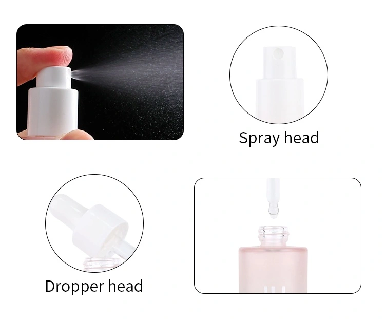
Mist Sprayers: Conversely, a facial mist or sanitizer depends on immediacy and portability. Here, atomization efficiency and spray comfort form the crux of UX. A well-engineered closure delivers a fine, even mist (typically between 40–80 micrometers in droplet diameter). The tactile travel of the actuator—neither too clunky nor too loose—creates an experience of effortless refreshment. This mechanical “feel” becomes synonymous with brand reliability.
Design Psychology:
This dichotomy—deliberateness versus immediacy, ritual versus utility—reflects divergent UX philosophies:
Luxury packaging with droppers encourages mindfulness, deeper brand attachment, and feelings of exclusivity. The consumer’s identity is shaped through the act of care and the tactile sensation of the cap.
Convenience packaging with mist sprayers or flip tops supports autonomy, quick emotional uplift, and a seamless flow between product and user.
Yet both approaches share a core design principle: the closure as the bridge between brand promise and product delivery. Whether it’s the compressive haptics of the rubber bulb on a dropper or the smooth travel of a mist sprayer actuator, every touchpoint is engineered to reinforce the emotional narrative of the product.
Strategic Alignment:
Leading brands leverage closure selection not just for technical fit, but for emotional coherence with their audience. High-end serums feature dropper caps to slow users down, build anticipation, and convey trust. Daily mists, on the other hand, feature spray actuators offering immediacy and satisfaction, anchoring memory and habit.
4. The Science of Touch and Perception
Neuromarketing and sensory design research show that touch and sound—the haptic and auditory elements of packaging—shape user perception of quality and trust. When a consumer twists a cap, presses a pump, or hears a closure “click,” the brain interprets these physical cues as reassurance of safety, performance, and sophistication. In closure design, the user’s hand becomes not just a tool of interaction but a sensor for brand integrity.
Modern UX-oriented packaging engineers integrate tribological engineering—the study of friction, lubrication, and material contact—to refine how consumers physically experience caps. The interaction between skin and material is tuned carefully; too little friction causes slips, while too much creates discomfort or torque fatigue. To balance this, microtexture mapping achieved through laser engraving or mold etching allows designers to modulate surface roughness and the coefficient of friction, ensuring a secure and comfortable grip under both dry and wet conditions—a vital improvement for environments like the “In Shower Challenge.”
Surface chemistry and micro-topography modifications are equally important. For instance, matte finishes on pump heads or textured ribbing on twist spouts increase confidence during handling, while gloss-coated flip top caps emphasize cleanliness and aesthetic smoothness. These design nuances influence the user’s unconscious sense of reliability and hygiene, key attributes in personal care, food, and pharmaceutical packaging.
Sound plays an equally powerful role in perception. Audio-enhanced packaging studies have shown that sound branding elements—such as the satisfying click of a flip-top snap or the deep thunk of a screw cap lock—create strong emotional associations with safety and quality. Manufacturers now engineer closure acoustics to resonate within a targeted decibel and frequency range (often between 600–1200 Hz), evoking the sensory satisfaction similar to that of closing a luxury car door. This auditory precision reassures the user of a proper seal, enhancing product credibility and pleasure in use.
Collectively, these haptic and auditory refinements embody multisensory UX design—the deliberate orchestration of tactile friction, actuation resistance, and closure sound to build cognitive trust and emotional comfort. Every microscopic ridge and every engineered click represent not just mechanical reliability but the subtle craft of perceived excellence: a language of touch that defines how the consumer feels about the brand long before the product is even dispensed.
5. Accessibility and Inclusive Design
Inclusive packaging is rapidly becoming a foundational element of user experience innovation, driven by demographic changes such as aging populations, increasing rates of arthritis, and the needs of users with temporary or permanent mobility challenges. Truly accessible products ensure safe, comfortable, and dignified interaction for everyone—making user-centered design a measure of both brand responsibility and competitiveness in the marketplace.
Child-Resistant Caps (CRCs) in Focus:
Child-resistant caps, especially the classic push-and-turn format, are essential in pharmaceuticals, and household chemicals for preventing accidental ingestion. However, these mechanisms can exclude seniors and people with limited dexterity due to high torque requirements or confusing two-step operations. Medical device ergonomics research consistently stresses the need to reconcile safety compliance with human inclusivity—ensuring child safety doesn’t mean sacrificing usability for older or differently-abled adults.
Innovative Responses to Accessibility:
Ergo-adaptive CRCs: Newer designs integrate spring-assist features that reduce necessary opening torque by up to 30%, benefiting users who have less grip strength while still meeting ISO 8317 and ASTM child-resistance standards.
Cap Assist Sleeves: External ribbed textures or soft-touch bands improve grip, allowing for easier manipulation even in wet or weak-hand conditions. Larger surface areas and improved tactile cues increase accessibility for those with arthritis or nerve conditions.
Smart CRCs: The future is now seeing digital enhancements such as NFC- or QR-enabled closures. These can confirm safety via apps or even biometrics, providing secure access without demanding physical force, and opening the door to “digital dual-verification” for high-risk medications.
Universal Design Principles:
Well-designed child-safe caps balance physical effort (lower torque, better grip design) with cognitive clarity (intuitive cues, clear icons, tactile guides, and simple instructions). Universal design strategies embed high-contrast visuals, braille or tactile markers, and one-handed operation, making packaging functional across the widest spectrum of users without adaptation.
Brands are increasingly treating accessibility as a core metric of innovation and social impact, not just an ethical add-on. The best inclusive packaging communicates opening direction, uses materials that reduce the required force, and tailors its mechanism for equitable use—proving that usability, safety, and dignity can coexist in contemporary closure design.
6. Material Behavior and Emotional Authenticity
Material choice in packaging is a subtle but powerful driver of user experience—the tactile and thermal qualities of cap materials shape how consumers perceive both function and emotion at the moment of first contact. For example, smooth, rigid polypropylene caps instantly communicate clean functionality and robust sealing, often preferred for everyday personal care, household, and food products. By contrast, matte or soft-touch elastomers (such as those found on luxury dropper caps or ergonomic sleeves) evoke warmth and sensorial comfort, making the interaction feel more gentle and premium.
The temperature diffusive property of a cap (thermal diffusivity) influences perceived luxury: slightly cool, weighty caps are associated with credibility and refinement, while warmer, softer finishes signal approachability and care. Many premium brands exploit this nuance by adding subtle metal inlays or using glass for dropper bulbs, signaling exclusivity and quality through sensory cues alone.
Micro-texture patterns and tactile surfaces further elevate brand identity and grip. Patterns etched or molded into the cap surface—ribbing, knurling, or laser micro-texturing—not only help users open and close bottles under different conditions (wet hands, reduced dexterity) but also form a memorable sensory “signature.”
Manufacturing precision is essential for building and maintaining psychological authenticity. Factors like misaligned threads, uneven parting lines, or squeaky living hinges erode user trust by suggesting poor quality control. This is why packaging UX begins at the mold level: high-precision CNC machining (±0.02 mm tolerance) ensures that every closure delivers consistent torque, click feel, and fit across mass production batches, supporting a seamless and reliable brand experience.
Ultimately, the physical and emotional response to cap material—grip, comfort, perceived temperature, and repeatable precision—lays the foundation for trust, desirability, and lasting consumer loyalty in modern packaging design.
7. Sustainability Meets Experience
Eco-design in closures is reshaping the physical and emotional experience of packaging, challenging the assumption that sustainable materials must compromise tactile appeal or usability. Forward-thinking brands are proving that sustainability and ergonomics can—and must—coexist as part of a modern UX narrative.
Post-Consumer Recycled (PCR) Materials:
Switching to PCR polypropylene or PET, now common in caps and bottles, introduces subtle changes in tactile quality. These materials tend to have a slightly grainier feel compared to virgin plastics, resulting from the nature of the recycled resin and its processing. Instead of treating this as a drawback, leading brands texture PCR surfaces to evoke natural, authentic aesthetics—a sensory cue that signals environmental responsibility and differentiates the product as eco-conscious. Matte, textured finishes also help mask minor visual inconsistencies typical of recycled content, all while reducing resource use and carbon footprint.
Mono-material Assemblies:
A trending innovation is the use of mono-material packaging, where both bottle and cap are made from the same polymer (often polypropylene or PET). This approach dramatically simplifies recycling—no need to separate disparate materials—enticing consumers with clear sustainability benefits and resulting in more efficient sorting and higher-quality recyclables. Mono-material designs reinforce mechanical consistency, color matching, and durability while supporting circular economy goals.
Tethered Caps:
Regulatory changes, particularly in Europe, now require many caps to be tethered (permanently attached) to the bottle, ensuring they are recycled together and not lost as waste. Thoughtful hinge geometries and flexible living hinges maintain user trust and comfort, demonstrating ecological intelligence without functional compromise. Brands must communicate the rationale and utility of tethered closures, as initial consumer studies found some skepticism or irritation—education and intuitive design are key to driving acceptance and linking sustainability to positive user experience.
UX as Sustainable Narrative:
Sustainability is no longer just a corporate responsibility; it is now a central part of the consumer’s emotional journey. Users should feel sustainable intent not just through environmental claims, but directly through the tactile experience—grip, durability, and surface honesty. When a cap is easy to use, visually honest in its material, and clearly supports recyclability, it fosters both ecological stewardship and brand loyalty. Eco-design is best measured when users report satisfaction with both the values and the actual experience the product delivers.
In sum, the future of closure design is about more than material substitution—it is about crafting multisensory experiences that unite environmental care with pleasure, ease, and pride of use. Sustainability must be tangible, rewarding, and seamlessly integrated—an everyday affirmation for users choosing products that align with their values and lifestyle.
8. Cultural and Behavioral Contexts
Closure UX is far from universal—it is profoundly shaped by regional behaviors, climatic conditions, and cultural expectations. What feels intuitive or premium in one market may seem inconvenient or even unappealing in another. Effective packaging acknowledges these cultural semiotic codes, ensuring that the cap not only functions well but communicates values such as purity, trust, and performance through its sensory and symbolic design.
In humid climates, where hands are often moist or slippery, anti-slip textures and ribbed grip designs become essential. The tactile security these provide directly enhances consumer satisfaction and builds confidence in functionality, converting a simple closure into an act of reassurance. Local climate-sensitive designs like this are especially critical in regions like Southeast Asia or coastal Latin America, where grip and moisture resistance define positive user interaction.
In Japanese cosmetics, packaging aesthetics follow philosophies of purity, harmony, and precision. Minimal-contact designs such as airless pumps and dropper caps minimize contamination and align with deeply ingrained cultural values of cleanliness and refinement. The focus on tactile minimalism—smooth surfaces, light resistance, and hygienic precision—transforms the act of dispensing into a meditative ritual reflecting the Japanese ideal of shibui, or understated beauty.
Across Europe’s beverage market, tamper-evident closures symbolize authenticity and integrity. The visible break ring on bottles represents a visual contract of trust: the consumer’s assurance that the product remains untouched and safe from adulteration. Conversely, North American personal care markets prioritize ease and efficiency—flip-top caps and disc-top closures dominate due to their one-handed convenience, catering to fast-paced lifestyles and multitasking behaviors that favor practicality over ceremony.
In cultural semiotic terms, caps and closures function as artifacts of meaning. Their textures, opening mechanisms, and even acoustics act as unspoken language systems—with some regions interpreting “clicks” as confirmation of safety, others perceiving them as signs of sophistication or technological advancement. Global brands must therefore perform a delicate act of “glocalization” : aligning core identity with local sensory expectations to maintain relevance and resonance across markets.
A well-adapted closure, whether a tethered cap designed for European sustainability mandates or a soft-touch disc top that appeals to North American users, reflects how cultural rituals of use extend beyond mere ergonomics. The cap becomes a vessel for cultural expression—a semiotic interface that communicates trust in Germany, purity in Japan, convenience in the U.S., and authenticity in France. Global success emerges when these tactile and symbolic cues align with how users around the world expect to feel during their everyday interactions with packaging.
9. Conclusion: The Seamless Interface of Human and Object
In the world of closures, every detail carries meaning. Rigorous engineering ensures flawless function; but true excellence emerges when these engineered components evoke delight—when the visual harmony of color, the haptic feedback of a satisfying resistance, the confirming sound of a closure “click,” and the natural flow of motion all converge into a seamless, affective whole. These micro-moments of interaction foster affective resonance, connecting users to brands without need for words or explanation.
Because every satisfying “click” is not just the sound of a closure completing its task—it is a connection, a memory, and the foundation of lifelong loyalty. The future of packaging belongs to those who recognize the power of that first touchpoint, investing in the seamless interface that unites human and object from the very first moment.