
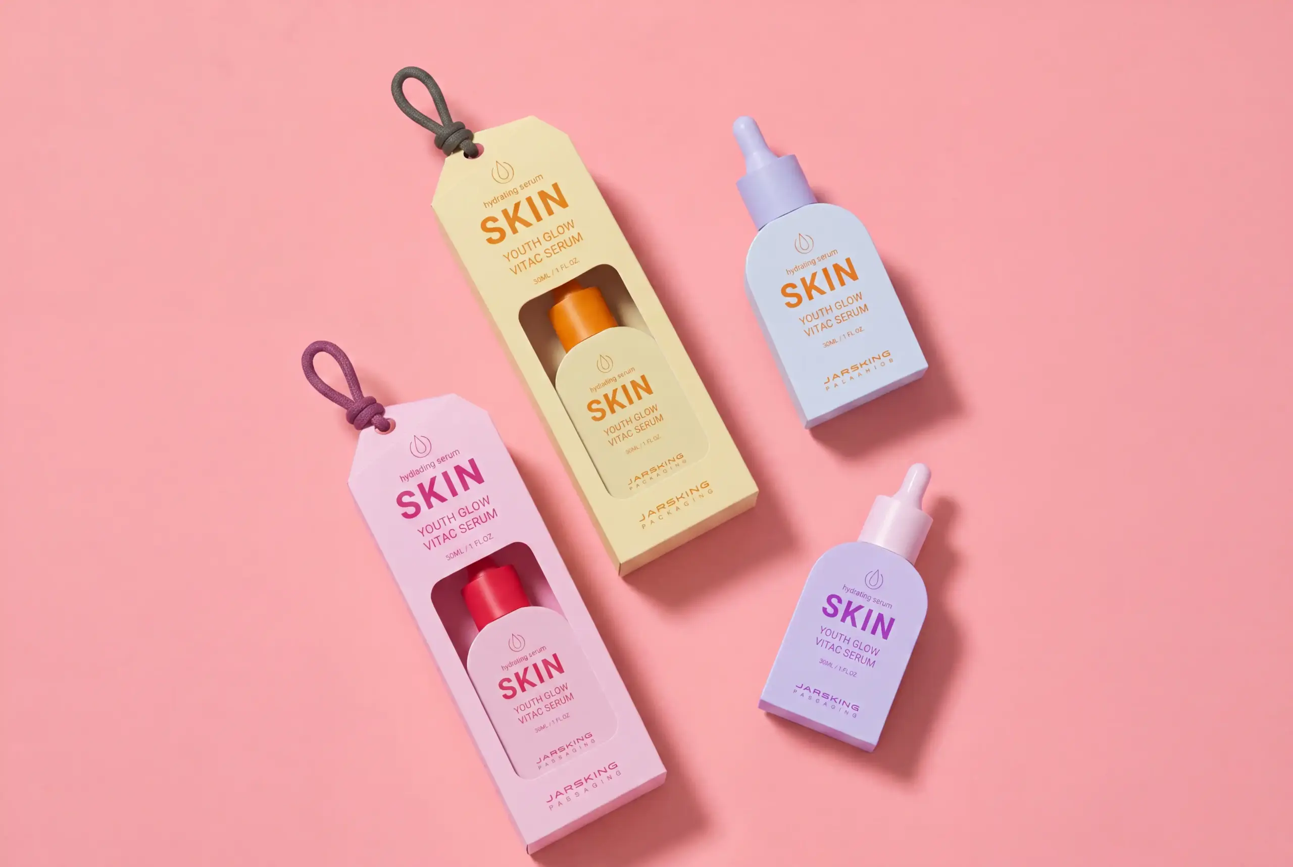

A beautiful serum bottle can win a click. A believable one can win a customer.
That distinction sounds small until you look at how skincare is actually bought today. Someone sees a creator hold up a frosted bottle in a sunlit bathroom. They pause. They zoom in. They read the comments. Then they ask the question that clean beauty brands cannot afford to ignore: Is this genuinely thoughtful, or does it simply look thoughtful?
For years, the beauty industry has treated “Instagram-worthy serum packaging” as a visual brief. Choose a calm color palette. Add a frosted finish. Use a sleek dropper. Place the logo in the middle. Put the bottle beside a stone tray and a leafy plant, and the work is done.
It is not done.
That formula may still produce a pretty image, but it rarely produces a memorable brand. Worse, it can create the exact problem that clean beauty brands are trying to escape: a package that appears sustainable in a campaign yet feels confusing, excessive, or disposable in a customer’s hands.
The future of serum packaging design is not about making products look more “eco.” It is about making sustainability visible, understandable, and desirable—without turning every bottle into the same beige, minimalist object.
A genuinely Instagram-worthy serum bottle should do more than photograph well. It should make a customer want to keep it on the shelf, understand how to use it, feel confident about what happens when it is empty, and recognize the brand before reading the label. It needs to perform during the first unboxing, yes. But it also needs to look good on day 47, after a few drops of serum have dried near the collar, after it has been carried in a gym bag, after it has sat in a humid bathroom, and after the customer begins to decide whether this brand deserves a repeat purchase.
That is the real design challenge.
1. Instagram-Worthy Is Not the Same as Photogenic
A bottle can be photogenic and still fail as packaging.
It may catch light beautifully but glare so badly that the product name disappears in video. It may feel satisfyingly heavy, but rely on a structure that is difficult to recycle. It may use a dramatic metallic cap, but show fingerprints after two days. It may look incredible in a launch campaign, then become awkward, leaky, or visibly worn in daily life.
This is where many skincare brands get stuck. They design for the perfect first impression—the ecommerce image, the influencer mailer, the launch-day post—but not for the complete customer experience.
For a clean beauty brand, that is a particularly costly mistake. Clean beauty customers are not only purchasing a formula. They are often purchasing a set of values: ingredient transparency, reduced waste, thoughtful sourcing, gentler routines, and a feeling that less can be better. If the product packaging undermines those values, the disconnect becomes obvious very quickly.
A better definition of Instagram-worthy serum packaging is this:
Instagram-worthy serum packaging is packaging that looks desirable on camera, feels credible in real life, and gives customers a story they are proud to share.
That story does not need to be loud. In fact, the most powerful packaging stories are often quiet.
A refill system that clicks into place cleanly. A bottle that looks substantial without being unnecessarily heavy. A cap that is easy to remove before recycling. A small QR code that explains exactly what the package is made from and how to dispose of it. A PCR bottle with a slightly imperfect tone that says, “Yes, this material has had a previous life.”
These details may not appear in every campaign image, but they become visible through customer behavior. They show up in “empties” videos, refill tutorials, comments, reviews, routine posts, and recommendations between friends. That is where trust is built.
2. The Clean Beauty Packaging Problem
There is an uncomfortable truth in clean beauty packaging: many brands are beginning to look like one another.
Walk through a beauty retailer or scroll through a skincare-heavy social feed. You will see white labels, muted greens, soft beige cartons, amber glass, modern sans-serif type, botanical line drawings, and phrases such as “conscious,” “pure,” “gentle,” and “planet-friendly.” None of these choices are wrong. The problem is that they have become a visual uniform.
Minimalism was originally powerful because it felt like a rejection of excess. It pushed back against crowded labels, impossible claims, and plastic-heavy glamour. But when every brand uses the same minimalist vocabulary, minimalism stops communicating clarity and starts communicating sameness.
The question is no longer, “Does this look like clean beauty?”
The better question is, “Could this bottle belong to anyone else?”
If the answer is yes, the brand may be aesthetically acceptable but strategically weak.
A strong custom serum bottle does not need to be complicated. It needs a distinct point of view. That point of view might live in a bottle shoulder that catches light in a recognizable way. It might be a signature translucent color rather than the expected pale green. It might be a cap with a subtle ribbed texture that customers can identify by touch. It might be a typography system that feels calm but unmistakably proprietary.
The smartest clean beauty brands are not abandoning minimalism. They are making it more specific.
They understand that simplicity is not the absence of personality. Simplicity is the discipline to choose one personality and express it consistently.
3. Sustainability Needs Proof, Not Just Green Signals
A leaf icon is not proof. A kraft-paper carton is not proof. A pale green label is definitely not proof.
Consumers are becoming more alert to the gap between sustainable language and sustainable design. They may not know every technical detail of packaging engineering, but they can sense when something feels performative. A bottle that claims to be eco-conscious while arriving inside layers of decorative material creates doubt. A “recyclable” pack with a pump that cannot be separated creates friction. A refill product that requires excessive effort makes customers wonder whether the system was designed for them or for a marketing presentation.
This is why clean beauty packaging should focus on proof signals rather than green signals.
Green signals are visual shortcuts. They include earthy colors, recycled-looking textures, plant illustrations, and environmental language.
Proof signals are functional and structural. They show customers that sustainability has been considered beyond the campaign:
A clear instruction that explains how to separate the cap, pump, label, and bottle
A refill structure that can be used without spills, tools, or complicated steps
A visible PCR percentage explained in simple language
A mono-material design where possible, reducing recycling complexity
Lightweight packaging that avoids unnecessary material consumption
Secondary packaging that has a real protective or informational purpose
Reusable outer components built to survive multiple refill cycles
The difference is emotional as much as technical. Green signals ask customers to believe the brand. Proof signals allow them to verify it.
This matters because trust is becoming a luxury cue. In the past, luxury skincare often relied on visual weight: thick glass, shiny metal, oversized caps, elaborate boxes, and multiple decorative layers. Today, many clean beauty consumers see unnecessary weight differently. They ask whether the extra material is protecting the formula or merely creating an illusion of value.
That does not mean premium serum packaging must feel cheap, light, or overly utilitarian. It means the definition of premium is changing.
Premium now means considered.
4. Lightweight Luxury Is Replacing Heavy Luxury
There was a time when a heavy bottle was the easiest shortcut to perceived value. You picked it up, felt the weight, and assumed the product inside must be expensive. Beauty brands learned that lesson well. Thick walls, large bases, metalized caps, and rigid secondary packaging became standard tools for communicating prestige.
But weight is no longer automatically synonymous with quality.
For a clean beauty brand, excessive weight can feel out of step with its own story. It can increase shipping emissions, raise breakage risk, consume more material, and make a product less convenient to carry. When customers are already asking whether packaging is necessary, a very heavy bottle needs a meaningful reason to exist.
This is where lightweight luxury becomes valuable.
Lightweight luxury does not mean stripping away every sensory element. It means moving perceived quality away from wasteful mass and toward intelligent design. A lighter glass bottle can still feel premium if its proportions are precise, its base is stable, its surface finish is refined, and its closure fits perfectly. A PCR PET bottle can feel elevated if the resin quality is good, the color is intentional, the label is clean, and the dispensing experience is controlled.
Real luxury often lives in details that are harder to see but easier to feel:
A dropper that draws product consistently without dripping down the neck
A pump with a smooth, deliberate stroke rather than a flimsy bounce
A cap that aligns cleanly every time it closes
A bottle that feels balanced in the hand
Printing that remains intact after months of daily use
A refill system that does not require customers to become packaging engineers
These are not decorative luxuries. They are evidence of care.
For brands developing a luxury serum bottle design, the opportunity is to create an experience that feels more responsible precisely because it is more intelligent. The bottle does not need to prove its value by being excessive. It proves value by being better.
5. The Formula and the Bottle Must Tell the Same Truth
Not every clean serum should look the same because not every clean serum does the same thing.
A barrier-support serum with ceramides and panthenol should not necessarily use the same visual language as a high-performance vitamin C formula. A botanical facial oil should not be packaged exactly like a peptide concentrate. A calming serum for reactive skin should not feel identical to a brightening treatment designed around active ingredients.
The formula and the packaging need to tell one coherent story.
For example, a vitamin C serum may need protection from light and air exposure. Amber glass or an opaque airless format can communicate that the brand has taken stability seriously. The packaging should not merely look “natural”; it should visibly support the formula’s needs.
A watery hydration serum might benefit from a dropper if the ritual of dispensing a few drops is central to the product experience. But if the formula is sensitive to repeated air exposure, an airless pump may be more appropriate. A premium bottle is not the one with the most elegant closure. It is the one whose closure makes sense.
This is where many brands make a subtle but damaging mistake: they choose a package based on what competitors are using, rather than what their formula, user journey, and price point require.
An authentic clean beauty brand should be able to explain every choice:
We selected this material because it protects the formula.
We selected this pump because it gives a consistent dose.
We chose this bottle weight because it balances premium feel and transport efficiency.
We selected this decorative finish because it holds up under bathroom use.
We chose this refill approach because it is genuinely practical for our customer.
That level of consistency is difficult to fake. It is also deeply persuasive.
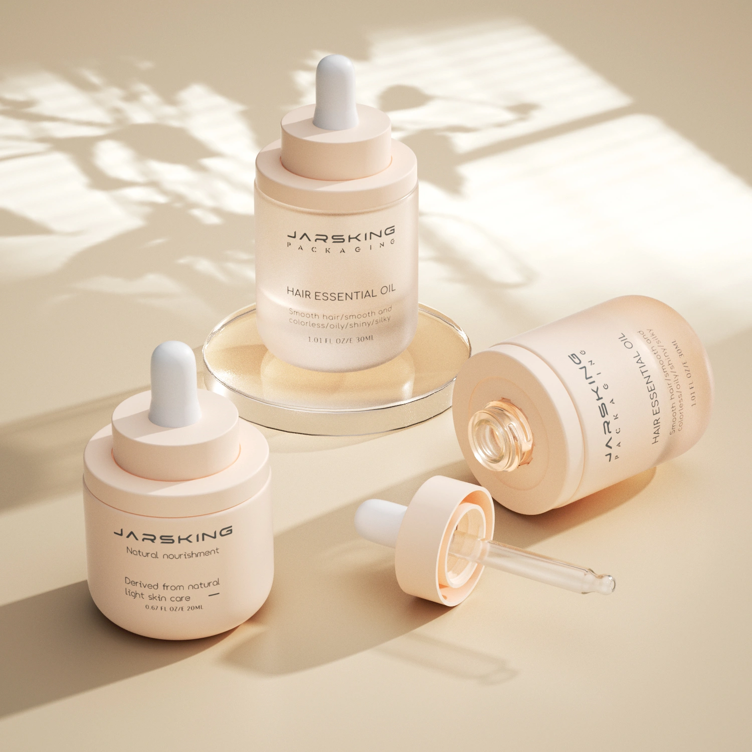
6. The Social Media Stress Test
Before approving a premium serum bottle, do not only review a render or a factory sample under perfect lighting. Put it through a social media stress test.
This should be a practical part of every packaging development process, particularly for brands that depend on online discovery.
Test the bottle in situations that resemble real customer content:
Photograph it in direct sunlight
Film it under a bathroom light
Place it against a white background, a dark background, and a natural wood surface
Hold it in a hand with wet skin
Record a close-up of the pump or dropper dispensing product
Take top-down flat lays with other skincare products
Capture the bottle at front, side, 45-degree, and overhead angles
Check whether the brand name remains readable in a short-form video frame
Put it in a toiletry bag and test for leakage, scratches, and cap movement
Use it daily for several weeks and inspect the decoration, closure, and product residue
The point is not to make packaging perform perfectly in every environment. That is impossible. The point is to identify where the design breaks down before customers do.
This testing can reveal surprising things. A clear glass bottle may look elegant but disappear against bright backgrounds. A foil logo may look premium in person but become unreadable in video. A beautiful matte coating may stain easily when touched with skincare oils. A bottle that appears compact may feel awkward in small hands.
These are the details that separate a concept from a commercially resilient packaging system.
7. Custom Packaging Creates Recognition, Not Just Variation
There is a difference between customization and identity.
Changing the color of a stock bottle is customization. Adding a logo to a standard cap is customization. These can be smart, efficient decisions for emerging brands, limited runs, or products that need speed to market.
But building a recognizable packaging identity requires a more deliberate system.
It might include a custom mold with a signature silhouette. It might include one distinctive cap family used across multiple product categories. It might include a unique finish that becomes part of the brand’s visual language. It might include a modular architecture where a serum, toner, moisturizer, and refill all feel related without becoming repetitive.
The goal is not to make every bottle radically different. The goal is to make the entire range unmistakably connected.
This matters more as brands grow. A customer may begin with one serum, then later encounter your cleanser, cream, or SPF in a different context. If your packaging system is coherent, recognition happens instantly. The customer does not need to read every label to know it belongs to your world.
For clean beauty brands, this kind of consistency also makes sustainability easier to communicate. Repeated structures can simplify supply chains, reduce unnecessary material variation, support refill programs, and create a clearer end-of-life story.
Custom packaging, then, is not simply a way to look exclusive. It can be a tool for building a more efficient, recognizable, and durable brand.
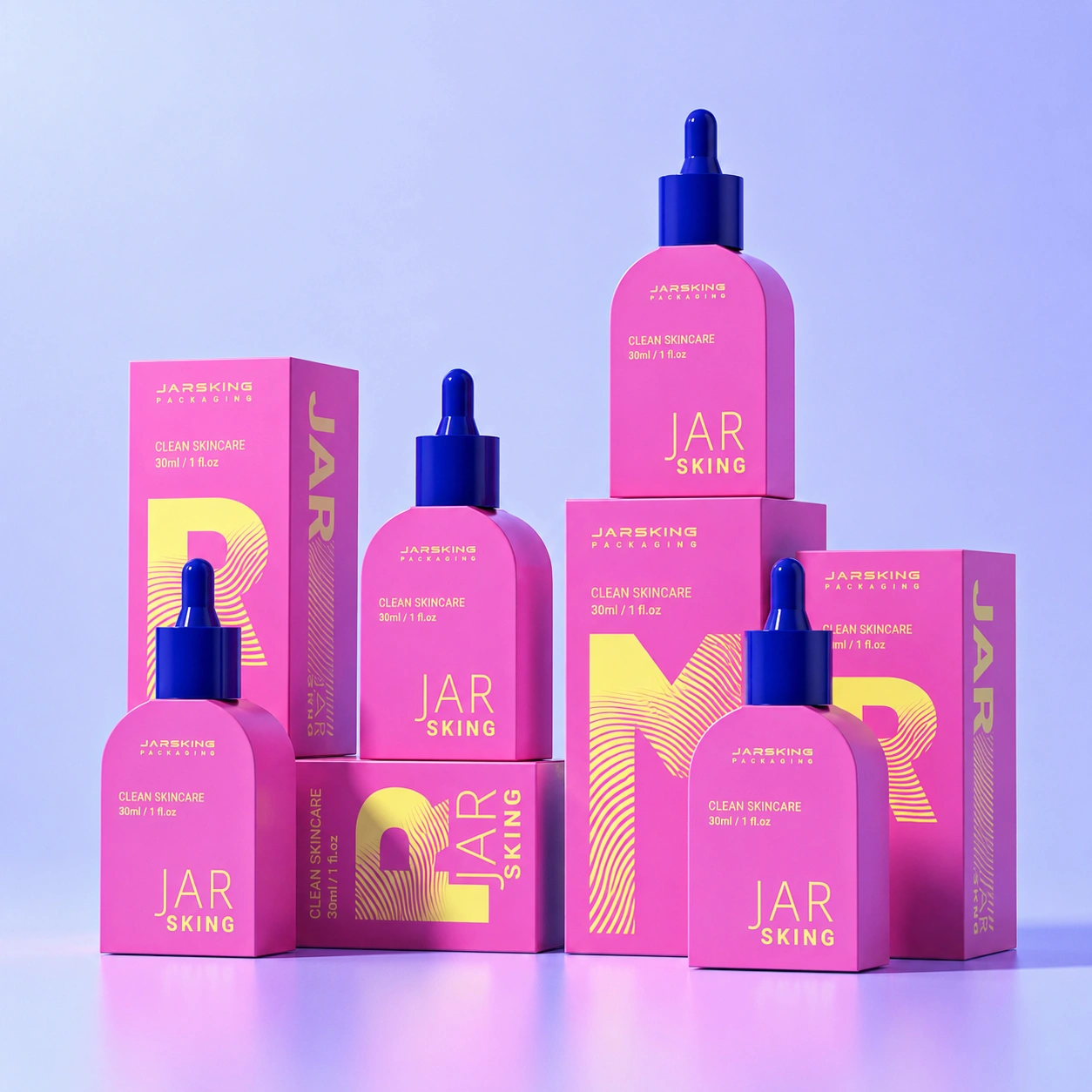
8. From a Bottle to a Brand Asset
The strongest serum packaging does not operate alone. It becomes part of a larger system: your product page, social content, retail shelf, creator partnerships, refill strategy, customer service, and sustainability commitments.
That is why packaging development deserves a broader conversation than “What bottle do we like?”
A better briefing process asks:
What should a customer understand in the first three seconds?
What should they feel when they hold the product?
What makes this package recognizable without the logo?
Which sustainability claim can the structure genuinely prove?
What happens when the customer finishes the serum?
Can this design scale across future SKUs without losing identity?
Can it be manufactured consistently at the quality level the brand promises?
For brands developing custom cosmetic packaging, the answer may involve a custom glass bottle, a PCR PET alternative, an airless pump format, a refillable outer shell, or a carefully refined stock structure. The right solution is not always the most complex one. It is the one that aligns formula protection, brand identity, user behavior, environmental responsibility, and production reality.
That alignment is what customers feel—even when they cannot explain it.
A serum bottle should never have to shout that it is sustainable, luxurious, or worthy of being shared. When the structure, materials, details, and experience all tell the same story, people understand it without being persuaded too hard.
And that is the kind of packaging that earns a place not only in an Instagram post, but on a customer’s shelf, in their routine, and in their memory.
FAQs
Is glass always the best material for clean beauty serum packaging?
Not always. Glass feels premium and is widely recyclable, but it is heavier and more fragile during shipping. PCR PET, lightweight glass, and refillable systems can be better choices depending on the formula, transport needs, and sustainability goals.
Should I choose a dropper or an airless pump for my serum?
Choose based on formula performance, not appearance alone. Droppers suit many low-to-medium-viscosity oils and water-based serums, while airless pumps are often a better option for formulas sensitive to air exposure, oxidation, or contamination.
Can PCR plastic still look premium?
Yes. High-quality PCR PET can look refined when paired with good proportions, a well-made closure, clear decoration, and a deliberate color palette. Slight material variation can even reinforce the authenticity of recycled content rather than weaken the design.
Is refillable serum packaging a good idea for every brand?
No. Refills work best when the process is genuinely simple, clean, and convenient. If customers need tools, complicated instructions, or extra cleaning steps, they may avoid the refill and return to buying a full new bottle.
How can a clean beauty brand avoid looking like every other minimalist skincare label?
Do not rely on white space, amber glass, and a neutral label alone. Build one or two distinctive brand codes—such as a signature bottle shoulder, cap texture, translucent color, label layout, or finish—and repeat them consistently across the range.
What makes serum packaging “Instagram-worthy”?
Instagram-worthy serum packaging looks good in photos and videos, but it also works well in everyday use. A strong design has a recognizable shape, readable branding, camera-friendly finishes, and a pump or dropper that dispenses cleanly.