
Picture this: a young entrepreneur with a suitcase full of dreams, a deep reverence for Mexico’s botanical, and a packaging design so intricate it had already made different suppliers shake their heads and walk away. The design wasn’t just beautiful — it was the brand’s whole story compressed into a surface. Every carefully drawn line, every raised contour was a reference to generations of Mexican craft, to ancient plants extracted with modern science, to a founder who refused to believe that “good enough” was ever actually good enough. And yet here she was, running out of options, wondering whether the packaging she had envisioned would ever exist outside of a computer screen.
In the competitive world of premium skincare, packaging is never just packaging. It is the first physical promise a brand makes to its customer — a tactile declaration of values before a single drop of formula meets skin. For this rising Mexican botanical skincare brand, headquartered in Germany and crafted for the discerning European consumer, that promise was written in dense, intricate line-work and realized through the demanding art of embossing. What followed our first conversation with the brand was not merely a manufacturing project. It was a genuine collaboration — one that solved the problems they knew they had, uncovered a critical challenge they didn’t yet know existed, and ultimately delivered a packaging suite that exceeded every expectation they had arrived with.
1. The Client — A Brand Built at the Intersection of Heritage and Innovation
Origins and Brand Philosophy
Mexico is one of the most biodiverse countries on earth, home to thousands of plant species that have been woven into the fabric of healing and beauty traditions for centuries. Prickly pear cactus, copal resin, tepezcohuite bark, rosehip, marigold — these are not trendy marketing ingredients. They are living threads connecting contemporary skincare to knowledge accumulated over generations. The brand’s founder grew up understanding this, and she built her company around a simple but powerful conviction: that these plants, extracted with modern cosmetic science and formulated with real precision, could offer European consumers something that the crowded shelves of prestige skincare had never quite managed to deliver.
What made the brand genuinely special was the combination of scientific seriousness and cultural authenticity. The formulations were not merely “botanical” in the loose, aspirational sense that word gets thrown around in beauty marketing. They were developed in collaboration with cosmetic scientists and herbalists who understood both the chemistry and the cultural significance of each ingredient. Active compounds were extracted using advanced methods to preserve bioavailability. Stability testing was rigorous and documented. Every ingredient had a reason to be there — grounded in either ethnobotanical tradition, clinical evidence, or both.
The German Headquarters: A Strategic Choice
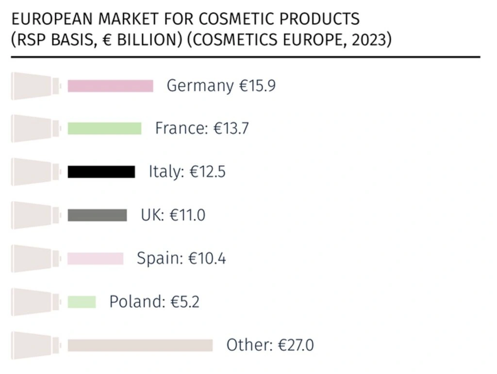
Setting up headquarters in Germany was a decision made with clear eyes. Germany is Europe’s largest consumer market and one of its most demanding. German consumers research before they buy. They read ingredient lists. They notice when packaging feels cheap. They reward transparency and punish vagueness. For a brand built on genuine formulation quality and authentic provenance, this was exactly the right arena.
Manufacturing stayed in Mexico — and this, too, was a considered choice. Keeping production rooted in the source of the brand’s ingredients meant freshness, traceability, and a supply chain story that was real rather than constructed.
The Target Consumer: The 40–60 Demographic
The brand’s core consumers — women and men aged 40 to 60 in the German market — are among the most sophisticated skincare buyers in the world. They have tried things. They have been disappointed by things. They can tell when a brand is serious and when it is not, and they are willing to pay meaningfully more for the former. They are also drawn to brands with depth: a real founder story, a genuine ingredient philosophy, a visual identity that rewards attention. Trend-chasing and viral moments do not impress this demographic. Consistency, authenticity, and demonstrated quality do.
This demographic insight shaped everything from the brand’s social media strategy — educational, narrative-driven, and community-focused rather than trend-reactive — to its packaging decisions. Consumers in this age group expect packaging that feels premium. They notice craftsmanship. They keep things that are beautiful. The brand’s founder understood all of this intuitively, and it informed every design choice she made.
Source: https://www.labopen.fi/en/lab-pro/rise-of-nordic-beauty-a-strategic-outlook-on-its-future-in-the-german-market/
2. The Packaging Challenge — When Vision Outpaces Available Supply
The Brand’s Packaging Vision
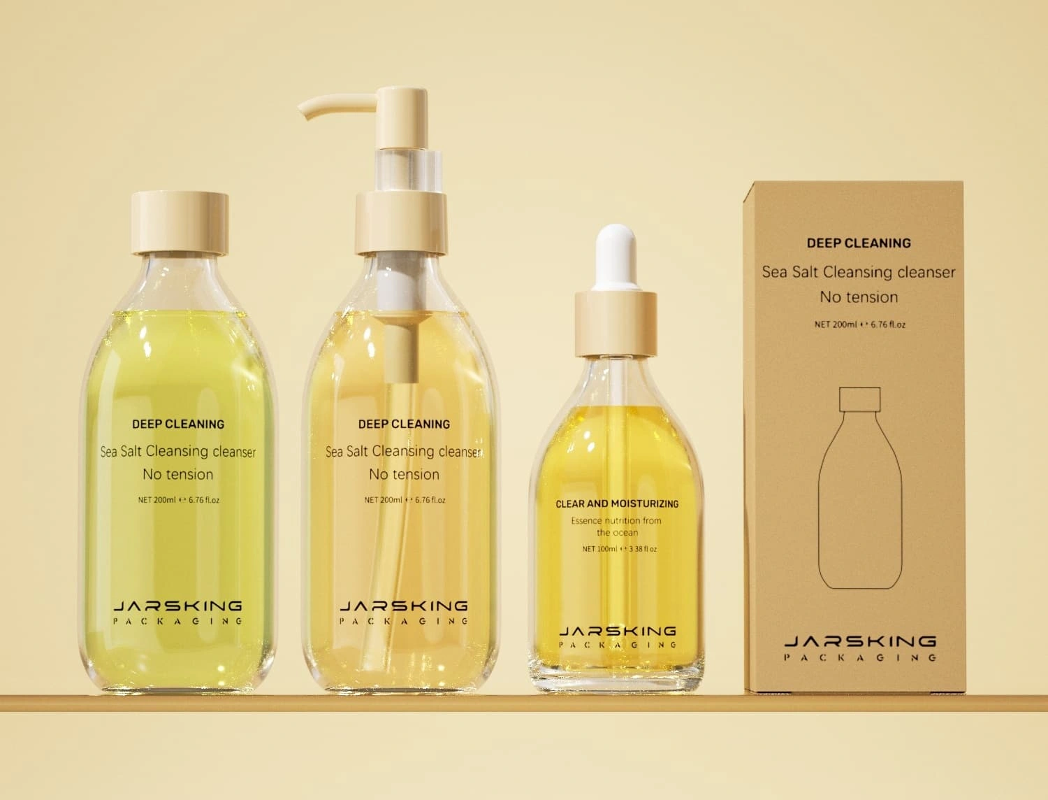
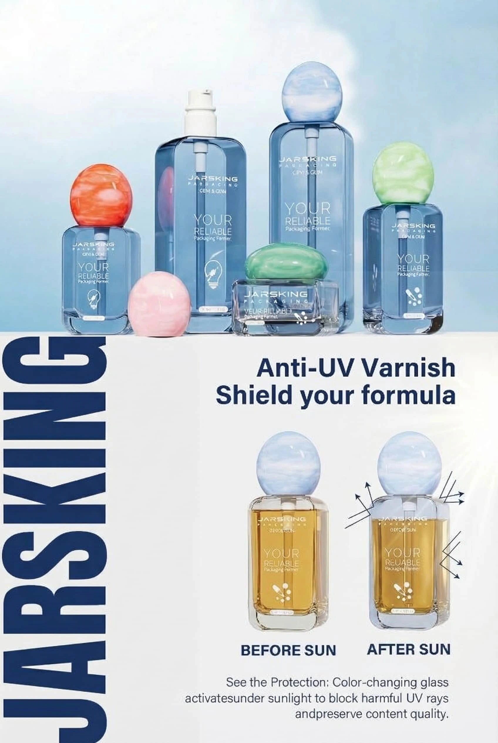
The hero technical element was embossing — raising design elements above the surface of the packaging to create a three-dimensional, tactile effect. For this brand, embossing wasn’t decorative flourish. It was integral to the concept. The moment a customer picked up a bottle, she should feel the brand’s identity in her fingers — the textile quality of the pattern, the sense of something made with care. That was the vision. It was vivid, specific, and non-negotiable.
Why Prior Suppliers Failed
By the time the brand’s founder reached out to us, she had been through this before. Multiple times. Each attempt had followed the same arc: initial optimism, technical review, and then — either a quiet admission that the design was too complex, or worse, physical proofs that arrived looking blurry and degraded, the intricate lines collapsing into each other under tooling that simply wasn’t precise enough.
The core difficulty was the relationship between line density and embossing precision. When design elements are closely spaced and directionally varied — as they were in this brand’s graphics — the tooling required to produce crisp, well-defined raised surfaces demands extraordinarily tight machining tolerances. Standard embossing equipment isn’t built for this. The fine details blur. The registration between the embossed surface and the printed design drifts. The layered visual effect the design relies on falls apart entirely.
Some suppliers had attempted it and failed. Others had assessed the design files, done the math, and simply declined. Either outcome left the brand in the same position: holding a packaging vision they believed in deeply, with no clear path to making it real. Each failed engagement cost time, money, and a little more of the founder’s confidence that the packaging she had imagined would ever actually exist. It was in this somewhat weary, cautiously hopeful state that she first contacted our sales manager.
3. First Contact and Feasibility Assessment
The Initial Inquiry
The inquiry that came through to our sales manager was unlike most of what lands in a packaging supplier’s inbox. It was detailed, technically specific, and refreshingly honest — including a candid account of the previous supplier failures and exactly what had gone wrong in each case. Attached were design files, substrate preferences, and a clear articulation of what “success” would look like. This was not someone fishing for a quick quote. This was someone who had done their homework and needed a partner who had done theirs.
Our sales manager recognized immediately that this wasn’t a job for a rapid commercial proposal. She escalated the inquiry to our structural engineering team the same day, framing it not as a standard feasibility check but as a genuine problem-solving exercise. The question wasn’t just “can we do this?” — it was “what would need to be true for us to do this beautifully, consistently, and at scale?”
The Feasibility Review Process
The joint review between our sales manager and structural engineers took several days of careful work. The design files were examined in detail — line spacing, embossing depth requirements, substrate interaction, and the registration tolerances necessary to align embossed and printed elements without drift. The engineers approached it the way good engineers approach hard problems: not looking for reasons to say no, but mapping exactly what success would require.
What they found was challenging but achievable. The embossing die specifications demanded machining tolerances significantly tighter than standard — our manufacturing partners had the CNC equipment for it, but the setup and calibration process would require extra care and a rigorous proofing phase before any production run could begin. The registration challenge was addressable through enhanced process controls and specialized pre-press setup. And the packaging substrate — the material of the bottles themselves — needed to be selected with particular attention to how it accepted both printing and embossing, balancing surface smoothness, structural integrity, and finishing compatibility.
The conclusion was unambiguous: we could do this. Not as a theoretical exercise, but as a real production reality with a clear, defined process path.
Communicating Confidence Without Overpromising
Here is where the conversation with the brand needed to be handled carefully. The founder had heard “yes, we can do this” before — and those previous yeses had not held up. Simply repeating the assurance would accomplish nothing. She needed to understand not just that we were confident, but why we were confident and how we would prove it before she committed to anything.
So our sales manager shared the engineering findings openly: here are the specific challenges we identified, here is exactly how we plan to address each one, here is the proofing process we will follow to validate quality before full production begins, and here are the standards we will measure against. What could have been a sales pitch became a technical conversation — and the founder, who was clearly no stranger to the technical details of her own brand, leaned in. For the first time in her supplier search, she was talking to people who understood the problem as well as she did.
4. The Enhanced Solution — Going Beyond the Brief
Identifying the Formulation Protection Gap
As conversations deepened and our team got to know the brand more fully, something important surfaced — something the founder hadn’t come to us with, but that mattered enormously to everything she was trying to build.
The brand’s formulations were built around active botanical ingredients. These are not simple, stable compounds engineered in a laboratory for predictable behavior. Plant-derived actives are chemically complex and, in many respects, beautifully fragile — which is part of what makes them effective and part of what makes them demanding to work with. Antioxidant compounds, flavonoids, carotenoids, naturally occurring enzymes: these are the elements that deliver the formulations’ benefits, and they are also precisely the elements most vulnerable to UV radiation.
UV exposure triggers a cascade of chemical reactions that degrade botanical actives — oxidizing antioxidants, bleaching pigmented compounds, denaturing enzymes. For a product that makes the journey from a Mexican manufacturing facility through international logistics to German warehousing and then to a consumer’s bathroom shelf, the cumulative UV exposure along that route is not trivial. It is entirely possible for a meticulously formulated botanical product to arrive at its destination meaningfully less effective than it left — not because anything went wrong, but simply because the packaging didn’t protect it.
The painful irony is that brands that invest most heavily in sophisticated botanical formulations are the most exposed to this risk. The richer and more complex the active profile, the more there is to lose.
The UV-Resistant Technology Proposition
The embossing challenge had brought the brand to us — but as our team spent more time with the project, something else came into focus. The brand’s botanical actives deserved better protection than standard packaging could offer, and we felt it was our responsibility to say so.
We raised the UV protection conversation not as a sales pitch, but as a natural extension of understanding the brand deeply. Together with the client, we walked through how UV radiation degrades the most valuable compounds in botanical formulations — the antioxidants, flavonoids, and plant enzymes that sit at the heart of the brand’s efficacy promise — and why the transcontinental journey from Mexican production facility to German consumer’s shelf made this a real and meaningful risk, not a theoretical one.
The solution our engineers developed was elegant precisely because it was invisible. UV-blocking additives were incorporated directly into the bottle substrate during manufacturing, complemented by a compatible surface coating that worked in complete harmony with the embossing and printing processes. The packaging looked exactly as the brand had designed it. It simply also, now, protected what was inside.
For the founder, this moment carried weight beyond the technical. It signaled the kind of partnership she hadn’t encountered before — one where a supplier thought carefully about the brand’s interests even when no one had asked them to. That quality of attention, once experienced, is hard to settle for going without.
The practical upside was just as real. UV-protective packaging gave the brand’s marketing a story worth telling: concrete, credible evidence that their commitment to ingredient integrity didn’t stop at the formulation stage, but extended all the way to the vessel that carried it — a message that resonates powerfully with the thoughtful, ingredient-savvy consumers the brand was built to serve.
5. Project Scope — A True One-Stop-Shop Engagement
Multi-SKU Complexity
As the full picture of the project came into focus, so did its scale. The brand’s product range was not a single hero product — it was a multi-category collection spanning different formulation types, textures, application methods, and usage frequencies. Lightweight serums in small precision-dispensing bottles. Rich creams and balms in wide-mouth jars. Cleansers in larger volumes. Treatment products designed for measured, precise application. Each category had distinct functional requirements; each also needed to carry the brand’s visual identity consistently.
Balancing those functional and aesthetic requirements across a full product range — some categories with single SKUs, others with multiple variants — required deep structural design work, separate tooling development for each format’s embossing, and separate testing protocols for each closure and dispensing mechanism. The coordination demands alone were substantial. Add the cross-continental supply chain, and it becomes clear why fragmented, multi-supplier approaches to projects like this tend to end in frustration.
Secondary Packaging Solutions
Beyond the primary packaging, the collaboration extended to secondary packaging — the boxes and cartons that complete the consumer experience. For a brand selling primarily through its own website and social media, the unboxing moment matters deeply. The secondary packaging was the first physical thing a customer would touch, and it needed to tell the same story the bottle told: intricate, beautiful, culturally rooted, made with care.
Our secondary packaging solutions carried the brand’s visual language — the botanical illustrations, the line-work motifs, the references to Mexican textile and craft traditions — while being engineered for the practical realities of e-commerce logistics: crush resistance, moisture resilience, and print fidelity at production scale.
The One-Stop-Shop Advantage
The real value of handling primary packaging, secondary packaging, and technical consultancy under one roof isn’t administrative convenience — though that matters. It’s the integrated understanding that comes from a single partner holding the complete picture of a brand’s packaging needs. When the same team designs the bottle and the box, there are no gaps in understanding, no accountability disputes, no moments where components produced by different parties turn out not to quite work together. There is just coherence — and the quiet confidence that comes with it.
6. The OBM Approach — From Supplier to Strategic Partner
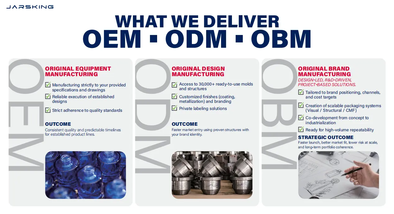
What OBM Really Means
OBM — Original Brand Manufacturer — gets used in the packaging industry to mean many things, some of them not especially meaningful. In its fullest sense, it describes a supplier capable of going far beyond producing to specification — a partner who brings enough domain knowledge and genuine investment to make proactive, value-adding contributions to a client’s brand decisions.
Every contribution our team made beyond the stated brief — the UV protection recommendation, the regulatory label guidance, the supply chain considerations, the closure mechanism suggestions for specific product formats — came from practicing OBM in this fuller sense. It came from asking, continuously, “given everything we know about this brand, what does good look like here?” That question is simple to ask and genuinely difficult to answer well. Answering it well requires expertise, curiosity, and care.
Professional Services and Expert Consultancy
The EU Cosmetics Regulation imposes specific requirements on cosmetic packaging labels — mandatory information, minimum font sizes, language requirements for the German market. Ensuring compliance while preserving design integrity required careful layout work and, in some cases, creative solutions to integrate regulatory elements without disrupting the visual composition. Our team’s familiarity with these requirements meant we caught potential issues early in the design process, long before they could become expensive corrections.
Supply chain design presented its own set of considerations. The transcontinental journey from Mexican production to German warehousing involves logistics touchpoints, variable humidity exposure, and lead times that demand careful packaging — not just of the product inside the bottle, but of the packaging itself during transit. Our recommendations on material specifications, inner protection systems, and quality control checkpoints were shaped by real experience with similar configurations. They weren’t theoretical. They were grounded in knowing what actually goes wrong, and how to prevent it.
7. Production, Quality Control, and Delivery
The Proofing Phase
Before any full production run, a rigorous proofing phase was essential — and both sides knew it. The brand had been disappointed before, and no amount of confident conversation would substitute for physical evidence of what we could actually produce. The proofing phase was designed to answer the question that mattered most: does the reality match the vision?
Physical proofs were produced for each primary packaging format under production-representative conditions, covering the full embossing treatment, printing, and finishing. These were evaluated against a detailed quality specification developed jointly with the brand — one that captured both measurable parameters (dimensional tolerances, color values, embossing depth) and the more subjective aesthetic standards that only the brand’s design team could assess.
One round of refinements followed. For two packaging formats, the initial proofs — technically within specification — didn’t fully satisfy the brand’s aesthetic standards. This is not failure; it is precisely what a proofing phase is for. Catching this at proof stage rather than after a full production run saved both time and cost, and sent the collaboration into full production with complete mutual confidence in what was coming.
Quality Control in Production
Quality control was integrated throughout production rather than applied only at the end. Incoming materials were verified before entering production. In-process checks ran at defined intervals. The embossing process — the most technically demanding element — received particular attention: die condition was monitored continuously, and registration alignment was checked regularly with calibrated measurement tools to ensure the critical relationship between raised surface and printed design remained precise.
Final inspection covered dimensional conformity, surface quality, print fidelity, emboss definition and depth, closure function, and packaging completeness. Approved product was then packed for shipment in protective configurations designed to maintain that quality across the long journey from production to the brand’s German operations.
Delivery and Brand Reception
When the completed packaging arrived at the brand’s German headquarters, the response was everything a long collaboration like this one deserves. The founder held the bottles in her hands — and the line-work held. The embossing was sharp and deep and exactly what she had drawn. The registration between the raised surface and the printed design was precise. The UV-resistant bottles, certified and tested, stood ready to protect the botanical actives inside. Across every format, every size, every secondary packaging component, the visual language was consistent and the quality was real.
It wasn’t just commercial satisfaction. It was relief, and excitement, and the particular joy of seeing something you believed in — something other people had told you couldn’t be done — actually exist in the world.
8. Lessons for the Industry
Technical capability matters, but it is not the whole story. The ability to execute complex embossing is what gets you in the room. What keeps you in the room — and what builds real partnerships — is the rigor and transparency of your process, and the genuine investment you bring to a client’s success.
The best packaging partners think like brand owners. The UV protection recommendation came from a team that was thinking about the brand holistically, not just executing a brief. That posture — curious, proactive, genuinely engaged — is harder to develop than any technical skill, and far more valuable over the long run.
One-stop-shop solutions create compound value. The administrative efficiency is real but secondary. The deeper benefit is the integrated understanding that makes better decisions possible and prevents the coordination failures that fragment multi-supplier arrangements.
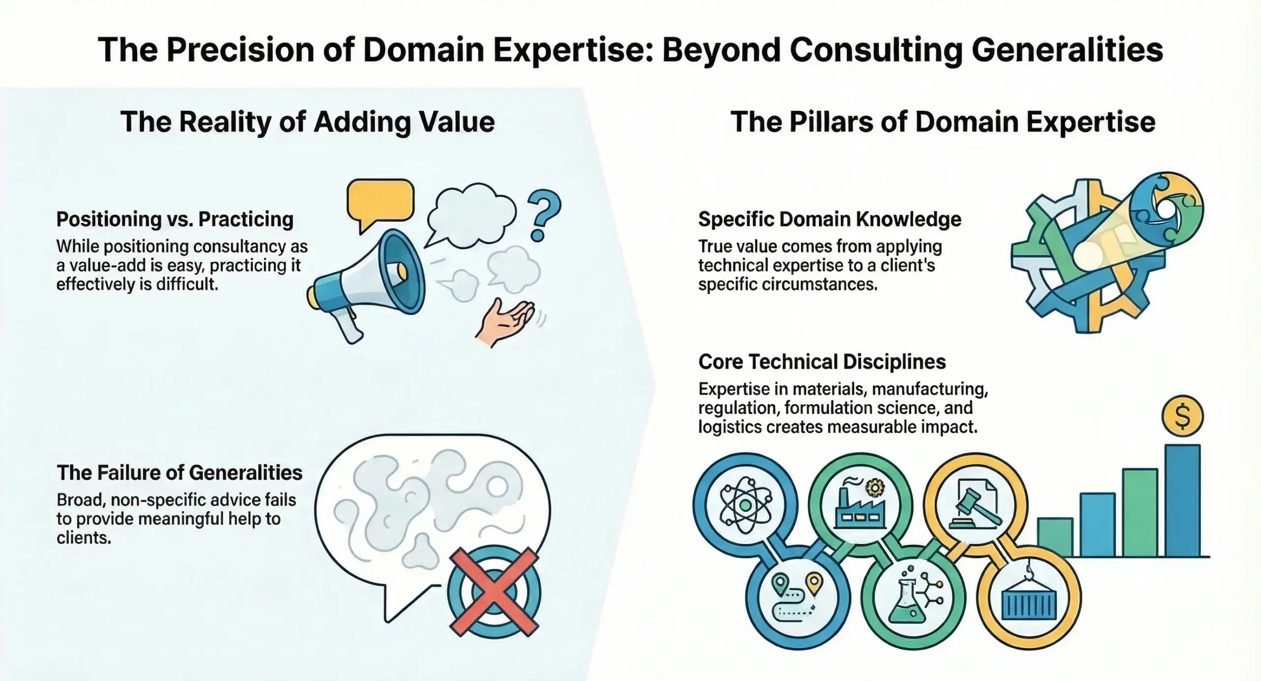
Consultancy must be grounded in real expertise. It is easy to position consultancy as a value-add. It is hard to practice it in a way that actually adds value. Doing it well means bringing specific domain knowledge — in materials, manufacturing, regulation, formulation science, logistics — to the specific circumstances of a specific client. Generalities don’t help anyone.
9. Conclusion: When the Right Partnership Changes Everything
The founder who first contacted our sales manager was, in a quiet way, running out of options. She had a packaging vision she believed in, a trail of suppliers who had failed to realize it, and the creeping worry that the packaging she had imagined might simply not be possible. What she needed was not just someone with better equipment. She needed someone who understood the problem, brought honesty about how to solve it, and cared enough about the outcome to go beyond what was asked.
That is what this collaboration was. A technically demanding embossing challenge, solved with precision and proven through rigorous process. A formulation protection gap, identified and addressed before it could become a problem. A complete packaging identity — primary packaging across all product categories, secondary packaging for a premium e-commerce experience — delivered with the coherence and quality that only a true one-stop-shop partner can provide. And an ongoing relationship built on the most durable foundation there is: demonstrated trust.
The packaging is, in the end, the brand’s physical presence in the world. It is what a customer holds before she knows whether the serum works. It is what a retail buyer assesses before she decides whether to carry the line. It is the daily, tactile expression of every decision the founder made about what her brand would stand for. Getting it right is not a detail. It is, in a very real sense, everything.
We are proud to have gotten it right together.
FAQs
How did you determine the project was feasible when others had said it wasn't?
Rather than giving a quick yes or no, our sales manager and structural engineering team conducted a thorough joint review of the design files before making any commitment. They mapped each specific technical challenge — tooling tolerances, registration requirements, substrate behavior — and identified a defined process path to address each one. The answer wasn’t “trust us.” It was “here is exactly what we will do, and here is how we will prove it before full production begins.”
What is UV-resistant packaging technology, and how does it work?
UV-resistant packaging incorporates UV-blocking additives directly into the bottle substrate during manufacturing, sometimes complemented by a compatible surface coating. These additives absorb or reflect UV radiation, preventing it from reaching the product inside. The technology is built into the material itself, so it requires no visible change to the packaging’s appearance — the protection is entirely invisible from the outside.
Did the UV-resistant technology affect the packaging's appearance or the embossing quality?
Not at all. The UV-blocking additives and surface coating were developed to work in complete harmony with the embossing and printing processes. The packaging looked exactly as the brand designed it. The protection was built in invisibly — which was a firm requirement from the outset, given how central the visual identity was to the entire project.
What does "one-stop-shop" packaging service actually mean in practice?
It means a single partner handling the full scope of packaging needs — primary packaging across all product categories and sizes, secondary packaging for retail and e-commerce presentation, structural design, technical consultancy, regulatory guidance, and quality control — all coordinated internally. For the brand, this eliminated the coordination costs, accountability gaps, and component mismatches that come with managing multiple specialized suppliers. Everything arrived coherent, consistent, and on the same timeline.
How did you handle quality control for such a technically demanding project?
Quality control was integrated throughout production rather than applied only as a final check. Incoming materials were verified against specification before entering production. In-process checks ran at defined intervals during each production run. The embossing process received particular attention — die condition was monitored continuously and registration alignment was checked regularly with calibrated tools. A rigorous proofing phase before full production also allowed refinements to be made at low cost and risk, ensuring that by the time full runs began, the process was fully dialed in.
What should a brand consider before approaching a packaging supplier with a complex design brief?
Come prepared and come honestly. Bring detailed design files, clear technical specifications, and — if you’ve had previous supplier experiences — a candid account of what went wrong and why. The more precisely you can describe the problem, the better equipped a capable supplier is to assess it accurately. Be wary of suppliers who say yes immediately without asking hard questions; thorough feasibility assessment is a sign of seriousness, not hesitation. And look for partners who engage with your brand as a whole, not just the specific component you’ve asked about — the best packaging decisions are made by people who understand what the packaging is ultimately there to do.