

1. Why Bottle Design Carries So Much Weight
Ask yourself honestly — when’s the last time you bought something labeled “luxury” purely on ingredient claims, without the packaging convincing you first? Probably never, and that’s not a coincidence. Consumers form quality judgments almost instantly, often before they’ve read a single word of copy, and packaging research consistently confirms that design functions as a genuine branding and persuasion tool, not just a container that holds liquid until it’s used up. This is actually a well-documented phenomenon in consumer psychology: shape, color, and material trigger snap associations with quality, price point, and even efficacy, long before rational evaluation kicks in. That’s precisely why premium brands invest so heavily in the physical object itself — the bottle is doing marketing work that no amount of clever copywriting can replace.
Think about it from the shelf’s perspective for a second. A customer scanning a wall of shampoos in Sephora or a hotel spa boutique isn’t reading ingredient decks in that split second — she’s reacting to weight, shine, shape, and finish. If the bottle feels light and hollow, the brain quietly downgrades the product’s perceived value, regardless of what’s actually inside. If it feels substantial, cool to the touch, and finished with intention, the brain does the opposite — it assumes the formula must be equally considered. This subconscious transfer of trust from container to content is the entire psychological mechanism premium packaging design is built to exploit.
The Non-Negotiables Industry Analysis Keeps Repeating
Industry analysis of shampoo packaging trends consistently points to a handful of non-negotiables that separate a shelf-worthy premium product from an also-ran:
– A silhouette that stands out from the sea of interchangeable cylindrical bottles crowding every drugstore and prestige aisle alike
– Materials that physically communicate quality the moment a hand touches them — weight, temperature, and surface finish all count
– Closures that function flawlessly even in wet, soapy, low-visibility shower conditions, because a broken user experience erodes brand trust faster than any marketing can rebuild it
– Color and finish choices that align with — rather than contradict — the brand’s positioning and price point
These aren’t arbitrary checkboxes. Each one maps directly to a moment of truth in the customer journey: the shelf glance, the first pickup, the daily shower use, and the repeat-purchase decision. Miss any one of these moments and the “luxury” positioning starts to feel hollow, no matter how good the formula performs.
2. Glass Bottles: The Gold Standard of Perceived Value
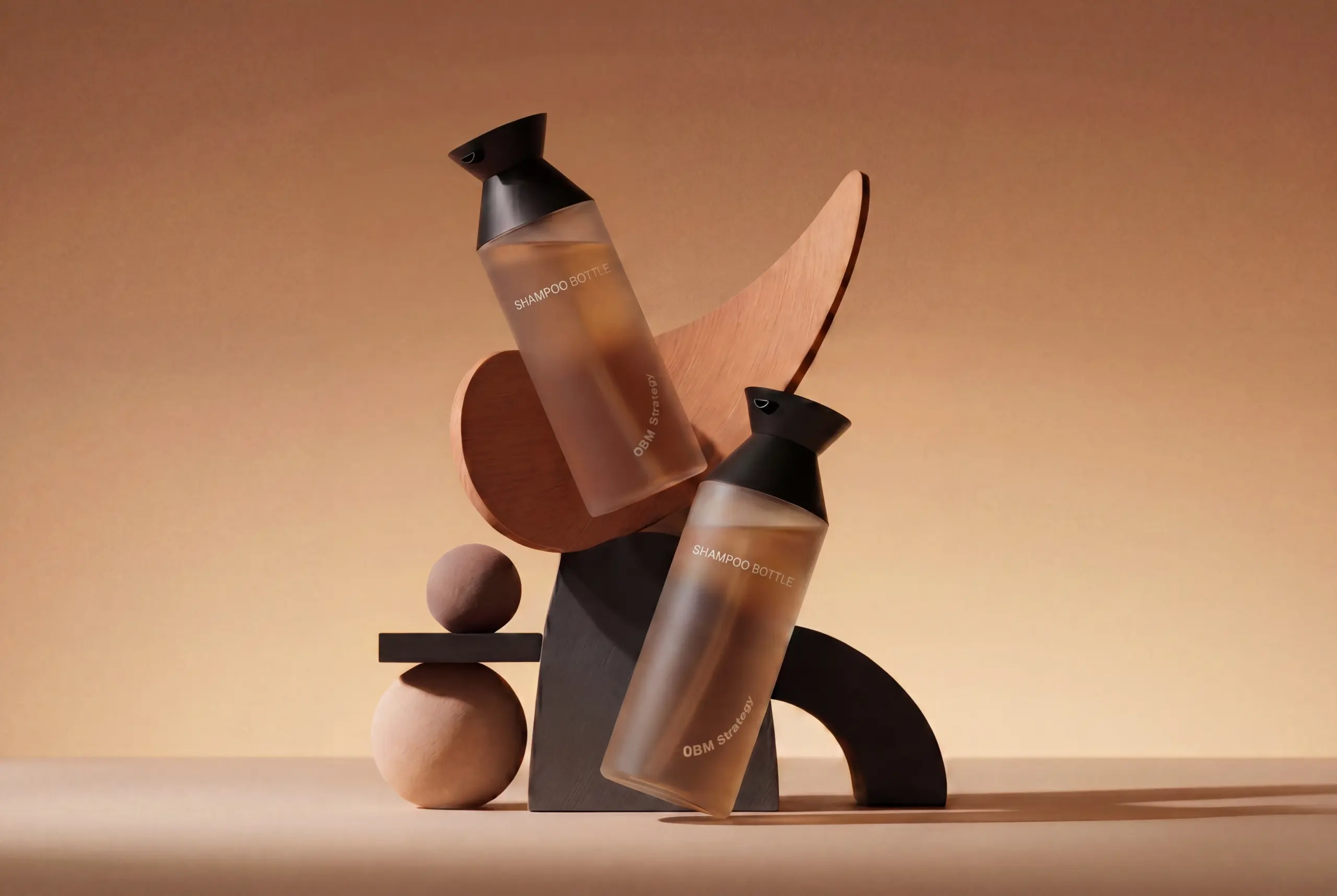
There’s a reason nearly every high-end salon brand eventually migrates toward glass. It’s cold to the touch, it has weight in the hand, and it photographs beautifully under studio lighting — three things plastic struggles to replicate no matter how good the mold is.
Amber or dark-tinted glass adds sophistication while genuinely protecting light-sensitive actives from UV degradation, which matters more than people realize for formulas loaded with active botanicals or vitamin complexes. Double-wall glass and acrylic construction takes this further, functioning simultaneously as a visual cue of prestige and a physical barrier that shields delicate formulas from heat, light, and oxidation, which is why insiders increasingly treat it as a strategic tool rather than a decorative flourish.
A few glass-forward ideas worth exploring:
Deep-tinted violet or amber glass with a gradient effect, paired with sculptural white or metallic caps for contrast
Frosted glass dropper-style bottles that feel instantly “spa-grade,” especially for hair oils and scalp serums
Double-wall glass-and-acrylic construction for treatment masks that need extra formula protection and shelf presence
Etched or engraved logos pressed directly into the glass surface for a permanent, tactile branding cue
3. What Real Luxury Brands Actually Do
Theory only gets you so far — it helps to look at what’s actually working on shelves right now. Aesop built its entire packaging identity around one unwavering choice: consistent amber glass bottles with minimalist, almost clinical typography, a decision rooted in the brand’s 1987 founding philosophy that substance always outranks spectacle. That restraint isn’t a lack of design effort — it’s the design effort. The amber tone isn’t arbitrary either; it genuinely protects formulas from light degradation while giving the brand an instantly recognizable silhouette across its entire catalog.
Oribe takes a different but equally deliberate path, describing its packaging philosophy as an obsession with “every detail,” down to the caps, jars, and travel sizes across the full product range. The brand runs an entire editorial series called “Behind the Bottle” dedicated to explaining the intentional design decisions behind individual products, which tells you something important: prestige haircare brands now treat bottle design as a story worth telling on its own, not just a functional afterthought. Both examples point to the same underlying truth — luxury doesn’t require the loudest design, it requires the most consistent and intentional one.
4. Shape and Silhouette: Breaking the Round-Bottle Monotony
Walk down any hair care aisle and you’ll notice something depressing: almost every bottle is a cylinder. That sameness is actually an opportunity. A square, flip-top design offers a shape rarely seen among shampoo bottles, and the flat surfaces it creates give brands a much larger canvas for embossing, texture, and creative labeling than a curved bottle ever could.
Triangular silhouettes are another underused move. One packaging redesign paired tall triangular bottles with square jars to create a line that felt “modern, daring, and unmistakably premium,” using sharp geometry for dynamic energy while square components added architectural balance. That kind of intentional shape contrast does something round bottles simply cannot: it makes the collection feel designed, not manufactured. This isn’t just theory, either — when one personal care brand boldly changed its shampoo bottle shape, the redesign itself became a viral marketing moment that drove attention far beyond the product’s usual audience.
For brands leaning into a natural or clean-beauty identity, organic silhouettes work in the opposite direction — rounded bottles, curved ergonomic grips, or pebble-inspired forms that subconsciously signal softness and authenticity. Ergonomic curves also solve a practical problem manufacturers have flagged repeatedly: wet, soapy hands need a shape that won’t slip mid-shower, which is exactly why curved, grip-friendly silhouettes have become an emerging trend in their own right rather than a purely aesthetic choice.
5. The Dispensing Mechanism Matters More Than You Think
A beautiful bottle with a mediocre pump ruins the entire experience within the first use. Luxury customers notice friction, drips, and inconsistent dosing immediately, and it undermines everything the visual design worked to build.
Closure choice is genuinely a user-experience decision, not just a cosmetic one — screw caps, flip-tops, disc-tops, droppers, and pumps each carry different implications for accessibility, spill control, and brand feel. Selecting the wrong one is one of the most common and costly mistakes new brands make: weak caps and threads weep under pressure changes during shipping, and closures that aren’t tested against the actual formula viscosity often fail in real shower conditions. Brands are advised to physically test pumps, flip-tops, and disc caps filled with their real formula, then run an honest at-home trial — one-handed use, wet hands, and dispensing when the bottle is nearly empty — before locking in a closure.
| Dispenser Type | Best For | Luxury Signal |
| Metal pump on glass | Shampoos, conditioners | High-end, weighty, tactile |
| Airless pump | Actives, serums, treatments | Formula stability, modern precision |
| Flip-top cap (square bottle) | Shower use, everyday shampoo | Convenience plus bold branding canvas |
| Disc-top cap | High-frequency daily dispensing | Reliable, splash-proof control |
| Glass dropper | Hair oils, scalp treatments | Spa-like, apothecary aesthetic |
For multi-SKU lines — say a moisture, volume, and color-safe range — it’s worth deciding early whether every product needs the same closure style, or whether mixing pumps, flip-tops, and tubes based on formula viscosity makes more functional sense than chasing aesthetic uniformity alone.
6. Color, Texture, and the Sensory Layer
Color does a lot of unpaid marketing work, quietly setting expectations before a customer even picks up the bottle. Understanding your brand’s core values sets the foundation for color choices that actually resonate — a luxury line might lean into deep jewel tones or soft metallics to convey opulence, while a natural-ingredient brand leans toward earthy greens and browns to emphasize authenticity. These aren’t stylistic whims; they’re calculated signals. A deep emerald or midnight blue bottle tells the brain “this is expensive” almost instantly, the same way a sage-and-oat palette tells the brain “this is gentle and clean.” Mismatch the color to the positioning — say, a neon plastic-looking hot pink on a brand claiming botanical purity — and the visual cue actively works against the marketing copy, no matter how well-written it is.
Heading into 2026, the palette is shifting further, and it’s worth tracking these movements closely because color trends age faster than shape or material choices. Soft neutrals and warm beiges are dominating for brands chasing calm minimalism, seafoam greens are signaling eco-freshness for sustainability-forward lines, and charcoal or stone finishes are being adopted by brands wanting to project clinical-grade, almost pharmaceutical credibility. That last one is particularly interesting — it reflects a broader shift where “premium” no longer just means opulent, it increasingly means scientifically credible, and packaging color is adapting to communicate that trust signal directly.
Texture: The Sense Most Brands Forget to Design For
Texture is the sensory layer most brands skip, and it’s a genuine strategic mistake. Visual design gets all the attention in mood boards and pitch decks, but the moment a customer’s hand actually wraps around the bottle, texture takes over as the dominant impression — and most founders never test for it beyond “does it feel nice.”
Matte and soft-touch finishes communicate elegance and modernity in a way glossy plastic simply can’t replicate, because they slow down the tactile experience and make each touch feel deliberate rather than slippery and disposable. Recycled resin blended with sand or stone textures adds natural authenticity, giving a bottle a slightly irregular, organic grain that visually and physically reinforces “this came from the earth” claims far more convincingly than a smooth, uniform surface ever could. Embossed or even 3D-printed logos take this further, elevating tactile branding while simultaneously cutting down on ink use — a detail that quietly supports sustainability positioning without requiring any change to the color palette at all.
Here’s the part that’s easy to underestimate: that tactile memory is genuinely what people recall when they think “premium,” often long before they consciously remember reading the ingredient list. Ask anyone to describe their favorite luxury skincare or haircare bottle, and they’ll usually reach for a texture word first — “heavy,” “smooth,” “grippy,” “cool” — before they mention color or even scent. That’s the sensory layer working exactly as intended.
Customization Techniques Worth Budgeting For
Translating color and texture strategy into production requires specific finishing techniques, and each comes with different cost, durability, and aesthetic tradeoffs worth planning around early:
Hot stamping for a metallic finish on caps or labels, ideal for adding rose gold, silver, or bronze accents that catch light without the cost of full metal componentry
Silk screen printing for durable, vibrant, wrap-around branding that holds up to repeated handling and won’t peel or fade the way adhesive labels sometimes do over months of daily use
Engraving or embossing for a raised, high-end texture that customers feel with their fingertips even in a dim, steamy shower where visual cues are harder to register
Waterproof labeling that survives daily shower exposure without peeling, which sounds like a basic requirement but is actually one of the more common quality failures in hair care packaging once bottles leave controlled photography conditions and enter real bathrooms
Choosing between these techniques usually comes down to where the brand wants the tactile investment concentrated. A brand built around metallic sophistication might lean hardest into hot stamping and embossed detailing on the cap, while a brand built around natural authenticity might invest more in the resin texture itself and use silk screen printing sparingly, letting the material do most of the storytelling. Either way, the underlying principle stays the same — color earns the glance, but texture earns the trust, and premium hair care brands that only optimize for the former are leaving real brand equity on the table.
7. Sustainability as a Luxury Signal, Not a Compromise
Sustainability no longer feels like a downgrade from luxury — it’s becoming part of the definition. With the beauty industry producing roughly 120 billion packaging units annually, most of which end up in landfills, sustainable packaging has evolved from a market differentiator into an essential business standard.
Refillable systems capture this shift best. The refillable packaging market overall is projected to reach USD 62.60 billion by 2030, growing at a 5.7 percent compound annual rate from 2025 onward, driven heavily by younger consumers who now factor environmental credentials into premium purchasing decisions. A well-designed refillable format pairs a beautifully finished vacuum or glass bottle with a removable pump so customers buy a refill pouch instead of a brand-new bottle each time — a system that’s simultaneously more sustainable and cheaper for the customer, while letting the brand keep its signature vessel on the vanity permanently. Newer vacuum refillable technologies go a step further, using vacuum pressure to protect formula integrity across multiple refill cycles without sacrificing the premium aesthetic that prestige brands need.
Cultural and material storytelling can push this further. Bamboo accents tap into an eastern-inspired, eco-luxury aesthetic that blends traditional symbolism with modern sustainable design, giving a brand a distinctive visual identity while reinforcing its environmental positioning. Mono-material construction is also gaining ground for a very practical reason: packaging made from a single material type is dramatically simpler and more effective to recycle than mixed-material assemblies.
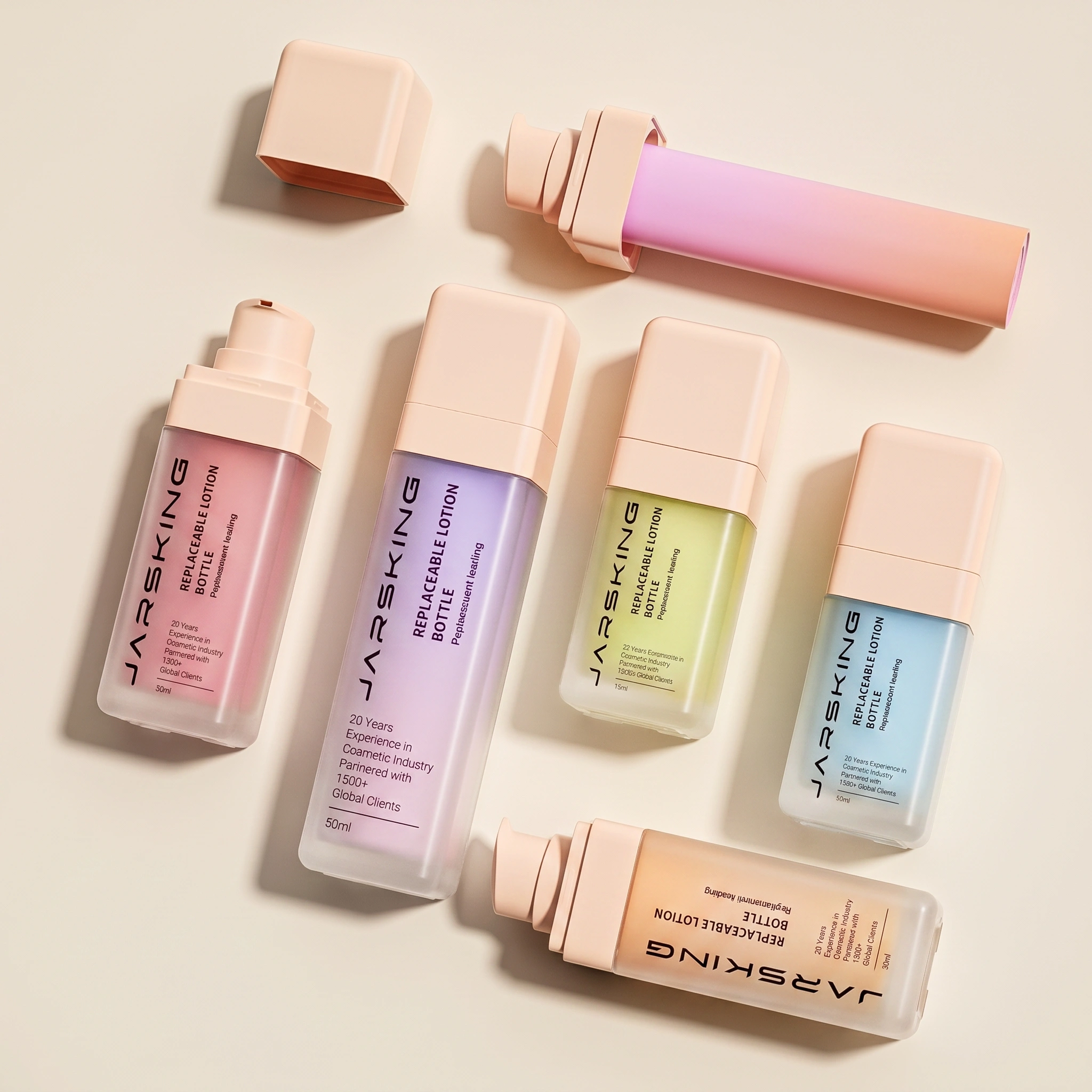
8. Series Packaging: Designing for a Whole Line, Not One Bottle
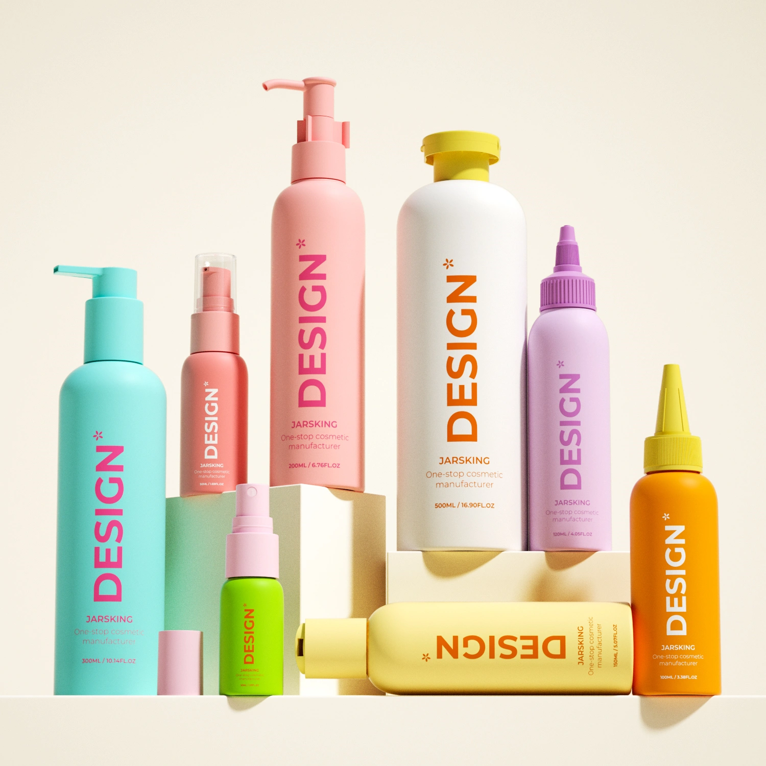
If you’re launching more than a single hero product, the smartest premium brands don’t design bottles one at a time — they design a system, and that shift in thinking changes almost every decision that follows. Series packaging with a cohesive visual language across a moisture, volume, and treatment line builds much stronger brand recognition than isolated, unrelated bottle designs, because customers start recognizing the “family” on shelf even from a distance, sometimes before they can even read the labels. That distance-recognition effect matters more than most founders realize — in a crowded retail environment or a cluttered bathroom shelf, a customer’s eye catches a familiar silhouette and color language long before it processes text, and that split-second recognition is what pulls a hand toward your brand instead of a competitor’s.
Think about how this plays out for an established shopper versus a first-time buyer. A repeat customer who already trusts your moisture shampoo will instinctively look for the same bottle shape and cap style when picking up your new scalp treatment for the first time — the consistent architecture acts as an implicit quality guarantee, transferring trust from one product to the next without requiring any new marketing effort. A first-time buyer standing in front of your full range, meanwhile, benefits from the opposite effect: a unified silhouette signals that this is a considered, professional line rather than a scattered collection of unrelated SKUs thrown together to fill shelf space.
9. The Practical Architecture: What Stays the Same, What Changes
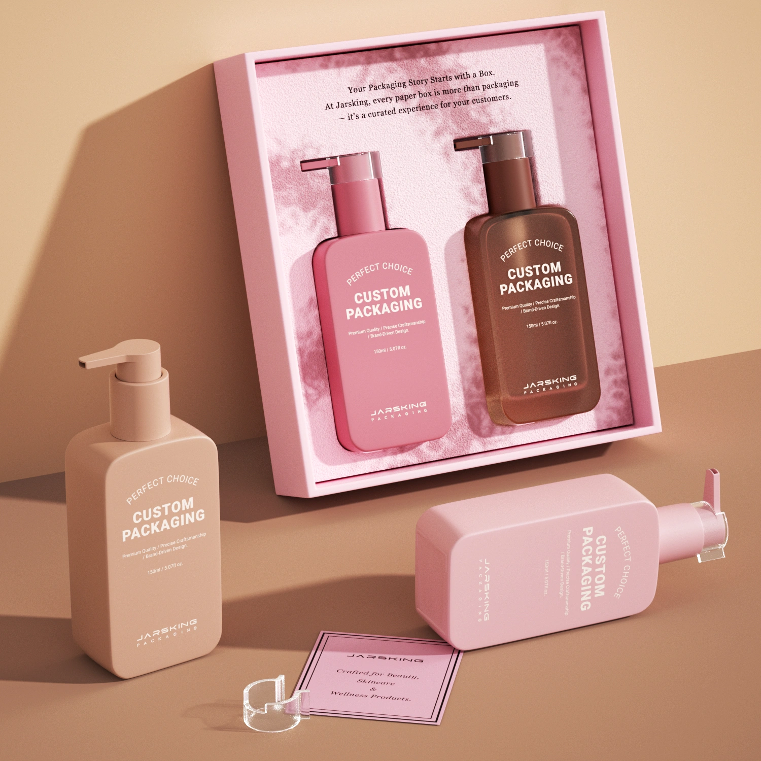
The practical approach is to standardize the primary architecture — bottle silhouette, neck finish, and closure family — across the whole line, then differentiate individual SKUs through controlled changes in color, finish, and secondary graphics. This isn’t just a design preference; it’s a deliberate cost-control strategy. Every unique bottle shape or closure mechanism requires its own mold, its own tooling investment, and its own minimum order quantity, so standardizing the core shape across five or six SKUs means the brand only pays for one primary mold instead of five or six separate ones. That single decision can be the difference between a manageable tooling budget and one that balloons out of control before the line even launches.
Here’s how that standardize-then-differentiate approach typically breaks down in practice:
Bottle silhouette and volume stay identical across the entire range, so a 250ml shampoo and a 250ml conditioner share the same base mold
Neck finish and threading remain constant, which also simplifies capping equipment on the filling line and avoids costly changeovers during production
Closure family stays consistent — if the moisture line uses a metal pump, the volume and treatment lines use the same pump mechanism rather than mixing in flip-tops or droppers unless the formula viscosity genuinely demands it
Color coding differentiates each SKU — a soft blue accent for hydration, a warm coral for volume, a deep green for scalp treatment — letting customers sort the range visually in seconds
Secondary graphics, icons, or label accents carry the functional messaging without altering the core silhouette that customers have already learned to recognize
10. Where This Is Heading
If the current trajectory holds, expect more brands to blend sculptural glass shapes with vacuum-refill ecosystems, treating the “hero bottle” as a permanent object customers keep for years rather than a single-use container that gets tossed after one cycle. This is a genuine shift in mindset, not just a materials upgrade. For decades, the industry treated packaging as disposable infrastructure — something formulated once, filled, sold, and discarded. A refill-first model flips that logic entirely: the bottle becomes the asset, and the formula becomes the consumable that flows through it repeatedly. That reframing changes how brands should think about design longevity, because a bottle meant to sit on a vanity for three years needs a very different aesthetic strategy than one meant to be thrown out after thirty days.
Texture innovation, digital authentication layers, and mono-material recyclability will likely converge as the default expectation for anything marketed above mid-tier pricing, especially as premiumization continues to outpace the rest of the hair care category through 2026. It’s worth pausing on why these three trends are converging rather than developing separately. Texture innovation addresses the tactile trust problem. Digital authentication addresses the counterfeiting and provenance problem that grows alongside a brand’s success. Mono-material recyclability addresses the regulatory and consumer-pressure problem that’s only intensifying as more markets adopt extended producer responsibility rules. Brands that solve all three simultaneously — rather than picking one and ignoring the others — will likely separate themselves from competitors still treating packaging as a single-dimension decision.
FAQs
What makes a shampoo bottle feel "luxury" instead of just expensive-looking?
It’s the combination of weight, material, and finish working together rather than any single element. A heavy glass bottle with a smooth metal pump and a considered texture communicates quality through touch, not just appearance, which is why premium brands invest in tactile details customers may not consciously notice but definitely feel.
Is glass always better than plastic for premium shampoo packaging?
Not necessarily — it depends on budget, shipping logistics, and brand stage. Glass delivers superior perceived value, UV protection for light-sensitive formulas, and infinite recyclability, but it comes with higher mold costs and MOQs, so many growing brands start with premium-finish plastic or a hybrid stock-bottle approach before graduating to full custom glass.
What type of pump or cap is best for shampoo?
It depends on formula viscosity and use case. Metal pumps on glass signal high-end quality for shampoos and conditioners, airless pumps protect active ingredients in serums and treatments, flip-top caps work well for everyday shower use, and droppers suit hair oils. The key is testing the closure with your actual formula and simulating wet, one-handed shower use before finalizing.
Why do so many premium brands use amber or tinted glass?
Amber and dark-tinted glass protect light-sensitive active ingredients from UV degradation while also creating an instantly recognizable, sophisticated visual identity — Aesop’s consistent amber bottle is the clearest example of this dual function in action.
How important is color psychology in shampoo bottle design?
Very important — color sets expectations before a customer reads anything. Deep jewel tones and metallics signal opulence, earthy greens and browns signal natural authenticity, and emerging 2026 palettes like soft neutrals, seafoam green, and charcoal are being used to communicate calm minimalism or clinical credibility.
What's the biggest packaging mistake new premium hair care brands make?
Choosing an aesthetically pleasing cap or closure that fails functionally in wet, slippery shower conditions, or committing to a fully custom glass mold and its high MOQ before validating real market demand.