

The first message was a request for a catalog. A buyer in Belarus wanted to see our glass cosmetic packaging. Her company was an established designer fashion brand with its own design team, an online store, and an existing customer base. It was preparing to launch a skincare line under a new brand. The team knew the look it wanted, and the buyer had already found a few bottles she liked. The packaging questions started when she tried to match those bottles to the products the company wanted to sell.
Some of the questions sounded simple. Could a bottle she liked hold more product? How did the cap open? Others took more work. Would a pump dispense a thick cream? Could the factory match the artwork across several bottle styles and cartons? What would happen if the printing on a sample peeled off?
Those questions shaped five months of work. We started with an Alibaba.com inquiry in December 2025 and received the formal purchase order and deposit in May 2026. The first order was worth 514,943.85 yuan. It covered 28 SKUs built around four bottle styles and four matching carton styles, with 105,490 individual bottles and cartons combined.
1. The catalog got the conversation started
The buyer was comparing several suppliers when she reached out on December 11. We replied within five minutes and sent the full catalog that day. She came back with product questions that evening, and we picked them up first thing the next morning. The catalog gave her something she could use right away. She could point to a style, tell us what interested her, and ask about the details while she was still comparing options.
We were also trying to understand the company behind the inquiry. We looked at the buyer’s activity on Alibaba.com and spent time on the fashion brand’s website. The clothing collections gave us a sense of its style, and the online store showed an established business that already knew how to present and sell its products. The buyer also explained that the company was developing a new cosmetics brand. Its team was developing artwork and preparing for filling while we worked through the packaging.
That background made the product references more useful. A bottle with a round cap, for example, told us something about the proportions and silhouette the buyer liked. It gave us a place to start when she asked about sizes outside the range she was looking at. We could keep that visual reference in view while asking what the package needed to do.
By December 17, the buyer had told us the company had chosen our packaging for the project. It was an encouraging signal. It also came while the team was still requesting drawings and working through technical questions. The brand had decided who it wanted to work with. There were still samples, artwork, and a production schedule to agree on before it could issue a purchase order.
2. The same look could work in a different material
In one early exchange, the buyer sent a reference image and asked whether that style came in 20, 30, 60, and 100 mL. We asked what she planned to put in the bottles. She described a 500 mL body lotion and 200 mL sizes for a facial cleanser and toner. Once we had those details, we could talk about the bottle she liked and the sizes the products called for as separate choices.
Glass was her first preference. We discussed what a larger glass bottle would weigh in shipping and suggested looking at plastic bottles with a similar shape. She came back asking about 200 mL and 500 mL plastic options. The conversation had moved from the capacity of a single reference bottle to the needs of several different products. Both materials ultimately had a place in the order, with glass used for two of the smaller bottle styles and plastic for the 500 mL bottle.
For this client, the material question was tied to both brand and logistics. The shape was part of the look the buyer wanted to carry into skincare. The weight was something her team would have to account for when shipping the packaging. Comparing the options side by side gave her a way to discuss both with colleagues. A plastic bottle became a practical option for a specific product, while glass remained available where the team wanted to use it.
The final order also included a 30 mL airless bottle. The four approved styles reflected decisions the client made as the line took shape. The early capacity questions gave us a way to explore those decisions, and the eventual purchase order gave production a specific set of bottles to work from.
3. A pump had to work with the cream inside
The buyer was concerned that one of the face creams might be too thick for the pump she was considering. She asked whether the bottle could take a pump with a wider opening. The existing option already had one of the larger openings in our range, so we suggested sending samples for her team to try with the actual formula. She agreed to sample it.
That gave us a practical way to answer two different questions. We could show the buyer what the pump looked like and explain its structure. Her team could use a sample to see how the cream behaved when they tried to dispense it. For a product people might use every morning, the buyer needed to think about how much effort it would take to get the cream out and how much would come out with each press. The sample gave her a way to evaluate those details against the formula she actually planned to use.
We also sent two photos of the pump taken apart so the buyer could see the internal structure and the position of the dip tube. When she asked how another bottle’s cap opened, we picked up the product, filmed ourselves opening it, and sent her the clip. She could see the full motion and share the video with a colleague who had the same question.
Each of those materials had a purpose. The video showed how to open the cap. The photos explained how the pump was put together. The sample gave the team a way to try the pump with its own cream. For a buyer learning a new category from a distance, getting the right kind of evidence at the right time made it easier to decide which options to keep exploring.
4. The designers needed files they could use
On the afternoon of December 17, the client requested dielines for four bottle styles. All four PDFs went out by 5:21 p.m. that day. The designer could start laying out the artwork using the actual packaging dimensions. Having all four files at once also made it possible to work on the products as a group, which mattered for a line that had to look consistent across bottles of different sizes.
The client supplied its own artwork. We helped create renderings that showed the designs on the bottles and alongside the matching cartons. A graphic on a flat page gives a good sense of the artwork. A rendering lets the designer see how it sits on the bottle’s curved surface and how it reads when there is a dark pump or cap above it. Putting several designs side by side gave the team enough context to discuss an individual bottle and the assortment around it.
That was a natural division of work. The fashion brand understood its visual identity and stayed in charge of how the new brand would look. We supplied the dielines, component options, and packaging renderings so its designers could apply their ideas to formats they were using for the first time. The purchasing team could look at the same renderings and see which bottle, closure, and carton went together. As the details changed, both teams had a specific packaging combination to refer to.
The design review took roughly one to two months. There were decisions about individual graphics, about how a bottle looked with its carton, and about how the variations would look next to one another. The time spent on those choices is part of what the 28 SKUs represent. Each variation had to make sense on its own and belong with the rest of the line.
It helped to have several ways to review the same design. The dieline gave the designer dimensions to work with. The rendering showed how the graphics, bottle, and carton would come together. The sample let the buyer handle the materials and look closely at the print. Some of the questions that came back in March, such as where the carton was glued and how well the printing adhered, came into focus once the buyer had the sample in hand. By then, the team had worked through the larger decisions about shape and visual direction and could focus on those details.
5. Four bottle styles gave the designers room to build a line
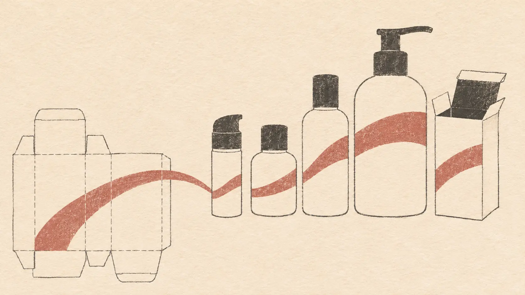
The approved assortment included a 30 mL airless bottle, 60 mL and 100 mL glass bottles, and a 500 mL plastic bottle. We worked with existing molds and put the customization into the finishes and graphics. The bottles featured a pink electroplated finish and three-color printing, with soft-touch matte black pumps, caps, or collars depending on the style. The matching cartons combined four-color printing, gold foil stamping, and black interiors.
For a fashion team, those details were part of the design itself. The matte black components would sit next to the reflective bottle finish, and the black interior of the carton would become visible when someone opened it. The packaging had to work as a set, from the bottle and carton on the shelf to the parts a customer would handle after bringing it home.
Using existing molds gave the designers a set of shapes they could work with from the start. It also gave the purchasing team a clear basis for comparing the combinations. The same bottle style could carry different exterior designs, with the carton providing another place to distinguish products within the line. That is how four bottle styles and four carton styles could support a much wider assortment. The work went into applying the finishes, artwork, and pairings across the set.
This approach fit the company we were working with. It had a point of view about color and texture and wanted to bring that into its first skincare line. Our contribution was to help it decide where to customize and show how those choices would look together before it committed to a production order.
6. A sample complaint became a production discussion
On March 31, the buyer sent photos of sample bottles with printing that had started to peel. She also had several changes in mind. She wanted to move the carton seam away from the front, price a black interior, and see whether the serum dropper and the body lotion pump could be made black.
We went through the list with production and replied that morning. The carton seam could move to the back. A black interior would add $0.02 per carton for this order. Painting the glass dropper black raised concerns about the coating peeling and coming into contact with the formula. A custom color for the pump nozzle carried a 300,000-piece minimum. With the price, process concern, and minimum order spelled out, the buyer could judge each request in the context of her first run.
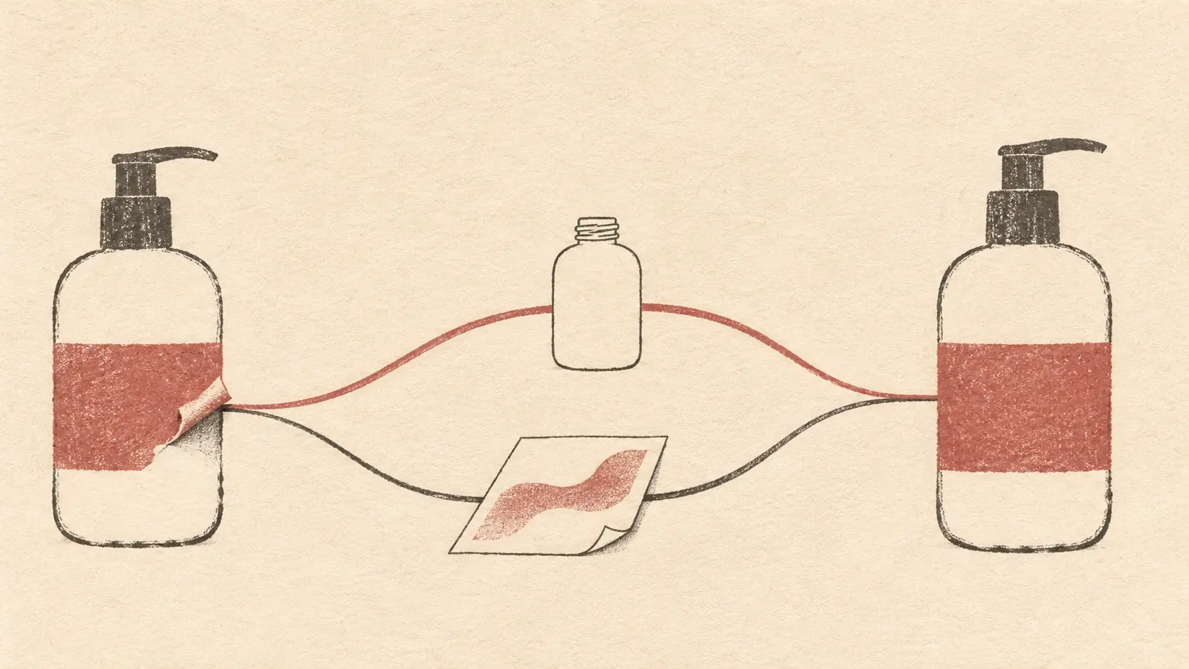
The peeling print called for a separate response. We checked how the sampling process differed from the planned production run. The team explained the difference to the buyer and said the full run would include a 24-hour drying step after screen printing. We also committed to checking print adhesion before shipment. The buyer could connect the defect she saw on the samples with a specific production step and a quality check.
The questions had arrived together, and each called for a different answer. A carton seam was a straightforward change. A black interior was a pricing decision. Coloring the dropper or pump nozzle brought up questions about the coating and the minimum order. We brought those answers back in one exchange so the client could consider the package as a whole.
On April 1, the buyer told us she was ready to start the first order of bottles. By then, she had gone from comparing styles in a catalog to reviewing physical samples, specifying changes, and discussing how the packaging would be made. The questions had become more precise, and so had the answers.
7. A 40-day schedule with work that could start sooner
In May, the client’s director joined the conversation and asked us to shorten the planned 40-day production lead time to 30 days. Some of the artwork was still being finalized. The client wanted to keep its launch moving, and the production team had to make room for electroplating, inspection, and more than ten similar-looking designs that had to be kept straight during production and quality checks.
We replied in Russian and explained what the 40 days covered. It helped to talk about the work behind the number. Electroplating and inspection took time. Similar designs needed careful handling because a mix-up could be difficult to spot. The client’s director could see which parts of the schedule were tied to the specific finishes and artwork the team had chosen.
The bottle color had already been approved, so we proposed starting the confirmed injection molding and spray coating while the designers finished the remaining files. The client could submit those files by May 25 and stay on the original schedule. The overall lead time stayed at 40 days. What changed was the sequence. The parts of the job with enough information to begin could move ahead, and the designer had a firm date for handing over the rest.
That gave the client a concrete way to respond to the timing pressure. The director knew which work could start, the designer knew when the files were due, and production could keep the time it needed for finishing and inspection. For a company coordinating a packaging project and a new product launch at the same time, knowing when one team’s work depended on another’s was especially important.
8. What a packaging partner brings to a first skincare launch
The client came into skincare with an established customer base, an in-house design team, and sales channels already in place. What it needed was a way to make packaging decisions in a category it was working in for the first time. When the buyer showed us a bottle she liked, we helped her work through the capacity, material, and dispensing options. When the designers were ready to start, we sent dielines for all four bottle styles and helped them see how their artwork would look across the bottles and cartons.
We kept things moving when the questions got harder. If a pump’s performance depended on the formula, we suggested a sample the client could try with its own cream. When the sample printing peeled, we brought the issue to production and came back with a specific plan for the full run and a commitment to check print adhesion before shipment. We stayed involved through scheduling and payment, so the work carried through from design approval to a formal order.
The project began with a request for a catalog and a bottle the buyer liked. It ended with a skincare line on the shelf that looked and felt like it belonged to the brand. Our role was to bring packaging and production expertise into the decisions the client was making for the first time, while leaving the design choices that made the line its own in the client’s hands.
FAQs
What information should I share when requesting a skincare packaging quote?
For each product, share the formula type, target fill volume, preferred dispensing method, and estimated order quantity. Include reference images and specify whether the quote should cover decoration and matching cartons. If you have a target launch date, share it early so the supplier can plan backward from it.
Can a skincare line use both glass and plastic bottles?
Yes. You can choose materials product by product while keeping the line visually consistent through shape, color, or decoration. In this project, the brand chose glass for its 60 mL and 100 mL bottles and plastic for its 500 mL bottle, where shipping weight was part of the discussion.
How do I know whether a pump will dispense a thick face cream?
Request a sample of the proposed pump and bottle, then try them with the actual formula. Check how many presses it takes for the cream to come out, how much effort each press takes, and whether the amount dispensed is consistent. The pump opening is one detail to consider, and the sample lets you judge how the full assembly works with your formula.
Can I get custom skincare packaging using stock bottle molds?
Yes. An existing bottle shape can serve as the base for custom finishes, printing, closures, and matching cartons. This case used four stock bottle styles and developed a 28-SKU assortment through variations in artwork and packaging combinations.
When should my designer ask for packaging dielines?
Ask for the dielines once the bottle and carton styles are selected, before the designer lays out the final artwork. The files give the designer the dimensions needed to place graphics on each format. For a product line with several sizes, request the full set so the designs can be developed side by side.
What can I check in a packaging rendering and in a physical sample?
Use the rendering to review how the artwork sits on the bottle, how the cap and carton look together, and whether the designs feel consistent across the line. Use the physical sample to check details you can see or feel in hand, such as the opening action, carton seam, surface texture, and print adhesion.