
Let me tell you something I’ve seen happen more times than I can count.
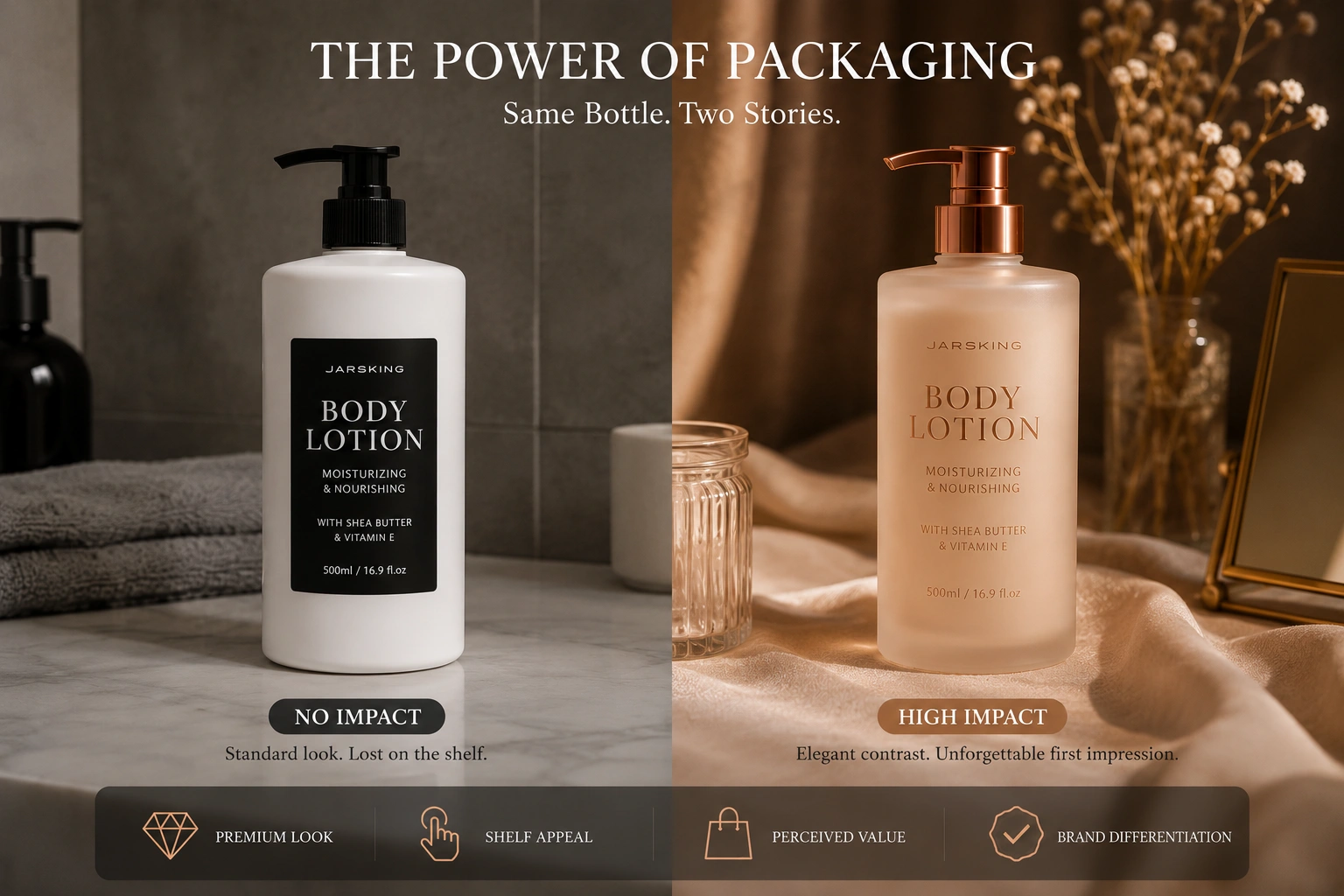
A founder pours eighteen months into developing a face serum — the formulation is exceptional, the ingredients are ethically sourced, the clinical data is solid. Then the product lands on shelves in a plain matte white tube with a black label, and it just… sits there. Meanwhile, a competing product with an arguably weaker formula — but a frosted glass bottle, a soft rose gold stamp, and a velvety soft-touch finish — sells out in two weeks.
This isn’t a hypothetical. It’s the pattern I’ve watched repeat itself across skincare launches, fragrance rollouts, and color cosmetics lines throughout my career. And it points to a truth the beauty industry still underestimates: packaging decoration isn’t cosmetic. It is the first product experience your customer has.
In 2026, where every beauty shelf — digital or physical — is a battleground for split-second attention, that first experience can make or break a brand. Consumers make purchasing decisions in under seven seconds. The decoration on your packaging is working harder in those seven seconds than your ingredient list ever will.
1. Why Packaging Decoration Is Actually Brand Strategy
There’s a reason the world’s most recognized beauty brands invest as heavily in packaging as they do in formulation. Decoration creates the visual shorthand consumers use to identify, trust, and return to a brand.
When a customer sees the same metallic gold accent, the same frosted texture, or the same debossed logo across your entire product line, their brain registers familiarity — and familiarity breeds trust faster than any marketing campaign can. This is the compounding logic of great packaging: every touchpoint reinforces the last, until your product becomes visually ownable in a category crowded with near-identical competitors.
The data reinforces what intuition already knows. Consumers routinely associate premium packaging finishes — frosted glass, electroplated caps, hot-stamped logos —with higher-quality formulations, even when the contents are functionally equivalent. This isn’t superficiality. It’s psychology rooted in decades of consumer behavior research. And smart brands build it into their decoration strategy from day one, not as an afterthought.
What most emerging beauty founders don’t realize is that decoration choices are downstream decisions from brand positioning. Before you select a finish, you need to know: What emotion should this product create the moment someone picks it up? What kind of person is reaching for it, and what do they expect that experience to feel like? A clean beauty brand targeting wellness-minded millennials and a prestige anti-aging line targeting affluent women over fifty are asking for fundamentally different tactile and visual languages — even if both could technically use frosted glass.
2. Silk Screen Printing: The Reliable Workhorse Every Brand Needs
Silk screen printing transfers ink through a mesh screen directly onto the packaging surface. It’s not glamorous to talk about, but it remains the backbone of the cosmetic packaging industry for good reason.
For large production runs — thousands of units of cosmetic jars, toner bottles, airless packaging — silk screen printing delivers exceptional color consistency and durability at a cost that doesn’t punish margins. Each color in a design requires its own screen, so the technique is inherently optimized for clean, bold graphics: logos, product names, simple brand marks.
The durability story is compelling. A well-executed silk screen print resists scratching, moisture, and the friction of everyday handling in a way that label printing often doesn’t. For brands whose products live in humid bathroom environments — shower shelves, bathroom counters — this matters more than many founders anticipate.
Where silk screen printing struggles: highly detailed artwork, photographic-quality gradients, and extremely fine typography. If your brand identity relies on intricate illustration or complex layered graphics, screen printing alone won’t serve you well. The solution most experienced packagers use is layering: silk screen printing for the primary information, with a secondary technique like hot stamping or embossing for brand distinction.
Best suited for: Everyday skincare lines, lotion bottles, PET containers, toner bottles, airless packaging, and brands scaling their first major production run where cost control is critical.
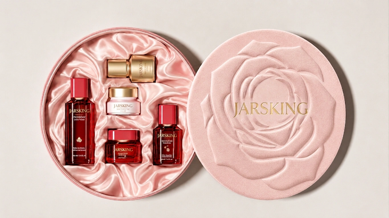
3. Hot Stamping: The Luxury Signal That Never Gets Old
If there’s one decoration technique that punches above its weight class in terms of perceived value, it’s hot stamping.
The process uses heat and pressure to transfer metallic foil onto the packaging surface, creating a reflective effect that almost no other method replicates at the same price point. Gold, silver, rose gold, copper, holographic — each foil color carries a different emotional register that sophisticated brand managers deliberately exploit. Rose gold says modern accessible luxury. Deep gold says heritage and authority. Holographic says limited-edition editorial cool. The same packaging shape with different foil colors tells entirely different brand stories.
What’s interesting about hot stamping in 2026 is how brands are deploying it with restraint. The era of metallic-everything is giving way to precision: a single stamped logo on a matte-coated jar, or a delicate foil border on frosted glass. That contrast — understated matte meeting a precise metallic accent — has become the visual signature of premium minimalist branding, the packaging equivalent of a well-cut suit with a single piece of excellent jewelry.
Consider how this plays in e-commerce specifically. Hot stamping photographs exceptionally well. The metallic reflection catches light in product photography in ways that communicate quality before a customer ever reads a description. In an era where most discovery happens on a 6-inch phone screen, that photographic quality isn’t a bonus — it’s table stakes.
Watch out for: Overly complex artwork losing definition at the foil transfer stage. Hot stamping thrives on clean, bold logomarks and typography. Very small text or fine-line illustration will lose clarity. And excessive metallic coverage can tip from luxurious into overwhelming — the goal is accent, not saturation.
Best suited for: Premium to luxury brand positioning; logo highlights, product name treatment, border accents; fragrance, prestige skincare, and color cosmetics.
4. Electroplating: When Your Packaging Needs to Feel Like an Object of Desire
Electroplating occupies a category of its own in cosmetic packaging decoration, and brands that use it well understand something fundamental: luxury isn’t just visual, it’s gravitational.
Through a specialized process, a metallic coating — chrome silver, gold, gunmetal, champagne, rose gold — is applied to plastic components, giving them the visual and tactile weight of solid metal at a fraction of the cost and none of the shipping penalty that actual metal would impose. Pick up a well-electroplated cosmetic jar cap and it feels substantial in the hand. That physical sensation signals quality before a single word on the label is read.
This technique dominates at the prestige end of anti-aging skincare and luxury fragrance for reasons that go beyond aesthetics. In categories where a single product might retail between $150 and $400, the packaging must justify the price point through every sensory cue available. An electroplated cap on a face cream communicates: this is not an impulse purchase, this is an investment in yourself. That narrative is worth significant production cost.
Popular electroplated finishes include chrome silver (the most reflective and clinical-feeling), gold (heritage luxury), gunmetal (modern editorial), and champagne gold (warm, approachable prestige). Each resonates differently with target demographics, and savvy brands test multiple finishes with consumer panels before committing to production tooling.
The honest caveat: Electroplating carries meaningfully higher production costs compared to standard decoration. It also adds complexity to sustainability planning, since electroplated plastic components are typically harder to recycle. Brands entering this territory need to weigh visual equity against environmental commitments and be prepared to communicate transparently with consumers about end-of-life solutions.
5. UV Coating, Matte Finishes & the Soft-Touch Revolution
UV coating is one of those techniques that quietly does enormous branding work while rarely getting the recognition it deserves.
Applied in gloss form, UV coating creates vibrant, high-shine surfaces with exceptional scratch resistance — ideal for trend-driven brands and color cosmetics targeting a younger demographic. Applied in matte form, it transforms packaging into something that feels almost tactilely intelligent: understated, velvety, and distinctly modern. The matte variant has become so associated with premium skincare that it now functions almost as a category signal — if it feels soft and matte in your hand, your brain instinctively says this is serious skincare.
The soft-touch variant of matte UV coating has emerged as one of the defining finishes in 2026 beauty packaging. The velvety, almost suede-like feel creates what packaging designers call a “hand feel moment” — an instant tactile reward that reinforces the premium positioning before the product is even opened. For brands in the clean beauty, wellness, and clinical skincare spaces, this finish communicates what words often struggle to: this product is thoughtful, considered, and worth your attention.
The layering opportunity: UV coatings are most powerful when combined with other techniques. A matte base coat with a spot gloss accent — a glossy logo on an otherwise matte surface, or a gloss varnish over a printed graphic — creates visual hierarchy through contrast. This technique appears frequently in prestige packaging precisely because it adds sophistication without adding noise.
Common mistake to avoid: Over-specifying gloss UV on packaging intended to communicate clean or minimalist positioning. If your brand language is about simplicity and transparency, a high-shine surface sends a contradictory message. Match the finish to the brand’s emotional register, not just the aesthetic trend of the moment.
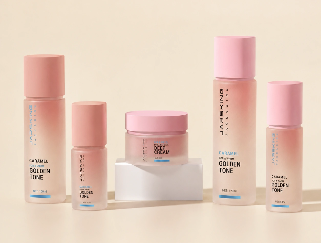
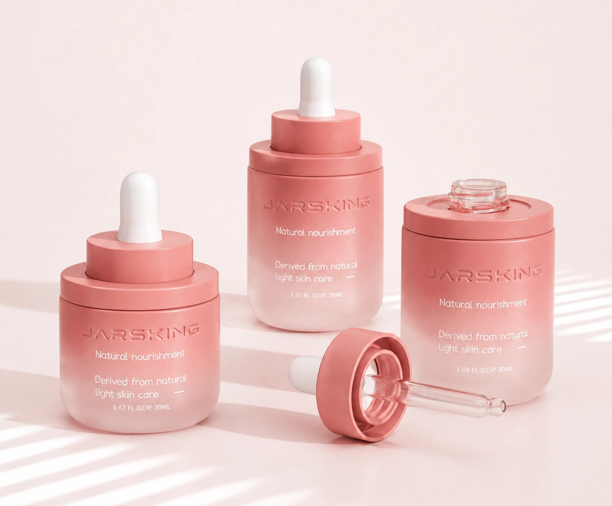
6. Frosted Finishes: Sophistication You Can See Through
There’s something about a frosted surface that makes even architecturally simple packaging feel elevated. Frosting diffuses light rather than reflecting it, creating a quiet visual elegance that doesn’t demand attention so much as reward it — exactly the aesthetic that resonates with the modern skincare consumer who values intentionality over spectacle.
Frosted glass remains the gold standard for face creams, serums, and essential oils in the luxury and premium-natural segments. The combination of glass’s inherent weight and quality signal with the diffused, organic texture of frosting creates an unboxing experience that consistently scores high in consumer research on perceived product quality. Brands like those in the apothecary and clinical skincare space have built entire visual identities around it.
But frosted plastic has matured significantly in the last two years, and this deserves more attention than it typically gets. Modern frosted acrylic and PET packaging can closely approximate the glass aesthetic at meaningfully lower weight and cost — a critical consideration for e-commerce brands where shipping economics directly affect margins. The key to making frosted plastic feel premium (rather than just cheap) lies in wall thickness, the quality of the frosting application, and the precision of any secondary decoration layered on top.
The trend extending into 2026 is combining frosted finishes with secondary decoration to create layered visual richness: a frosted bottle base with a hot-stamped logo, or a frosted jar body paired with an electroplated metallic cap. These combinations create what designers call “visual tension” — the matte diffuse surface against the reflective metallic element creates a dialogue that makes packaging feel designed rather than simply manufactured.
Best suited for: Luxury and premium skincare, clean beauty, wellness brands, essential oils, serums, and any line where “purity” and “efficacy” are the primary brand values.
7. Spray Coating: Your Brand’s Signature Color, Owned
Walk through any forward-thinking beauty retailer in 2026 and you’ll notice something: the brands with the most cohesive shelf presence don’t just have a logo — they own a color. A specific, custom-mixed hue that triggers brand recognition before a customer reads a single word.
Spray coating is how that’s built. The technique allows for Pantone-matched custom colors, gradient effects, transparent washes, soft-touch finishes, and metallic appearances across virtually any substrate. The warmth-toned architectural neutrals that have dominated skincare packaging in 2025–2026 — soft terracotta, sage green, dusty rose, warm beige — are almost universally achieved through spray coating.
What makes spray coating strategically underrated is its role in creating proprietary visual assets. When a consumer sees your specific shade of frosted sage green on a shelf across a room, that recognition is brand equity that compounds over time. It can’t be copied without deliberate effort and can’t be achieved through standard stock packaging. For emerging brands trying to build visual identity with limited marketing budgets, investing in a signature spray coat color often delivers more long-term return than paid media.
Advanced applications: Gradient effects — where color transitions from deep at the base to translucent at the top — have become increasingly popular for serums and treatment products, creating a visual metaphor for transformation that connects to product storytelling. Two-tone spray applications (complementary colors on different packaging components) are also gaining traction as a way to differentiate SKUs within a product range while maintaining visual cohesion.
8. Embossing, Debossing & the Power of Touch in a Digital Age
Here’s something that matters more in 2026 than it did five years ago: physical, tactile experience has become a genuine competitive differentiator precisely because so much discovery now happens on screens.
As e-commerce captures an ever-larger share of beauty sales, the moment a customer first physically holds a product they ordered online carries extraordinary emotional weight. That unboxing moment — the first real sensory encounter with your brand — is where tactile decoration earns its return on investment. Embossed and debossed designs work on a sensory level that photography simply cannot capture or replicate.
A raised logo on a cream jar. A debossed brand name on a glass serum bottle. A textured geometric pattern embossed across the shoulder of a lotion pump. These details don’t just look premium — they feel premium in a way that creates a micro-moment of brand loyalty every time the customer uses the product.
Haptic finishes and structural reliefs are consistently cited across 2026 industry research as one of the defining differentiators in premium beauty packaging. The competitive logic is elegant: when two products look similar in a product photo, the one that feels better in the hand wins the repeat purchase.
Embossing vs. debossing — knowing the difference: Embossing raises elements above the surface, creating a three-dimensional effect with strong visual presence. Debossing presses elements into the material, creating a subtler, more intimate effect that rewards close inspection. Luxury skincare brands often favor debossing for logos because the understated impression communicates confidence — a brand secure enough not to need to shout.
9. Metallization: The Bridge Between Electroplating and Accessibility
Metallization achieves reflective metallic finishes through vacuum deposition processes rather than electroplating — producing chrome silver, gold, rose gold, and brushed metal effects at a different cost and material profile.
For brands working at mid-to-premium positioning, metallization often hits the sweet spot. It delivers luxury-adjacent aesthetics — the same mirror-bright chrome or warm gold that electroplating achieves — at a production cost that better fits a growing brand’s economics. It’s particularly prevalent on caps, collars, pump actuators, and decorative packaging components where the metallic finish is visible but the component isn’t the primary packaging structure.
The sustainability dimension of metallization deserves a mention here. Like electroplating, metallized plastic components present recycling complexity. Some manufacturers are now offering metallized finishes using recyclable mono-material designs or water-washable metallization processes specifically to address this. As PPWR regulations tighten in Europe and sustainability scrutiny intensifies across global markets, this technical evolution will matter increasingly to brand procurement decisions.
10. Decoration Method Selection at a Glance
| Technique | Cost Level | Luxury Impact | Durability | Ideal Brand Tier |
|---|---|---|---|---|
| Silk Screen Printing | Low | Medium | High | Mass to mid-market |
| Hot Stamping | Medium | High | Medium | Premium to luxury |
| Electroplating | High | Very High | High | Prestige/luxury |
| Frosted Finish | Medium | High | High | Clean beauty/premium |
| Matte UV Coating | Medium | High | High | Modern/minimalist |
| Spray Coating | Medium | Medium–High | High | Brand-building |
| Embossing/Debossing | High | High | High | Luxury/artisan |
| Metallization | Medium–High | High | High | Mid-premium |
11. What’s Actually Shaping 2026 Decoration Trends
The beauty packaging landscape in 2026 is being defined by three converging forces that didn’t exist in quite the same configuration even three years ago:
Sensory luxury over material weight. The old equation of heavy = premium has broken. Consumers — shaped by sustainability awareness and years of handling excellently engineered consumer electronics — now equate quality with thoughtfulness of design, not mass. A lightweight PET bottle with a perfect soft-touch spray coat and a precisely embossed logo communicates more sophistication than a heavy glass jar with generic chrome trim.
Sustainable decoration becoming non-negotiable. Brands are actively moving toward water-based inks, recyclable coatings, and decoration techniques designed with end-of-life recyclability in mind. In Europe, updated PPWR (Packaging and Packaging Waste Regulation) requirements are making this legally consequential, not merely reputationally virtuous. Forward-looking brands are embedding sustainability criteria into decoration briefs from the start — not retrofitting them after the fact.
Mixed-technique layering as the new standard. Single-finish packaging is giving way to considered combinations that create visual depth through contrast: frosted base + hot stamp, matte coating + embossed logo, spray coat + silk screen print. The brands doing this best treat decoration like composition in design — each element serves a role, nothing competes with anything else, and the total effect is greater than the sum of its parts.
12. The Decoration Mistakes That Kill Great Packaging
The most common failure mode isn’t cheap execution—it’s conceptual misalignment. And it costs brands far more than it should.
Decoration divorced from brand identity is the real killer. I’ve watched brands with genuinely excellent products adopt decoration trends that belong to a completely different consumer psychology than their own. A youthful Gen-Z color cosmetics brand and a clinical anti-aging skincare line targeting affluent women in their fifties are asking for fundamentally different visual and tactile languages. Applying a holographic hot stamp or a maximalist spray gradient to packaging that’s supposed to communicate clinical precision creates cognitive dissonance that consumers feel instantly — even if they can’t articulate why they’re reaching for the competitor instead.
Over-decoration remains a chronic temptation. The impulse to add more — another foil element, another texture layer, another color effect — almost always produces packaging that reads as cluttered rather than luxurious. The most powerful premium packaging in 2026 tends toward restraint: one or two techniques executed with exceptional precision, rather than five techniques fighting each other for attention.
Poor contrast and legibility is a quieter failure that shows up most on packaging with dark base colors or heavy metallic finishes. When logo type gets lost against a busy decorated surface, or ingredient information becomes illegible, the brand’s communication fails at the most basic level. Always evaluate decoration in context — on a physical sample under retail lighting and in product photography — before committing to final production.
Skipping durability validation is a costly oversight that surfaces post-launch. Scratch resistance, adhesion stability, moisture exposure, UV fading, and transportation friction all need to be tested — especially for hot stamping and soft-touch coatings, which can degrade significantly if the base coat specification is wrong. A product that photographs beautifully on day one but shows decoration wear after three weeks of use damages brand perception every time a loyal customer reaches for it.
13. A Practical Framework for Choosing Your Decoration Strategy
Rather than asking “which technique is best?” — a question with no universal answer — work through these four decisions in sequence:
Define your brand’s emotional register first. Clinical precision, warm wellness, bold color play, and quiet luxury each call for different decorative vocabularies. Your decoration brief should start with an emotional target state, not a technique name.
Map the customer’s primary touchpoint. If your customer discovers and purchases primarily in-store, shelf presence and tactile in-store interaction drive the decoration brief. If they’re buying online, the unboxing moment is your primary brand stage — and tactile decoration like embossing and soft-touch finishes deliver their ROI there.
Understand your production economics honestly. Electroplating and embossing tooling costs can be significant at lower MOQs. For early-stage brands with runs under 5,000 units, spray coating and silk screen printing with a single hot-stamp accent often deliver the best value-to-quality ratio. As volume scales, more complex techniques become economically viable.
Build sustainability criteria into the brief from the start. Don’t treat eco-friendly decoration as a constraint to work around — treat it as a design parameter that shapes better decisions earlier. Mono-material compatibility, water-based ink options, and recyclable coating systems are now available across most major decoration categories.
The brands building lasting packaging equity in 2026 aren’t necessarily the ones with the most technically complex decoration. They’re the ones who chose their techniques deliberately — who understood that every finish, every foil, every texture is a word in the visual sentence their packaging speaks to the customer.
When that sentence is clear, coherent, and emotionally true to the brand, packaging stops being a container and becomes a reason to believe.
FAQs
What is the most cost-effective cosmetic packaging decoration technique for small beauty brands?
Silk screen printing is generally the most budget-friendly option for beauty brands starting out. It delivers strong color consistency and durability at a low cost per unit, making it ideal for first production runs. For brands with modest MOQs, combining silk screen printing with a single spray coat color can create a professional, cohesive look without overspending on tooling or setup fees.
What is the difference between hot stamping and silk screen printing on cosmetic packaging?
Silk screen printing uses ink applied through a mesh screen — it’s durable, cost-effective, and ideal for logos and text. Hot stamping uses heat and pressure to transfer metallic foil onto the surface, creating a reflective finish that ink cannot replicate. The key difference is visual: silk screen printing reads as functional and clean, while hot stamping signals premium or luxury positioning. Many brands use both on the same package.
What cosmetic packaging decoration techniques are most sustainable in 2026?
The most environmentally forward options in 2026 include water-based ink silk screen printing, recyclable matte UV coatings, and spray coatings formulated with low-VOC water-based systems. Embossing and debossing are inherently low-impact since they add texture through pressure rather than added materials. Electroplating and metallization present the most recycling complexity and are worth evaluating carefully if sustainability is a core brand value.
Which cosmetic packaging decoration technique offers the best durability for everyday-use products?
For products subject to daily handling in high-moisture environments — such as bathroom counters and shower shelves — silk screen printing and electroplating offer the strongest durability profiles. Silk screen printing, when applied with a compatible base coat and properly cured, resists scratching, moisture exposure, and handling friction through the full product lifecycle. Electroplating, while more costly, produces a robust metallic surface resistant to chipping and oxidation. Soft-touch coatings and hot stamping, while visually compelling, require more rigorous durability validation — particularly adhesion testing and abrasion resistance — to ensure long-term performance under real-world conditions.
How do I choose between matte and gloss UV coating for my skincare packaging?
The choice comes down to brand positioning and target consumer psychology. Gloss UV coating creates vibrant, high-shine surfaces that appeal to younger consumers and trend-driven brands. Matte UV coating communicates sophistication, minimalism, and clinical seriousness — a finish strongly associated with premium and clean beauty in 2026. If in doubt, consider your brand’s emotional register: high-energy and expressive calls for gloss; calm, trustworthy, and refined calls for matte.
What are the key quality control tests required before approving cosmetic packaging decoration for production?
Professional quality control validation for cosmetic packaging decoration should include the following assessments prior to production sign-off: adhesion testing (cross-hatch tape pull test per ASTM D3359) to confirm decoration bonding integrity; abrasion and scratch resistance testing to simulate handling and retail friction; chemical resistance testing using common cosmetic ingredients — alcohols, emollients, fragrance compounds — to confirm decoration stability under product contact conditions; UV and light fastness testing to assess color and finish durability under retail and storage lighting; drop and transportation simulation testing to evaluate decoration performance through supply chain handling; and temperature and humidity cycling to confirm stability across climate variation. Skipping any of these validation steps significantly increases the risk of post-launch decoration failure — a costly outcome that damages both brand perception and customer retention.